Chapter 2 Visualization
Data scientists and statisticians visualize data to explore and understand data. Visualization can help analysts identify features in the data, such as typical or extreme observations. Visualizations can also help describe variation. Because it is so powerful, data visualization is often the first step in any statistical analysis.
The topic of data visualization can be vast, and entire textbooks have been written about the topic.2 Given the powerful nature of data visualization, only an introduction to data visualization is covered in this book, to use them for interpreting statistical results. Only a few data visualizations will be explored, described, and used.
Data visualization can be broken down into many different components in many different ways. In this book, we aim to differentiate data visualization into two different types. First, this chapter will aim to explore a single attribute of interest, often referred to as univariate visualization. The term univariate can be split into two pieces: one, “uni-,” meaning one, and second, “variate,” referring to the attribute or variable explored. Often, univariate data visualization is used for the attribute that is deemed the outcome or the attribute of interest, but this does not need to be the only attribute explored in such a way. The goals of the univariate data visualization are to understand more about the single attribute of interest, identify the key features, whether there are extreme values, whether the attribute spreads over many possible values, or whether the data is more homogeneous (i.e., similar).
The second type of data visualization discussed in this book is multivariate data visualization. The phrase “multivariate” can again be broken into two components, “multi-,” referring to more than one, and “variate,” referring to the attribute of variables. Multivariate visualization will be discussed more in chapter 4 of this book. As discussed in Chapter 4, multivariate visualization is used primarily to understand how more than one attribute in the data may be related to one another. Multivariate data visualization can also be helpful for understanding if there are differences across smaller subgroups in the data.
This chapter will focus on univariate or single-attribute data visualization. The goals for this chapter are to introduce common univariate data visualizations, how to interpret these data visualizations, and explore cases where each type of data visualization is helpful to use.
2.0.1 College Scorecard Data
The U.S. Department of Education publishes data on higher education institutions in their College Scorecard (https://collegescorecard.ed.gov/) to facilitate transparency and provide information for interested stakeholders (e.g., parents, students, and educators). A subset of this data is provided in the file College-scorecard-clean.csv. To illustrate some of the standard methods statisticians use to visualize data, we will examine admissions rates for 2,019 higher education institutions.
Before the analysis, we will load two packages, the tidyverse package and the ggformula package. These packages include many useful functions that we will use in this chapter.
There are many functions in R to import data. We will use the function read_csv() since the data file we are importing (College-scorecard-clean.csv) is a comma separated value (CSV) file..3 CSV files are a standard format for storing data. Since they are encoded as text files, they take up a little space or computer memory. They get their name because, in the text file, each data attribute (i.e., a column in the data) is separated by a comma within each row. Each row represents a unique case or observation from the data. The syntax to import the college scorecard data is as follows:
colleges <- read_csv(
  file = "https://raw.githubusercontent.com/lebebr01/statthink/master/data-raw/College-scorecard-clean.csv",
  guess_max = 10000
  )
In this syntax, we have passed two arguments to the read_csv() function. The first argument, file=, indicates the path to the data file. The data file here is stored on GitHub, so the path is specified as a URL. The second argument, guess_max=, helps ensure the data are read inappropriately. This argument will be described in more detail later.
The syntax to the left of the read_csv() function, namely colleges <-, takes the output of the function and stores it or, in the language of R, assigns it to an object named colleges . In data analysis, it is often helpful to use results in later computations, so rather than continually re-running syntax to obtain these results, we can store those results in an object and then compute on the object. For example, we would like to explore the data that was read by the read_csv() function. We use the assignment operator, <-, when assigning computational results to an object. (Note that the assignment operator looks like a left-pointing arrow; it takes the computational result produced on the right side and stores it in the object on the left side.)
2.0.2 View the Data
Once we have imported and assigned the data to an object, ensuring that it was read appropriately is quite helpful. The head() function will give a quick data snapshot by printing the first six rows.
## # A tibble: 6 × 17
##   instnm     city  stabbr preddeg region locale adm_rate actcmmid  ugds costt4_a
##   <chr>      <chr> <chr>  <chr>   <chr>  <chr>     <dbl>    <dbl> <dbl>    <dbl>
## 1 Alabama A… Norm… AL     Bachel… South… City:…    0.903       18  4824    22886
## 2 Universit… Birm… AL     Bachel… South… City:…    0.918       25 12866    24129
## 3 Universit… Hunt… AL     Bachel… South… City:…    0.812       28  6917    22108
## 4 Alabama S… Mont… AL     Bachel… South… City:…    0.979       18  4189    19413
## 5 The Unive… Tusc… AL     Bachel… South… City:…    0.533       28 32387    28836
## 6 Auburn Un… Mont… AL     Bachel… South… City:…    0.825       22  4211    19892
## # ℹ 7 more variables: costt4_p <dbl>, tuitionfee_in <dbl>,
## #   tuitionfee_out <dbl>, debt_mdn <dbl>, grad_debt_mdn <dbl>, female <dbl>,
## #   bachelor_degree <dbl>
We can also include an interactive version for viewing the book on the web using the DT package.
2.1 Exploring Attributes
Data scientists and statisticians often start analyses by exploring attributes (i.e., variables) that are interesting to them. For example, we are interested in exploring the admission rates of the institutions in the college scorecard data to determine how selective the different institutions are. We will begin our exploration of admission rates by examining different visualizations of the admissions rate attribute. There are many visualizations helpful in exploring the data. Each visualization has pros and cons; it may highlight some features of the attribute and mask others. Looking at many different data visualizations in the exploratory phase is often necessary.
One of the primary goals of any data visualization, especially in this chapter, is to summarize (think, simplify) the data to understand key components of the attribute more easily. For example, it would be possible to explore all 2019 of the raw data to see the exact admission rate for each institution. However, if the goal is to know overall trends for the admission rates of institutions, knowing the exact values for each institution from the table would be too unwieldy. Instead, the data visualization aims to simplify the admission rate attribute to identify key features. Data visualization is a trade-off, as there is a loss of information. However, this loss of information is helpful in this context as it allows for the summarization of the attribute.
2.1.1 Histograms
The first visualization we will examine is a histogram. We can create a histogram of the admission rates using the gf_histogram() function. (This function is part of the ggformula package, which must be loaded before using the gf_histogram() function.) This function requires two arguments. The first argument is a formula that identifies the variables to plot, and the second argument, data =, specifies the data object assigned on data import. For example, earlier, we used the read_csv() function to import the college scorecard data, and we assigned this to the name colleges. The syntax used to create a histogram of the admission rates is:
Figure 2.1: Histogram of college admission rates
The formula provided in the first argument uses the following general structure:
~ attribute name
where the attribute name identified to the right of the ~ is the exact name of one of the columns in the colleges data object.
2.1.2 Interpreting Histograms
Histograms are created by collapsing the data into bins and counting the number of observations that fall into each bin. To show this more clearly in the figure created previously, we can color the bin lines to highlight the different bins. To do this, we include an additional argument, color =, in the gf_histogram() function. The bins’ color can be changed using the fill = argument. Here, the color of the bin lines is black, and set the bin color to yellow.4
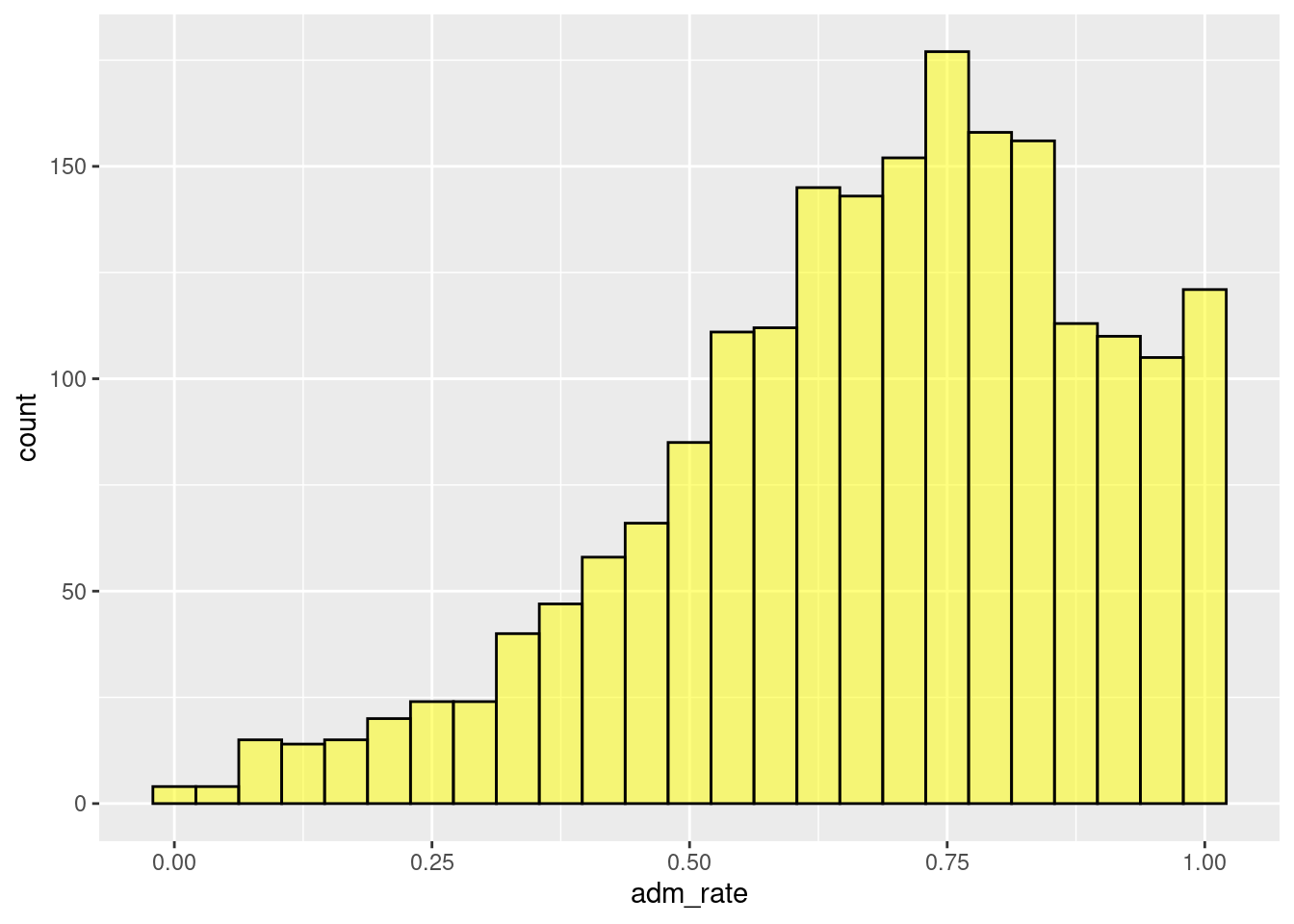
Figure 2.2: Histogram changing the color and fill of the bars.
A single bar, for example, the bar at 0.50, shows the number of institutions with admissions rates between about 0.48 and 0.52. In this case, there are about 80 institutions that have admissions rates between 0.48 and 0.52 (i.e., 48% to 52% admission rates). Similar interpretations are found for all of the other bars as well.
A common assumption made with a histogram is that the bars’ width is the same on the attribute of interest. For example, in the single bar interpreted in the preceding paragraph, the width of the bar was about 4% on the admission rate scale. Therefore, assuming all bars have the same width, all 30 bars in the histogram would range by about 4%.
Rather than focusing on one bin, we typically want to describe the distribution as a whole. For example, most institutions admit a high proportion of applicants since the bins to the right of 0.5 have higher counts than those below 0.5. However, some institutions are selective, only admitting fewer than 25% of the students who apply.
2.1.2.1 Adjusting the Number of Bins
The width or number of bins sometimes influences the interpretation of the distribution. It is often helpful to change the number of bins to explore the impact this may have on the interpretation. Changing the number of bins is done by either (1) changing the width of the bins via the ’binwidth =argument in thegf_histogram()function or (2) changing the number of bins using thebins =` argument.
The binwidth in the histogram refers to the range or width of each bin. A larger binwidth would mean fewer bins as it would take fewer bins to span the entire attribute range of interest. In contrast, a smaller binwidth would require more bins to span the entire range of the attribute of interest.
In contrast, the number of bins can be specified directly, for example, 10 or 20. The default within the R graphics package used is 30. Within this framework, each bin will have the same width or binwidth.
The relationship between the number of bins and binwidth is shown with the following equation:
\[ binwidth = \frac{attribute\ range}{\#\ of\ bins} \] To be more explicit, suppose that we wanted there to be 25 bins. Using algebra, we could compute the new binwidth given that we want 25 bins and the original attribute’s range. The admission rates attribute has values as small as 0 and as large as 1. Therefore, the total range would be 1 (1 - 0 = 1). The binwidth could then be computed as:
\[ bindwidth = \frac{1}{25} = .04 \]
In contrast, if we wanted to specify the binwidth instead of the number of bins, we could do some algebra in the above equation to compute the number of bins needed to span the attribute range given the specified binwidth. For example, if we wanted the binwidth to be .025, 2.5%, we could compute this as follows:
\[ \#\ of\ bins = \frac{1}{.025} = 40 \]
We will let the software compute these, but the equations above show the general process used by the software in selecting the binwidth.
More bins/smaller binwidth can give a more nuanced interpretation of the attribute of interest, whereas fewer bins/large binwidth will do more summarization. Having too few or too many bins can make the figure easier to interpret by missing key features of the attribute or including too many unique features. For this reason, it is often interesting to adjust the binwidth or number of bins to explore the impact on the interpretation.
The code below changes the binwidth to specify it as .01 via the binwidth = .01 argument with the figure shown in Figure 2.3.
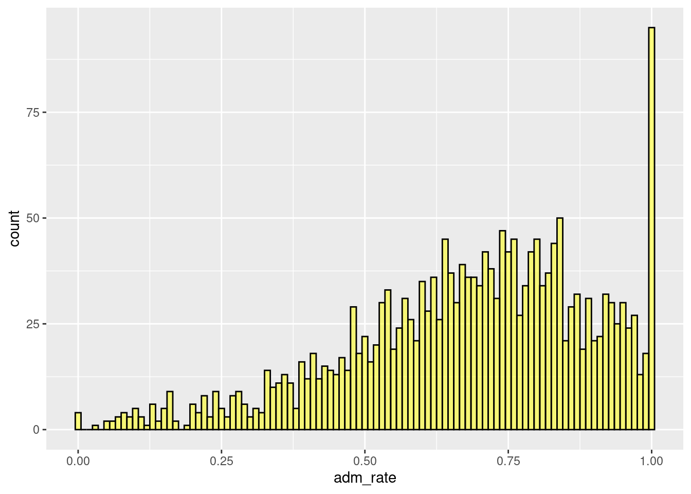
Figure 2.3: Histogram modifying the binwidth.
The code below specifies ten bins via the bins = 10 argument shown in Figure ??.
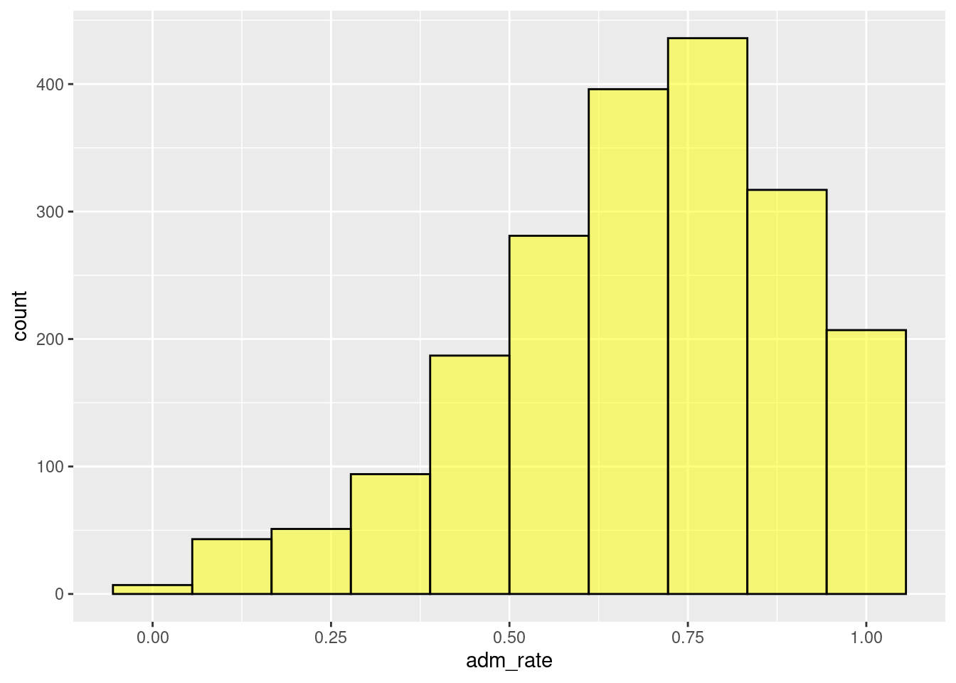
Figure 2.4: Histogram modifying the number of bins.
Our interpretation remains the same across all the binwidth or number of bin combinations, namely that most institutions admit a high proportion of applicants. However, when we used a bin width of 0.01, we could see that several institutions admit 100% of applicants. This interpretation was difficult to visualize in the other histograms we examined. As a data scientist, these institutions warrant a more nuanced examination.
2.2 Plot Customization
There are many ways to customize the plot we produced to make it more appealing. For example, the figure is more informative when changing the label on the x-axis from adm_rate to something more informative. Alternatively, adding a descriptive title to the figure can add more context. These customizations can be specified using the gf_labs() function.
2.2.1 Axes labels
To change the labels on the x- and y-axes, we can use the arguments x = and y = in the gf_labs() function. These arguments take the text for the label to add to each axis, respectively. Here, we change the text on the x-axis to “Admission Rate” and the text on the y-axis to “Frequency.” The gf_labs() function is connected to the histogram by linking the gf_histogram() and gf_labs() functions with the pipe operator (|>).5
gf_histogram(~ adm_rate, data = colleges, color = 'black', fill = 'yellow', bins = 25) |>
  gf_labs(
    x = 'Admission Rate',
    y = 'Frequency'
    )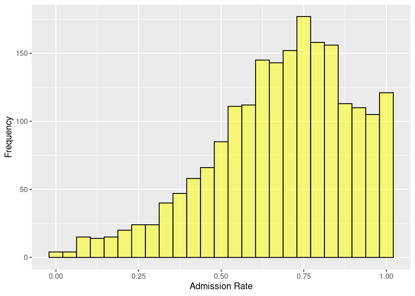
Figure 2.5: Adding custom x and y-axis labels.
2.2.2 Plot title and subtitle
We can also add a title and subtitle to our plot. Similar to changing the axis labels, these are added using gf_labs() but using the title = and subtitle = arguments.
gf_histogram(~ adm_rate, data = colleges, color = 'black', fill = 'yellow', bins = 25) |>
  gf_labs(
    x = 'Admission Rate',
    y = 'Frequency',
    title = 'Distribution of admission rates for 2,019 institutions of higher education.',
    subtitle = 'Data Source: U.S. Department of Education College Scorecard'
    )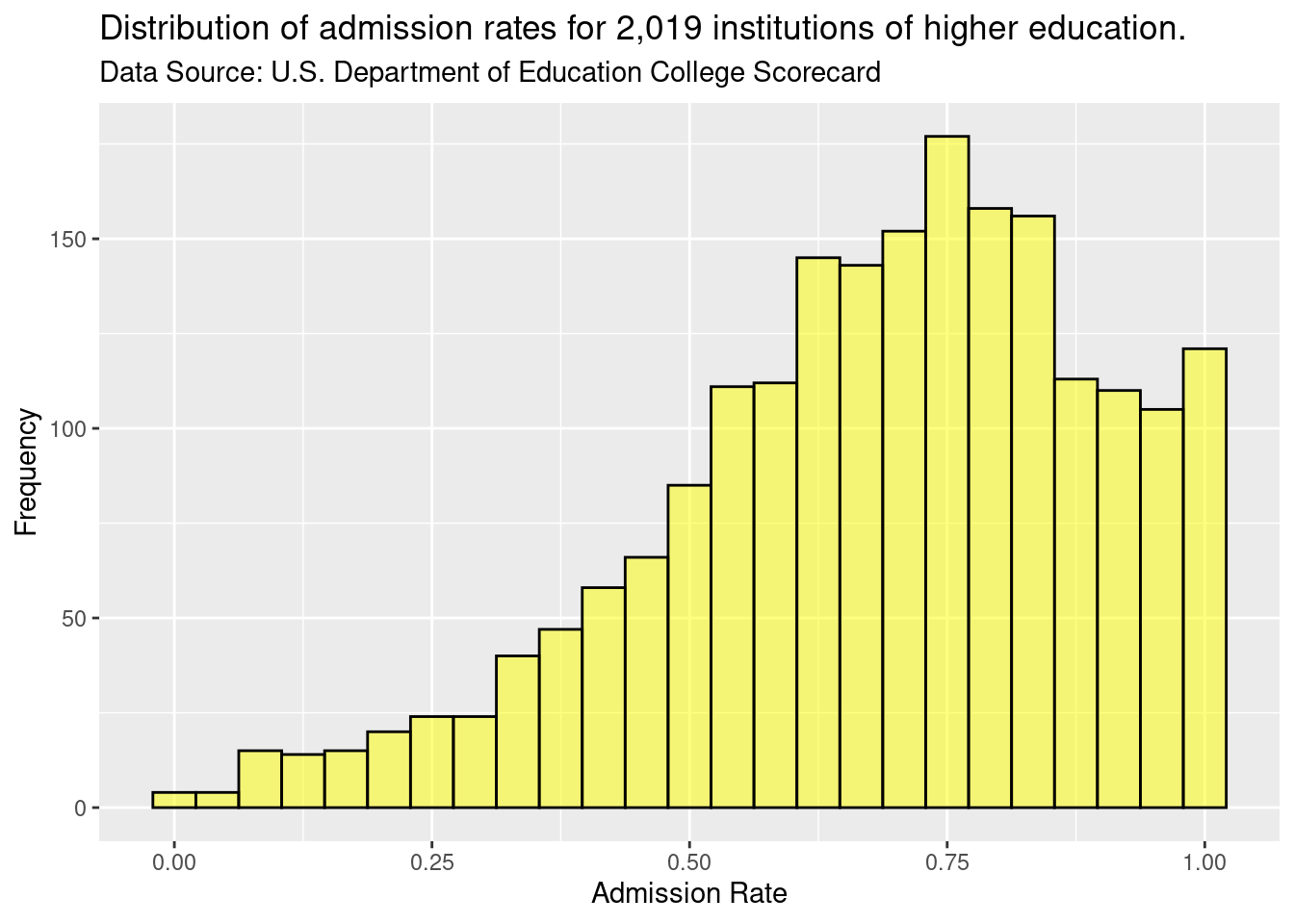
Figure 2.6: Adding plot title and subtitle.
Plot titles and subtitles are helpful to use to provide context to the figure and describe the overall purpose of the figure. For example, the subtitle in Figure 2.6 describes the source for the data plotted.
2.2.3 Plot theme
By default, the plot has a grey background and white grid lines. This can be modified by using the gf_theme() function. For example, in the syntax below, we change the plot theme to a white background with no grid lines using theme_classic(). Again, the gf_theme() is linked to the histogram with the pipe operator.
gf_histogram(~ adm_rate, data = colleges, color = 'black', fill = 'yellow', bins = 25) |>
  gf_labs(
    x = 'Admission Rate',
    y = 'Frequency',
    title = 'Distribution of admission rates for 2,019 institutions of higher education.',
    subtitle = 'Data Source: U.S. Department of Education College Scorecard'
    ) |>

gf_theme(theme_classic())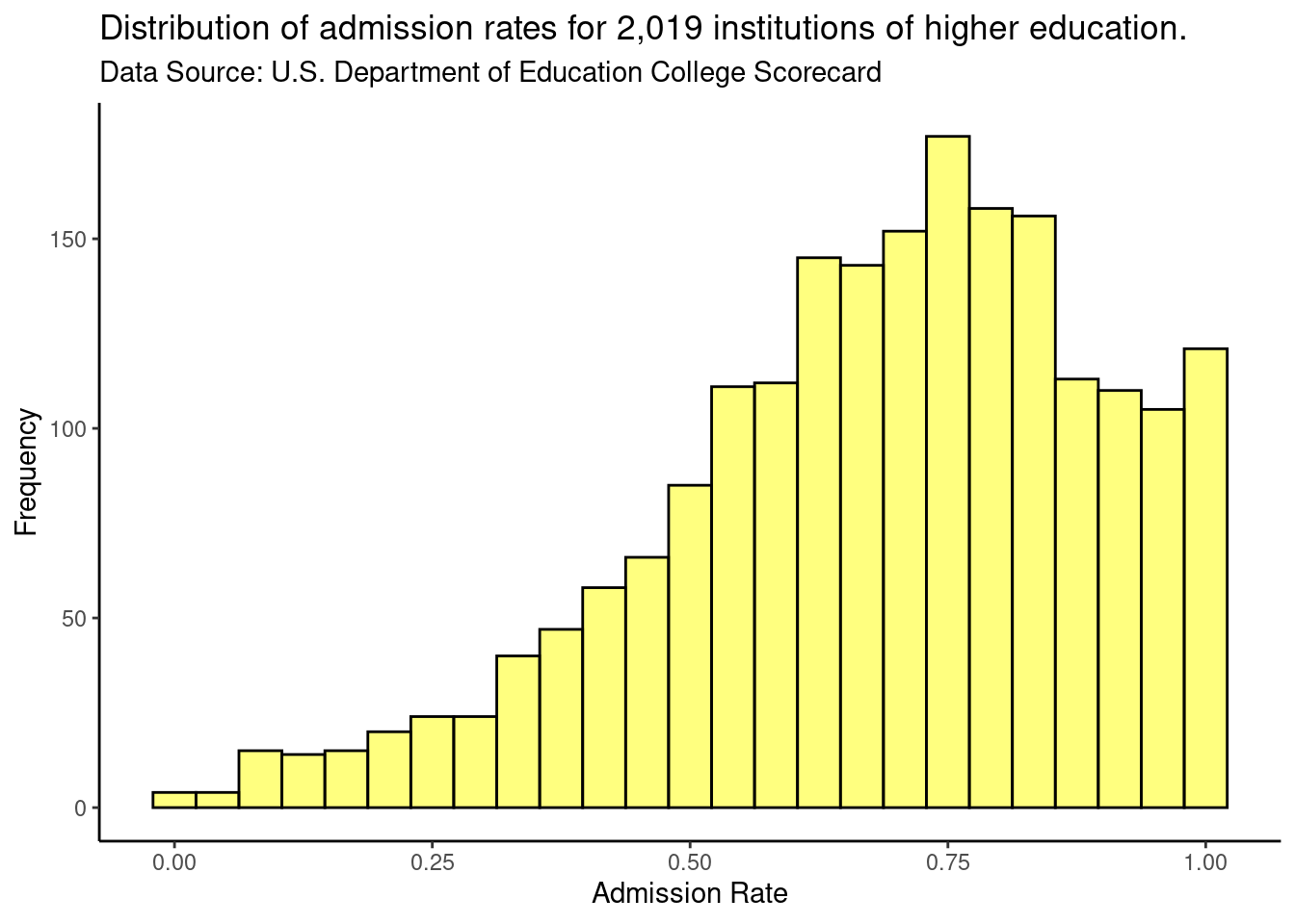
Figure 2.7: Varying figure theme.
We have created a custom theme to use in the gf_theme() function that we will use for most of the plots in the book. The theme, theme_statthinking() is included in the statthink package, a supplemental package to the text that can be installed and loaded with the following commands:
##
## Attaching package: 'statthink'
## The following object is masked _by_ '.GlobalEnv':
##
## collegesWe can then similarly change the theme to how we changed the theme before.
gf_histogram(~ adm_rate, data = colleges, color = 'black', bins = 25) |>
  gf_labs(
    x = 'Admission Rate',
    y = 'Frequency',
    title = 'Distribution of admission rates for 2,000 institutions of higher education.',
    subtitle = 'Data Source: U.S. Department of Education College Scorecard'
    ) |>

gf_theme(theme_statthinking())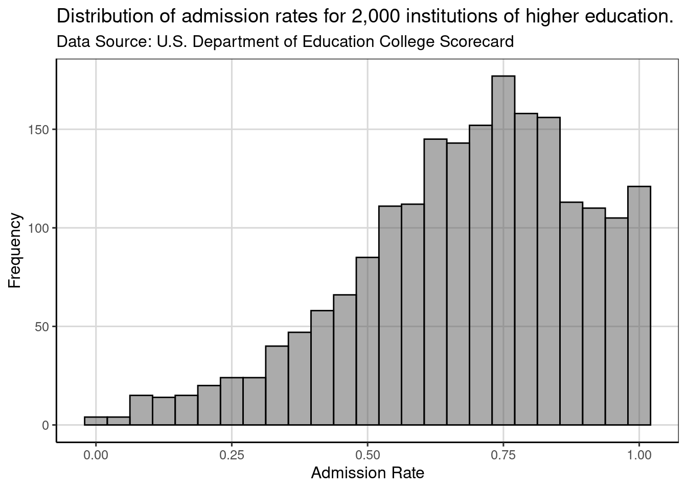
Figure 2.8: Histogram showing distribution of admission rates for institutions of higher education.
2.2.3.1 Setting the default plot theme
Since we will use this theme for all of our plots, making it the default theme (rather than the grey background with white gridlines) is useful. To set a different theme as the default, we will use the theme_set() function and specify the
theme_statthinking() theme as the argument within this function.
When we create a plot, it will automatically use the statthinking theme without specifying this in the gf_theme() function. Often, the plot theme would be one of the first lines of code for any analysis so that all the figures created in subsequent areas would all have a similar theme/style.
In the code chunk above, the size of the text is increased to make it easier to read throughout the book. Increasing the font size was done with the base_size = argument, where the font size was specified as size 14.
Figure 2.9 shows that the theme is now applied automatically without needing to use the gf_theme() function to specify. In addition, the font size is increased as well compared to previous figures created in this chapter.
gf_histogram(~ adm_rate, data = colleges, color = 'black', bins = 25) |>
  gf_labs(
    x = 'Admission Rate',
    y = 'Frequency',
    title = 'Distribution of admission rates for 2,000 institutions of higher education.',
    subtitle = 'Data Source: U.S. Department of Education College Scorecard'
    )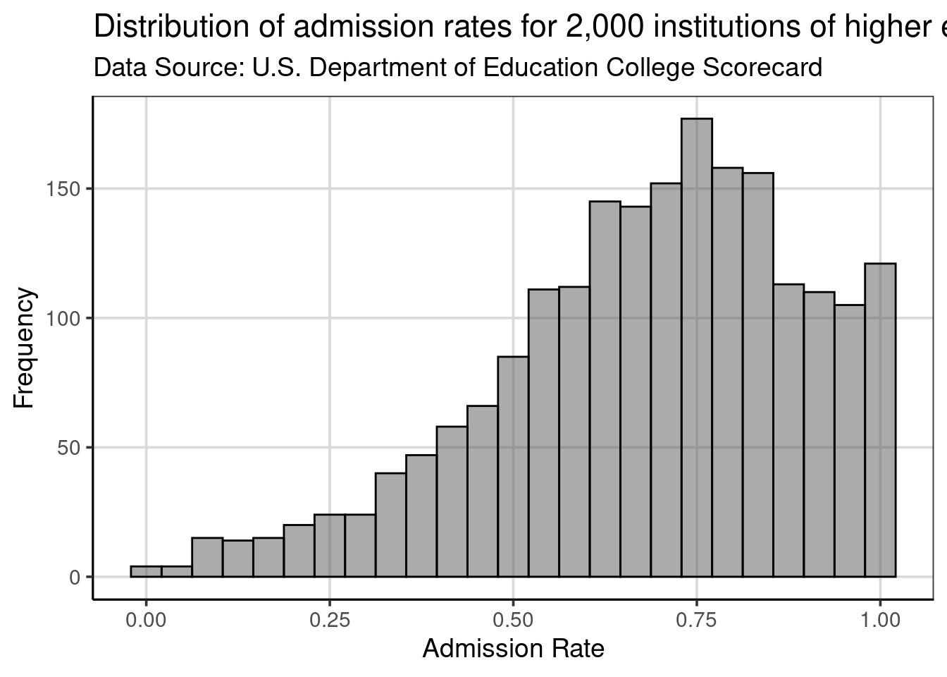
Figure 2.9: Histogram showing the distribution of admission rates for institutions of higher education.
2.3 Density plots
Another plot that is useful for exploring attributes is the density plot. This plot usually highlights similar distributional features as the histogram, but the visualization does not have the same dependency on the specification of bins. Density plots can be created with the gf_density() function, which takes similar arguments as gf_histogram(), namely a formula identifying the attribute to be plotted and the data object.6 Comparing the code specified for the first histogram, notice that only the function name changed.
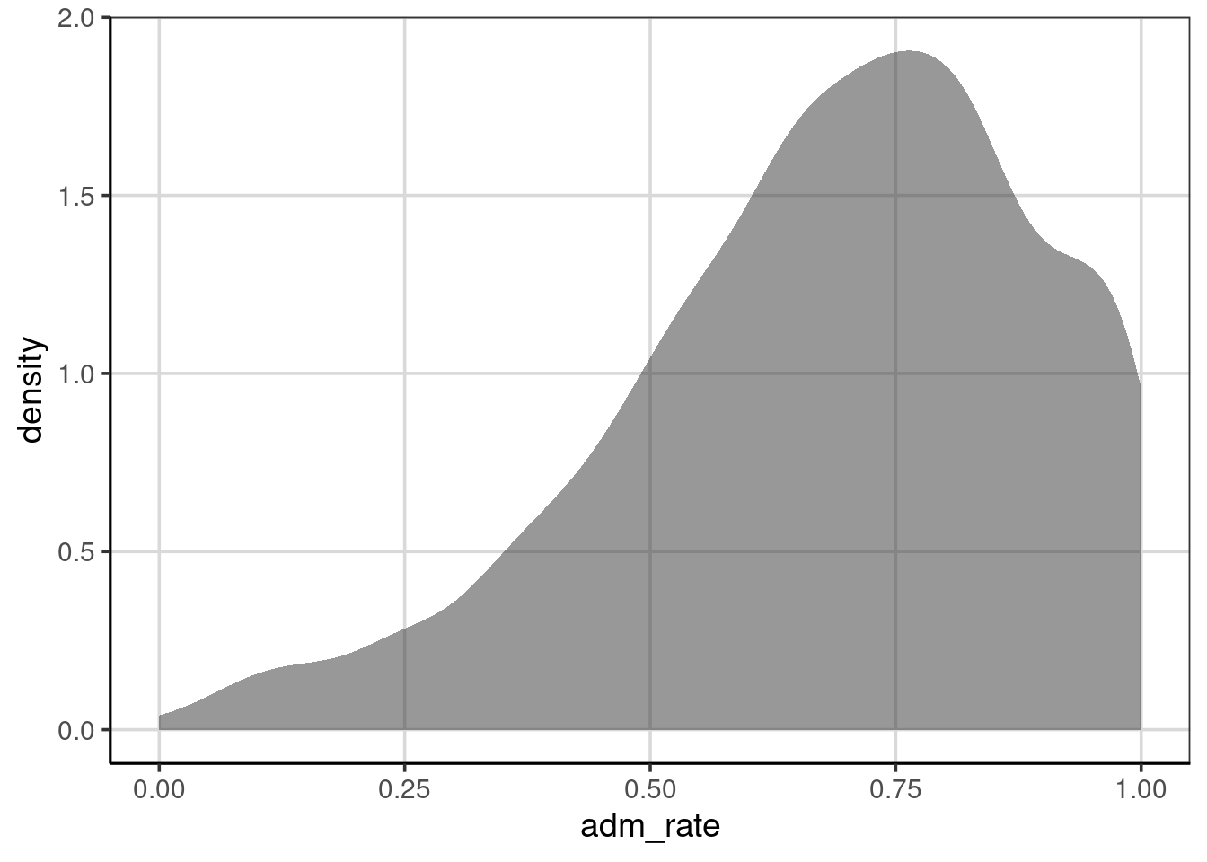
Figure 2.10: Density curve of admission rates for institutions of higher education.
2.3.1 Interpreting Density Plots
Density plots are interpreted similarly to a histogram in that areas of the density curve that are higher indicate more data in those areas of the attribute of interest. Places where the density curve is lower, indicate areas where data occur infrequently for the attribute of interest. The density metric on the y-axis differs from the histogram, but the relative magnitude can be interpreted similarly. That is, higher indicates more data in that region of the attribute.
Like the histogram, the attribute depicted in the density curve is on the x-axis. Therefore, important features for the attribute of interest can be found by looking at the y-axis, but then the place where high or low prevalence occurs is depicted by looking back to the x-axis. For example, when looking at the density curve in Figure 2.11, the density curve has a peak on the y-axis density scale of just under 2.0. The peak of this density curve occurs around 0.75, as shown on the x-axis.
Our interpretation remains that most institutions admit a high proportion of applicants. Colleges that admit around 75% of their applicants have the highest probability density, indicating this is where most of the institutions are found in the distribution. Additionally, there are just a few institutions that have an admission rate of 25% or less.
The axis labels, title, and subtitle can be customized with gf_labs() in the same manner as with the histogram. The color = and fill = arguments in gf_density() will color the density curve and area under the density curve, respectively.
gf_density(~ adm_rate, data = colleges, color = 'black', fill = 'yellow') |>
  gf_labs(
    x = 'Admission Rate',
    y = 'Probability density',
    title = 'Distribution of admission rates for 2,019 institutions of higher education.',
    subtitle = 'Data Source: U.S. Department of Education College Scorecard'
    )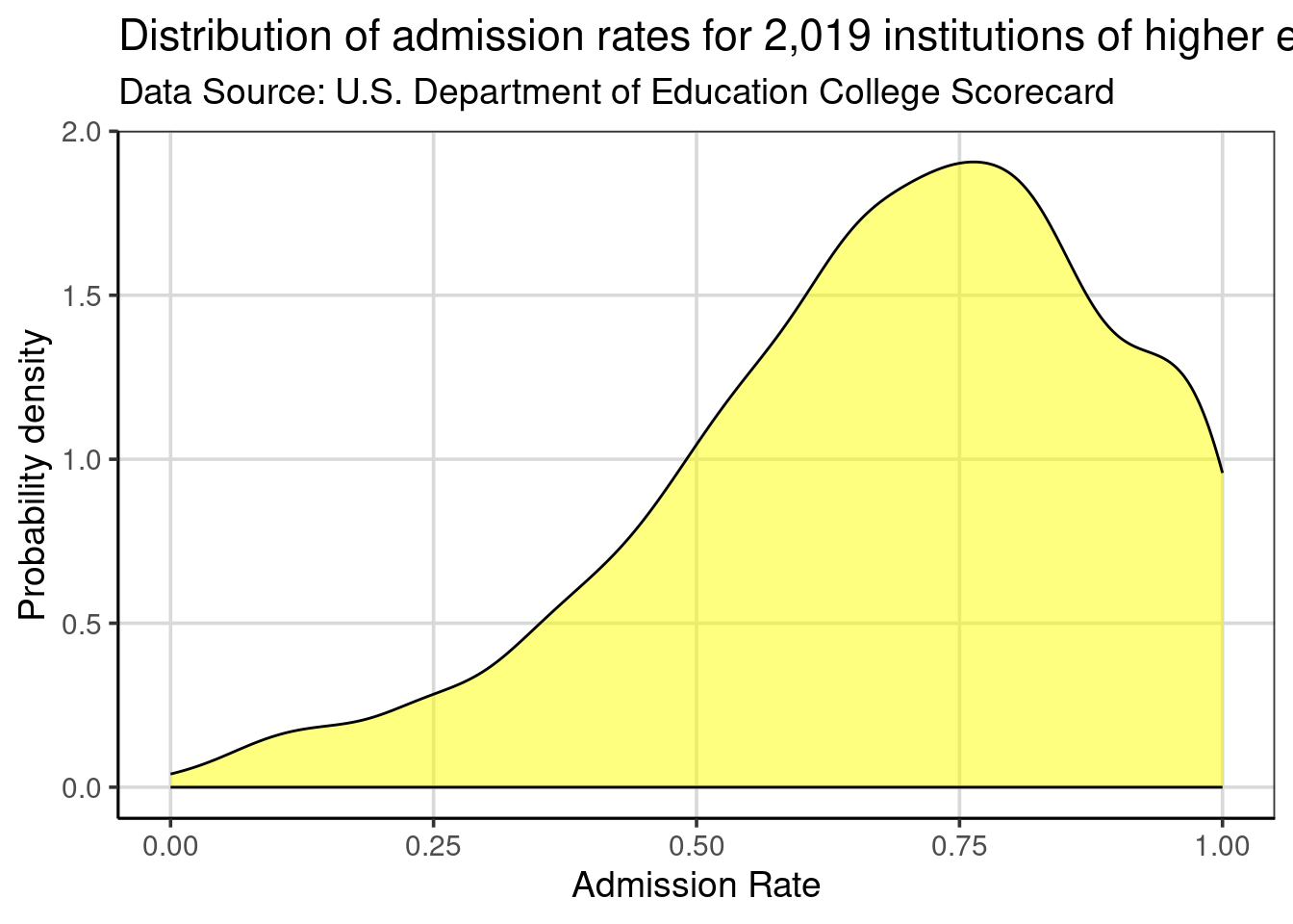
Figure 2.11: Density curve showing the distribution of admission rates for institutions of higher education.
Clause Wilke has a great book on the Fundamentals of Data Visualization, and Kieran Healy has another great book data visualization called Data Visualization: A practical introduction. Both of these books are also freely available online, with print versions available.↩︎
This function is a part of the tidyverse package, so you need to be sure to run
library(tidyverse)prior to usingread_csv().↩︎R knows the names of 657 colors. Type
colors()at the command prompt to see these names.↩︎The pipe operator,
|>,can be read as “then” and the code processes in the order written. For example, the histogram is first created, then (|>%), and the labels for the x- and y- axes are changed.↩︎The default kernel used in
gf_density()is the Normal kernel. This can be changed if desired, but the default works well in many situations.↩︎