Chapter 4 Multivariate Visualization
library(tidyverse)
library(ggformula)
library(statthink)

# Add plot theme
theme_set(theme_statthinking(base_size = 14))
Real world data are more complex than exploring a distribution of a single variable, particularly when trying to understand individual variation. In most cases, attributes interact with one another and move in tandem, and many phenomena help to explain the attribute of interest. For example, when thinking about admission rates of higher education institutions, what are some important attributes that explain why higher education institutions differ in their admission rates? When considering the high temperature for the given day, what attributes would be helpful to understand why the high temperature on a day is different? Take a few minutes to brainstorm some ideas.
Building off the high-temperature example, we will use weather data from two seasons of cooler months of the year, October through April of 2018-2019 and 2019-2020, of various locations around the United States. This data was downloaded from the National Centers for Environmental Information (NCEI) Climate Data Online portal and is part of the companion package, statthink. The locations extracted in these data are found in the northern part of the United States and include: c(“Buffalo, NY”, “Iowa City, IA”, “Chicago, IL”, “Boston, MA”, “Portland, ME”, “Minneapolis, MN”, “Duluth, MN”, “Detroit, MI”). The first few rows of the data are shown below.
4.1 Multivariate Distributions
Before moving to multivariate distributions, first, we will explore a univariate distribution of the average daily temperature. The average daily temperature takes the recorded temperatures from a single day and averages those. Therefore, this value would fall somewhere between the high and low temperature for the day. What are some key characteristics of the average daily temperature distribution? Take a few minutes to summarize the key characteristics.
gf_histogram(~ drybulbtemp_avg, data = us_weather, bins = 30) |>
  gf_labs(x = "Average daily temperature, in Fahrenheit",
          title = "Univariate distribution of avg daily temperature")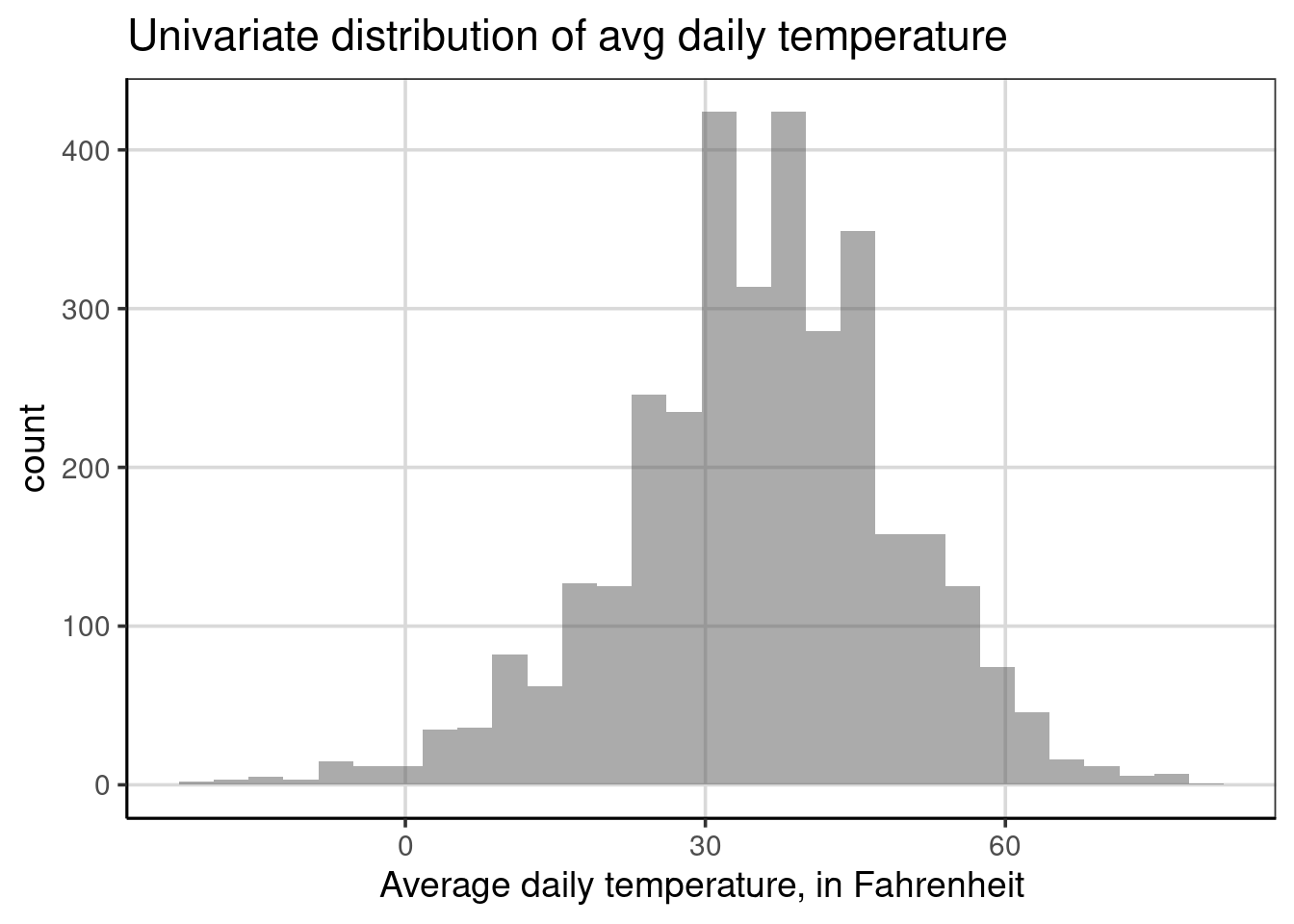
From the univariate figure of the average daily temperature, notice variations in these values, with a fairly wide range considering the values. For example, some average daily temperatures are below zero, and some of 60 degrees Fahrenheit. However, most values are between 20 and 45 or so, which is reasonable given that these are cooler months of the year and primarily northern locations in the United States. Finally, the distribution is unimodal and somewhat symmetric, not skewed enough to be too concerned.
Earlier, we asked what other attributes may help to explain variation in high temperatures. Take a minute to think about this question now. What attributes could help to understand why the average daily temperature has such a wide range of values?
Many answers could be informative to this discussion. We will first explore whether it snowed on a given day, which could influence the average temperature for a few reasons. First, when it snows, it must be cold enough for the precipitation to stay in frozen form rather than melting as it falls being at or below freezing (32 degrees Fahrenheit) 15; also if it snowed during the day it would be less likely for the sun to be out further making the temperature less variable and likely lower during the winter months.
4.1.1 Histograms
Below is the multivariate distribution of the average daily temperature by whether it snowed or not at some point during that day. Whether it snowed or not is depicted by color in the figure; the blue color shows the distribution of average daily temperature for days where it snowed, and red is otherwise. Before we interpret the figure in more detail, the code for making this change was done by adding the snow attribute to the fill aesthetic using the formula syntax: fill = ~ snow. The fill aesthetic tells the histogram bars to be colored by the different categories of the attribute of interest, here snow. The fill attribute for histograms is best used when the attribute only has a few categories.
gf_histogram(~ drybulbtemp_avg, data = us_weather, bins = 30,
             fill = ~ snow) |>
  gf_labs(x = "Average daily temperature, in Fahrenheit",
          title = "Multivariate distribution of avg daily temperature by whether it snowed",
          fill = "Snow?")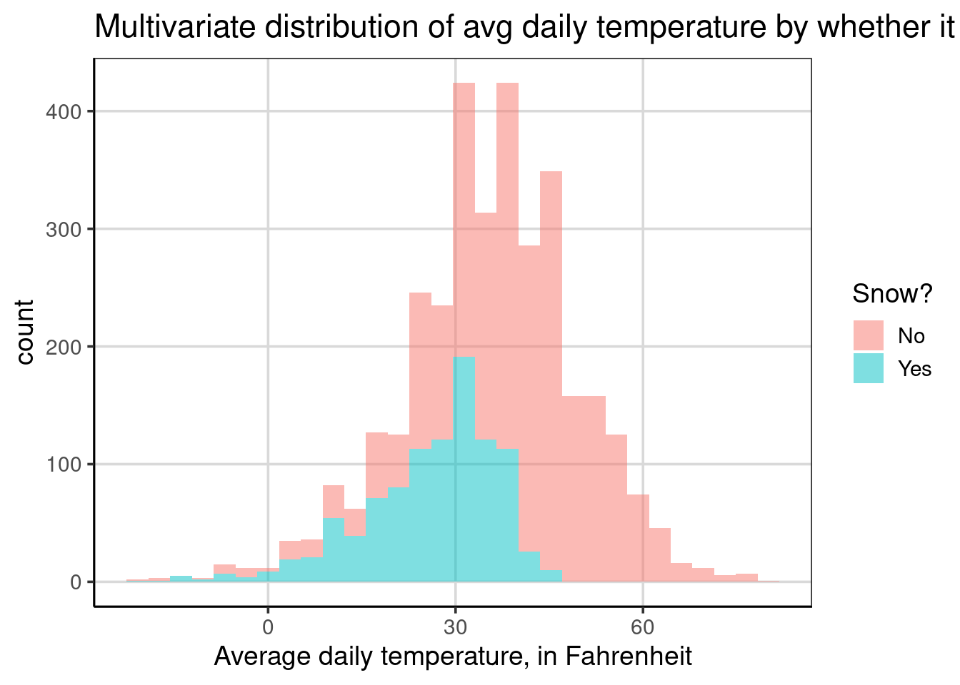
Suppose we compared the distribution for the average daily temperature for days when it snowed to when it did not snow. What similarities and differences do you notice? Please take a few minutes to try and interpret this figure, focusing on similar or different characteristics across days when it snowed or not.
Notice that the bars are higher for the days that did not snow than those that did snow. Why might this be occurring? This likely happens due to snow occurring less often. The bars are higher for days when it did not snow due to more data (i.e., days) where it did not snow. This characteristic of the histogram in this example makes the histogram more difficult to interpret and can even be misleading when comparing the two groups. We will explore a solution to this problem soon.
Another observation you may have noticed is that the temperature is lower for days when it snows compared to when it does not snow. On average, if we estimated the location of the mean for the two groups, the average daily temperature for days where it snowed would likely be under 30 degrees. In contrast, it would be around 45 degrees Fahrenheit for days it did not snow. You may have also noticed that the variability for days when it snowed was also lower than for days when it snowed. Why might this occur? This is likely due to the temperature ranges where snow forms readily.
You may wonder why there are days when the average daily temperature is about 45 degrees Fahrenheit when it generally needs to be lower than 32 degrees Fahrenheit for it to snow. There could be many explanations, but since the distribution shows the average daily temperature over 24 hours, the weather can change drastically. For example, it could snow at the beginning or end of the day and the rest of the day could be quite different and much warmer than when it snowed.
Finally, the distribution for days when it snowed is more left-skewed than when it did not snow. Snow readily forms when it is cooler, typically less than 32 degrees Fahrenheit, so the temperature commonly falls below this value when it snows. Therefore, the average temperature would be restricted by those colder values, pulling the average lower, even if it was warmer earlier or later in the day. This restriction is not found for days when it does not snow. Therefore, the temperatures can be found over a broader range of temperature values.
4.1.2 Density Curves
Often, density plots are easier to visualize when there is more than one group. The other benefit of moving to a density plot is that any sample size differences across the groups are normalized automatically, which does not occur by default with the histogram. To start, we will explore the average daily temperature based on whether it snowed that day or not. We will use almost the same code as the multivariate histogram for the first density curve. The only change in the code is to use gf_density() instead of gf_histogram(). Take a few minutes to summarize important differences in this figure compared to the multivariate histogram.
gf_density(~ drybulbtemp_avg, data = us_weather, size = 1,
             fill = ~ snow) |>
  gf_labs(x = "Average daily temperature, in Fahrenheit",
          title = "Multivariate distribution of avg daily temperature by whether it snowed",
          fill = "Snow?")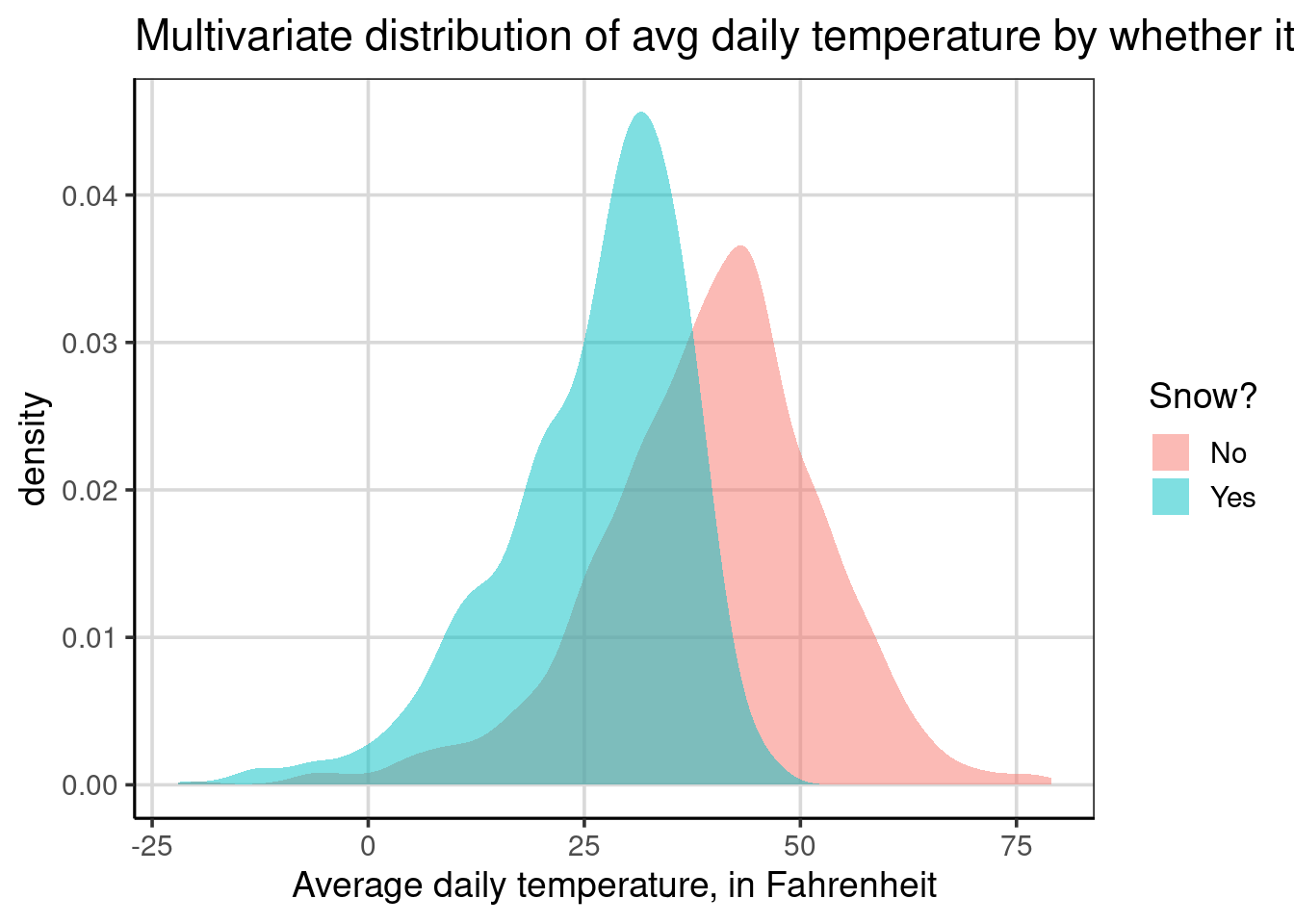
Notice that there are two density curves, each shaded a different color: light blue for days it snowed and light red for days without snow. One primary difference between the density and histogram is that the curves are normalized for sample size differences. Therefore, differences in heights for the two density curves can be interpreted as there is more data at that location. For example, the curve for days it snowed has a higher peak, around 30 degrees Fahrenheit, compared to the peak for days it did not snow, around 45 degrees. The higher peak here means there is more data clustered around 30 degrees for the snowy days compared to the amount of data clustered around 45 degrees for the days it did not snow.
Normalizing sample size across the groups helps accentuate the key differences. Namely, the two groups have differences in the center and amount of variation. When plotting two groups with a histogram, the groups are plotted over each other, which can further mask differences in the group plotted first. As depicted above, the density curve with some transparency is fine with these problems.
There is another plotting aesthetic that is useful to know about when using density curves. This is the color aesthetic, which changes the colors of the line of the density curve. Similar to the fill aesthetic, it is possible to have the lines change color based on the snow attribute as such: color = ~ snow. The code below does this and also makes the lines slightly larger to view easier with the size = 1 global aesthetic.
gf_density(~ drybulbtemp_avg, data = us_weather,
             color = ~ snow, size = 1) |>
  gf_labs(x = "Average daily temperature, in Fahrenheit",
          title = "Multivariate distribution of avg daily temperature by whether it snowed",
          color = "Snow?")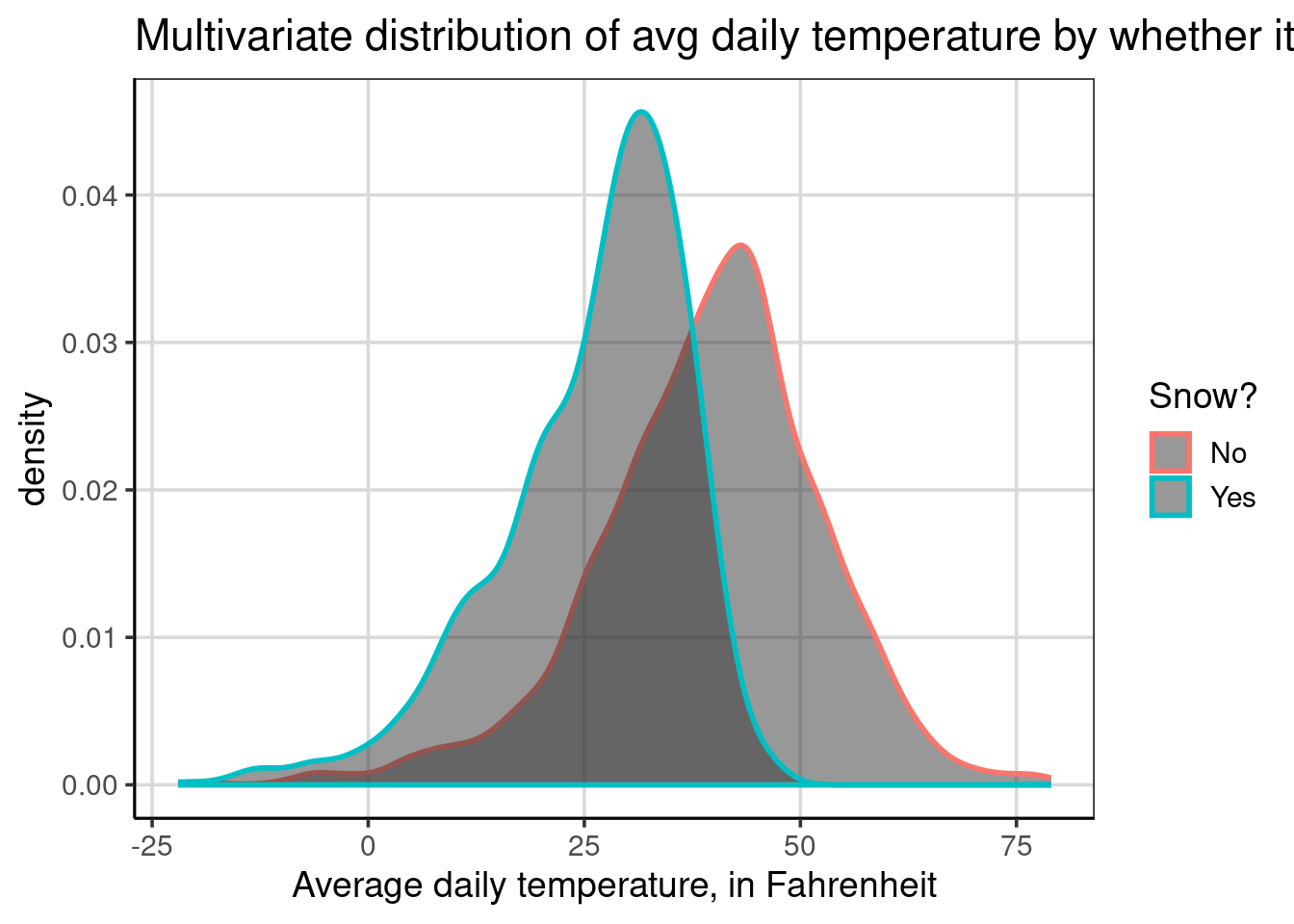
Without specifying the fill aesthetic, both groups have the same fill color below the lines but notice that now the lines are colored instead of the entire curve being filled in. Areas that are darker gray are areas where the two groups overlap. The rest of the density curves are the same, besides the appearance differences.
Combining the color and fill aesthetics is also possible, even with the same attribute. For example, the code below uses the snow attribute for both the color and fill aesthetics. The primary difference here is that the lines are slightly larger than the first density figure shown.
gf_density(~ drybulbtemp_avg, data = us_weather,
           color = ~ snow, size = 1,
           fill = ~ snow) |>
  gf_labs(x = "Average daily temperature, in Fahrenheit",
          title = "Multivariate distribution of avg daily temperature by whether it snowed",
          fill = "Snow?",
          color = "Snow?")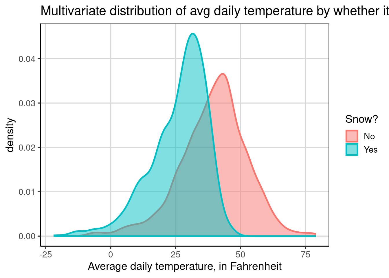
It is also possible to use both aesthetics but set one to be constant rather than adding the attribute. When there are many groups, this can be an excellent way to visualize more groups and not have too much color happening. In the code below, the snow attribute is specified to the color aesthetic, but now the fill aesthetic is set to a specific color, this time a shade of gray—the grayscale ranges from 0 to 100, where 0 is black, and 100 is white. Therefore, when setting fill = 'gray75' in this case, this would be a lighter gray as the number is closer to 100.
gf_density(~ drybulbtemp_avg, data = us_weather,
           color = ~ snow, size = 1,
           fill = 'gray75') |>
  gf_labs(x = "Average daily temperature, in Fahrenheit",
          title = "Multivariate distribution of avg daily temperature by whether it snowed",
          color = "Snow?")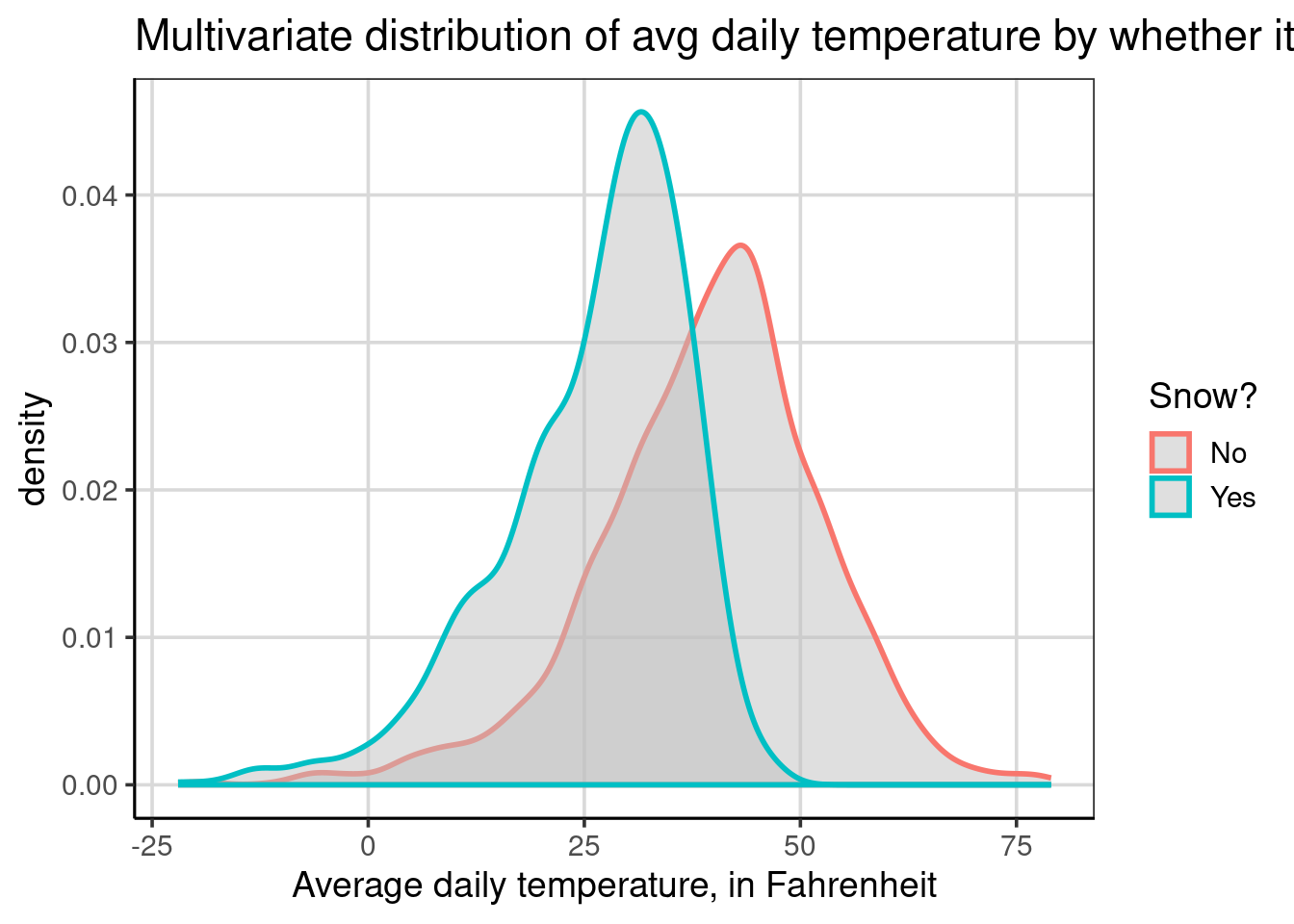
This results in a figure that is lighter than the default gray color used in density plots. This lighter gray makes it easier to see the density curves that are plotted behind. When there are more than two groups, this can be an important consideration to take into account to ensure the visualization is easier to interpret. Take the example below: instead of showing whether it snowed, it shows the different locations.
gf_density(~ drybulbtemp_avg, data = us_weather,
           color = ~ location, size = 1,
           fill = 'gray85') |>
  gf_labs(x = "Average daily temperature, in Fahrenheit",
          color = "")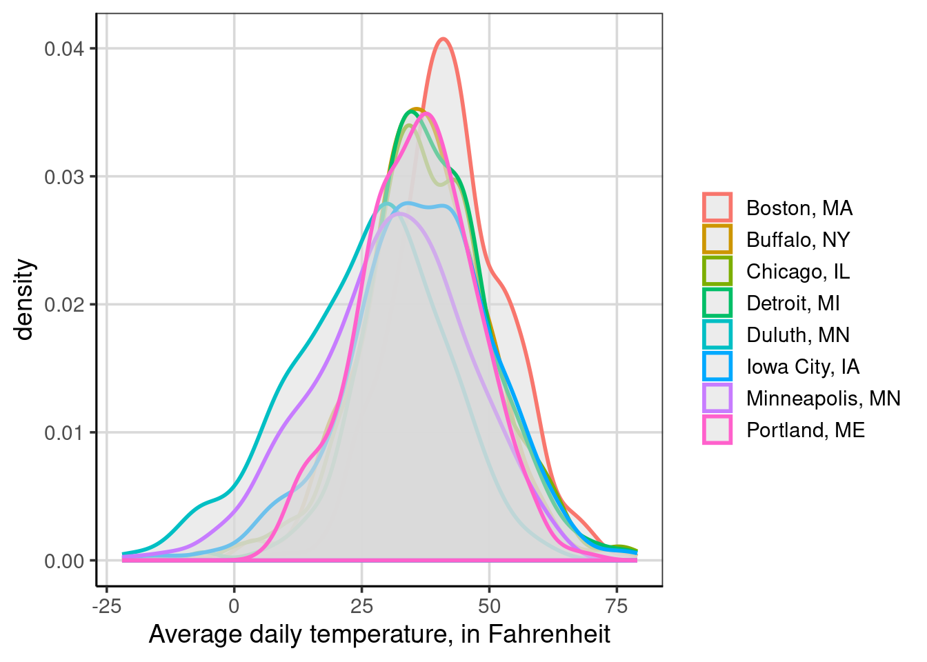
Figure 4.1: Multivariate distribution of avg daily temperature by whether it snowed
In this figure, the grayscale was also changed from 75 to 85, but it is still difficult to view all the locations. This is made more difficult here because the locations have similar distributional centers. The following section will show an alternative visualization that can help when density curves are challenging to interpret.
4.1.3 Violin Plots
Violin plots are another way to make comparisons of distributions across groups. Violin plots are also easier to interpret when there are more than two groups on a single graph. Violin plots are density plots that are mirrored to be fully enclosed. Procedurally, the density curve that was shown above is mirrored or flipped across the x-axis. Let us explore an example that creates a violin plot with the gf_violin() function and a two-sided formula, drybulbtemp_avg ~ snow which will visualize the average daily temperature by whether it has snowed or not.
gf_violin(drybulbtemp_avg ~ snow, data = us_weather) |>
  gf_labs(y = "Average daily temperature, in Fahrenheit",
          title = 'Multivariate distribution of avg daily temperature by whether it snowed',
          x = "Snow?")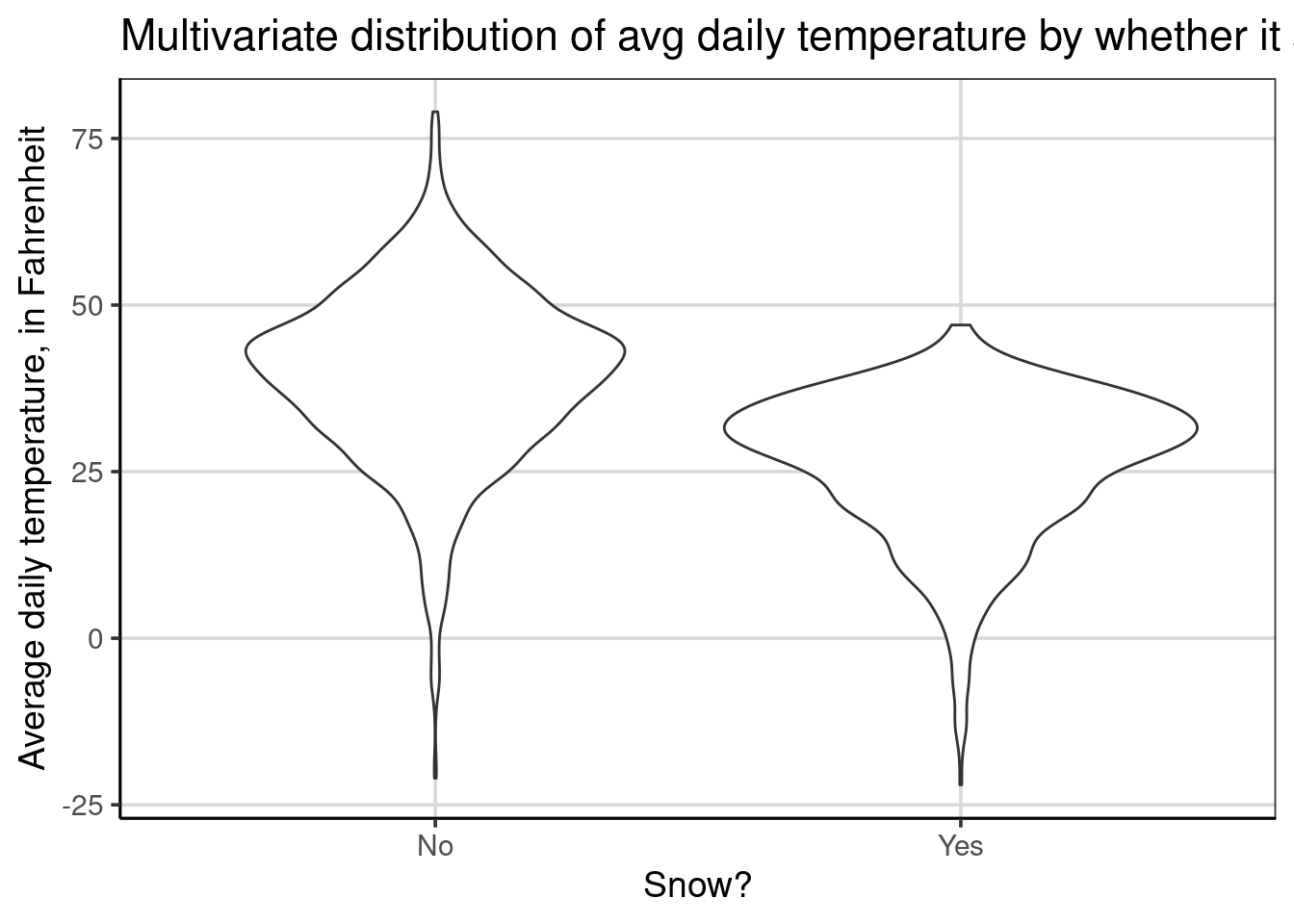
By default, the violin plots are oriented vertically, where the temperature is on the y-axis and whether it snowed or not is on the x-axis. This is the opposite of our use of histograms and density curves. Fortunately, we can change this behavior by adding a single line of code, gf_refine(coord_flip()). This command flips the x- and y- axes to place the average daily temperature on the x-axis. Throughout the rest of the book, any violin plots shown will have the default axes flipped for consistency with the histograms and density plots.
gf_violin(drybulbtemp_avg ~ snow, data = us_weather) |>
  gf_labs(y = "Average daily temperature, in Fahrenheit",
          title = 'Multivariate distribution of avg daily temperature by whether it snowed',
          x = "Snow?") |>
  gf_refine(coord_flip())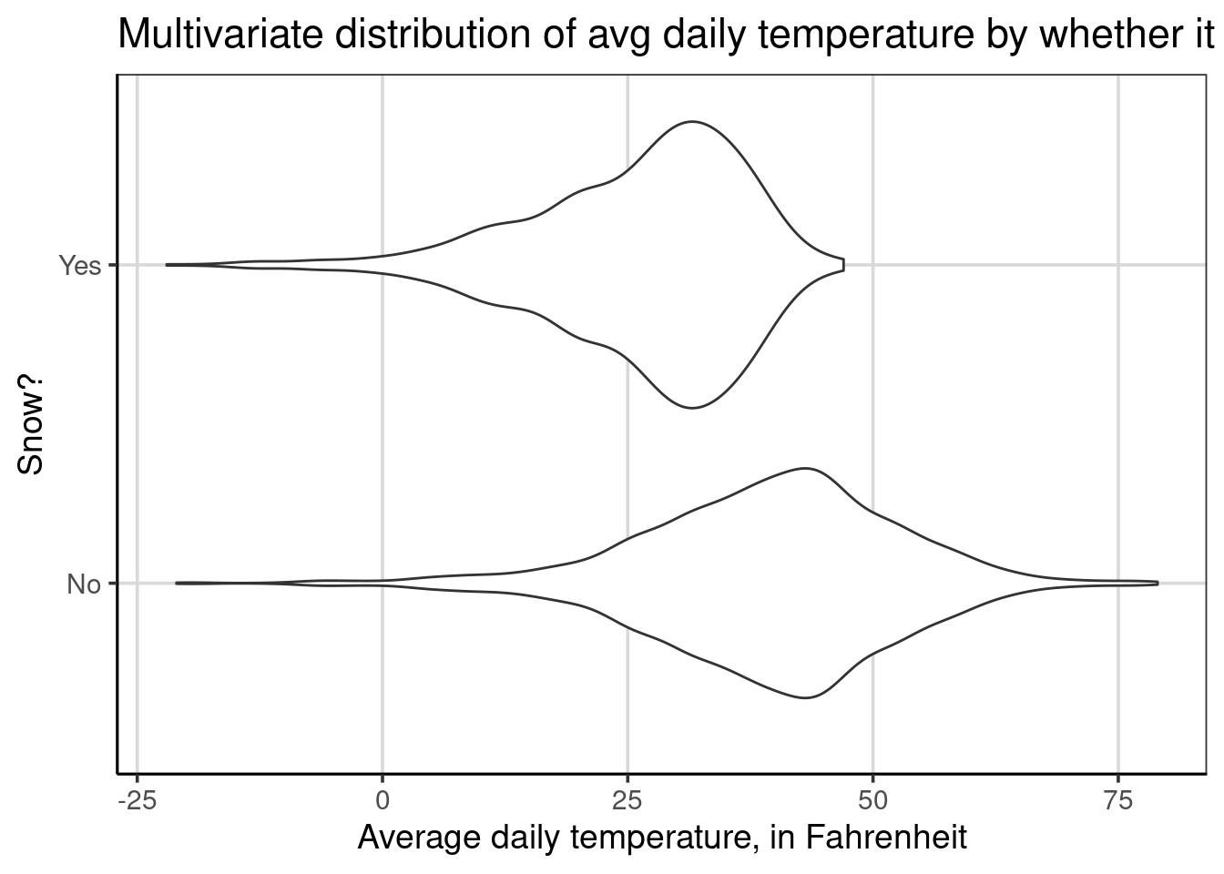
Violin plots are depicted for each group separately. This means there will be the same number of violin plots as the number of groups in the attribute on the right-hand side of the equation specified inside gf_violin(). In the example above, there is a violin plot for days it snowed and a second one for days it did not snow and these violin plots are shown separately and never stacked on top of one another. This feature enables these figures to handle larger groups more efficiently than the density or histograms.
From the figure, similar findings discussed earlier can be articulated. For example, there is a higher center and more variation on days it did not snow. There is also evidence that the distribution for days that did snow is left-skewed, whereas the distribution for days without snow is more symmetric.
Aesthetically, these figures are more pleasing if they include a light fill color. This is done similarly to the density plots shown above with the fill = argument, specified as fill = 'gray85'.
gf_violin(drybulbtemp_avg ~ snow, data = us_weather, fill = 'gray85') |>
  gf_labs(y = "Average daily temperature, in Fahrenheit",
          title = 'Multivariate distribution of avg daily temperature by whether it snowed',
          x = "Snow?") |>
  gf_refine(coord_flip())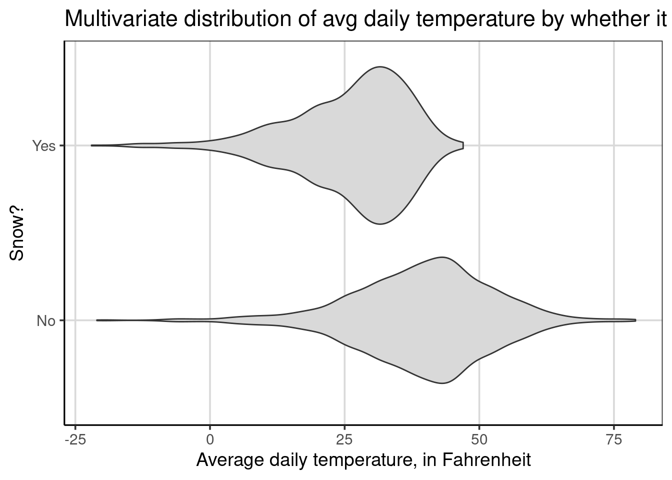
Percentiles are another helpful feature to aid in comparing groups with violin plots. These can be added with the draw_quantiles argument. In the below code, three percentiles are shown, and the 10th, 50th, and 90th percentiles are added with the code, draw_quantiles = c(0.1, 0.5, 0.9). Notice that the percentiles are represented as a proportion instead of as a percentage.
gf_violin(drybulbtemp_avg ~ snow, data = us_weather, fill = 'gray85',
          draw_quantiles = c(0.1, 0.5, 0.9)) |>
  gf_labs(y = "Average daily temperature, in Fahrenheit",
          x = "Snow?") |>
  gf_refine(coord_flip())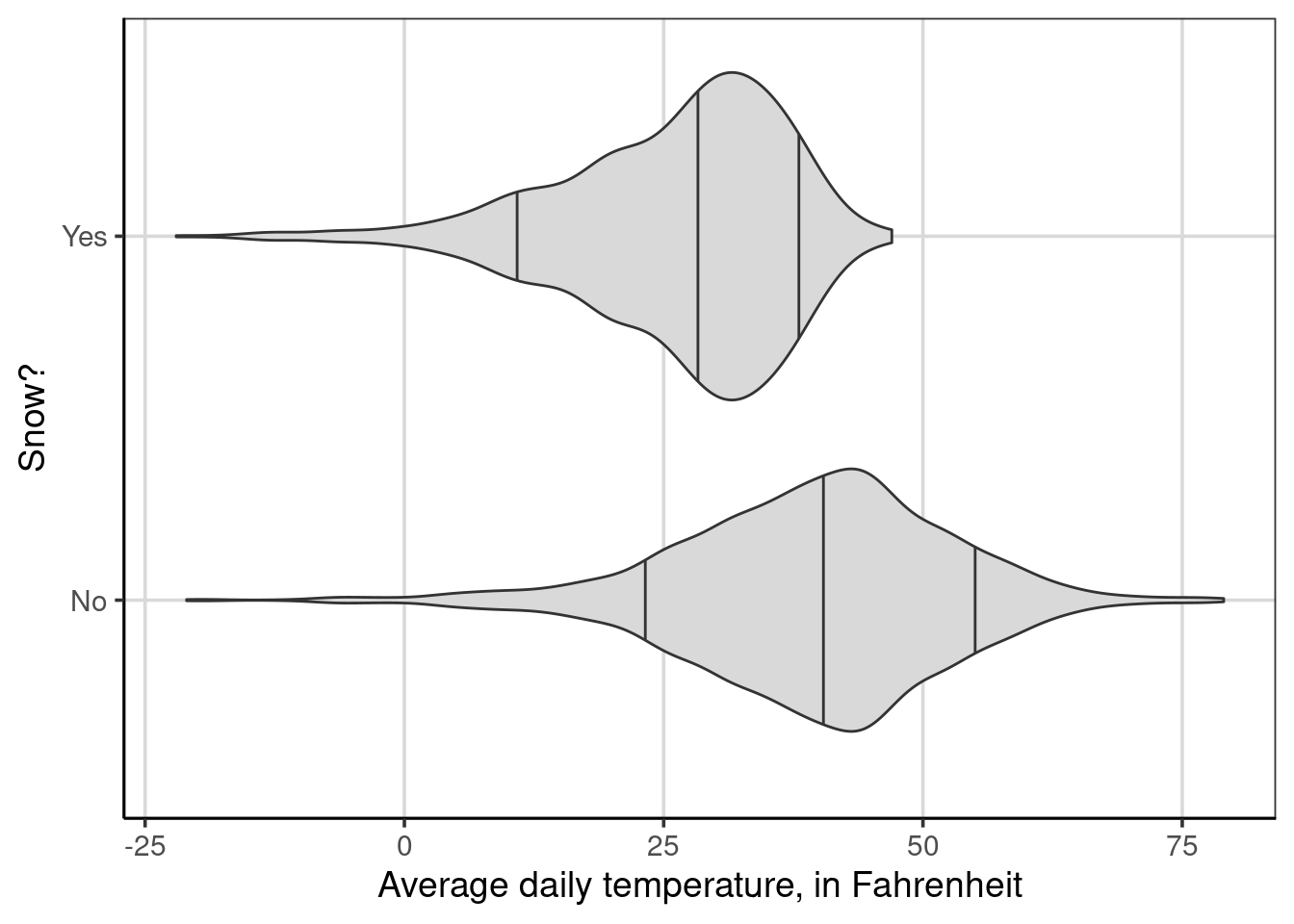
Figure 4.2: Multivariate distribution of average daily temperature by whether it snowed
When the percentiles are added, it is now easier to compare the center of the two distributions by using the middle vertical line in each violin plot which represents the 50th percentile or median. In this violin plot, the 50th percentile is lower for days it snows compared to days it does not snow. Furthermore, the 90th percentile is also lower than the 50th percentile for days that it did snow. This helps to provide evidence that days that it did snow tends to be much colder than typical days, as shown by the 50th percentile, when it did not snow.
Comparing the distance between each group’s 10th and 90th percentiles can also give a sense of the range of typical values. Although this is not the interquartile range 16, the difference between the 10th and 90th percentiles reflects a similar quantity. The 10th percentile is around 10 to 12 degrees Fahrenheit for days that it snowed, and the 90th percentile is around 37 to 40 degrees Fahrenheit. Therefore, the difference would be about 25 to 30 degrees Fahrenheit. Doing the same process for days it did not snow, the 10th percentile would be around 24 degrees Fahrenheit and the 90th percentile would be around 55 degrees Fahrenheit. The difference would then be around 31 degrees Fahrenheit. This suggests that the spread of the middle 80% of the data in each group is similar, with days in which it snowed showing some evidence of being slightly less spread out over this middle 80%.
4.1.3.1 Violin Plots with many groups
As discussed earlier, visualizing many groups can be done more efficiently using violin plots than density or histograms. This is shown below where the average daily temperature is shown for each of the 8 locations in the US weather data. The 10th, 50th, and 90th percentiles are also shown for comparison. Take a minute to compare this figure to the one with overlapping density curves in Figure 4.1.
gf_violin(drybulbtemp_avg ~ location, data = us_weather, fill = 'gray85',
          draw_quantiles = c(.1, .5, .9)) |>
  gf_labs(y = "Average daily temperature, in Fahrenheit",
          x = "Location") |>
  gf_refine(coord_flip())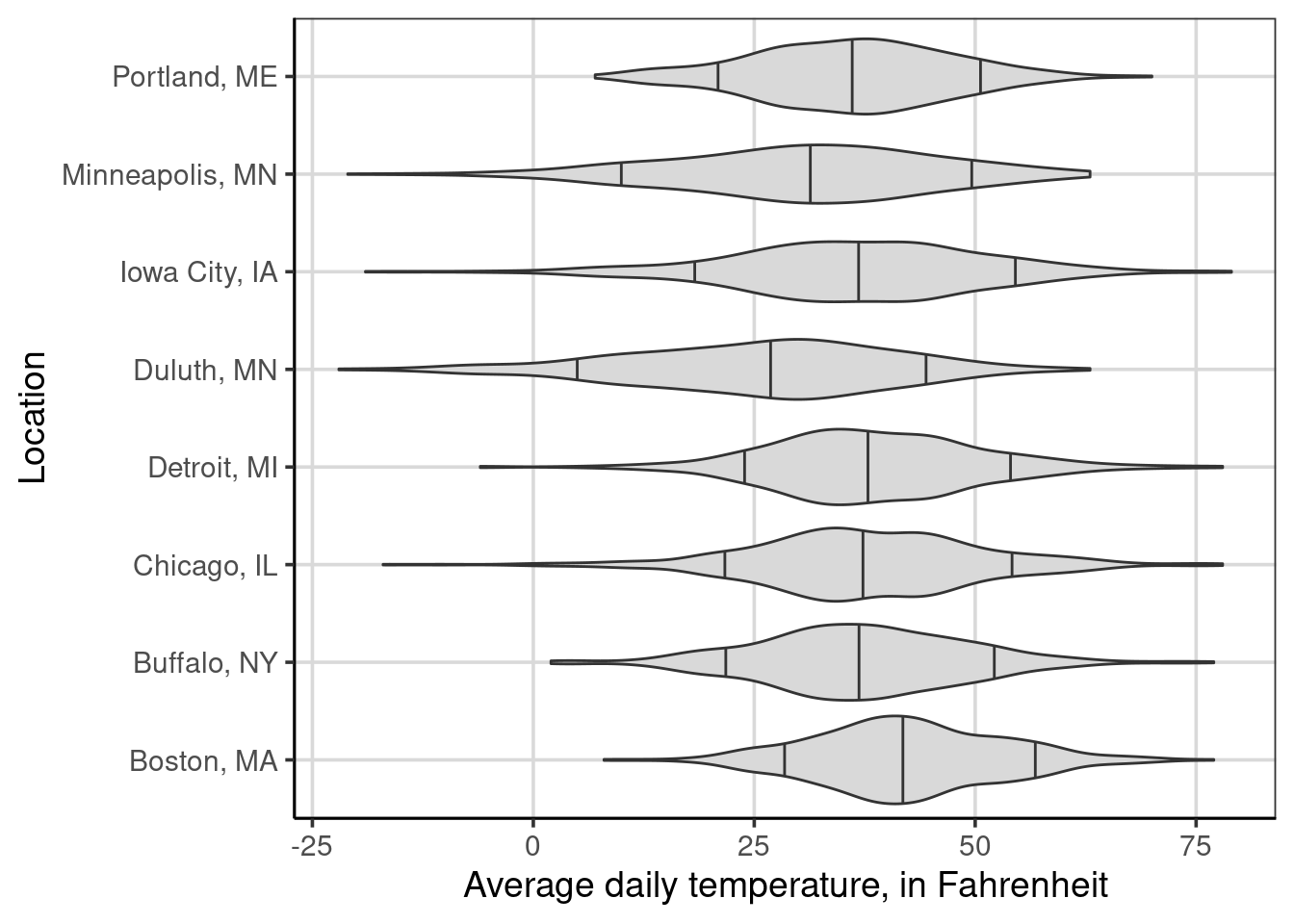
Figure 4.3: Average daily temperature by the location of weather measurement.
4.2 Faceting
Faceting is a graphical procedure to create multiple figures side by side. This is helpful when there are more than 2 attributes to explore. For example, we have explored the distribution of average daily temperature by whether it snowed or not and the location separately. There may be differences in the distribution of average daily temperatures for whether it snowed or not based on the location. This multivariate visualization now considers two attributes that may help to understand why the average daily temperature may differ.
Below is an example of adding the faceting to a violin plot. The violin plot will explore the average daily temperature by the location. This figure was explored initially in Figure 4.3. This new figure (Figure 4.4) adds one line of code to do the faceting, gf_facet_wrap(~ snow). Notice that inside the gf_facet_wrap() function, a similar formula notation used by other plotting functions is used. This function uses a one-sided formula where the attribute name is specified after the ~.
gf_violin(drybulbtemp_avg ~ location, data = us_weather, fill = 'gray85',
          draw_quantiles = c(.1, .5, .9)) |>
  gf_labs(y = "Average daily temperature, in Fahrenheit",
          x = "Location") |>
  gf_refine(coord_flip()) |>
  gf_facet_wrap(~ snow)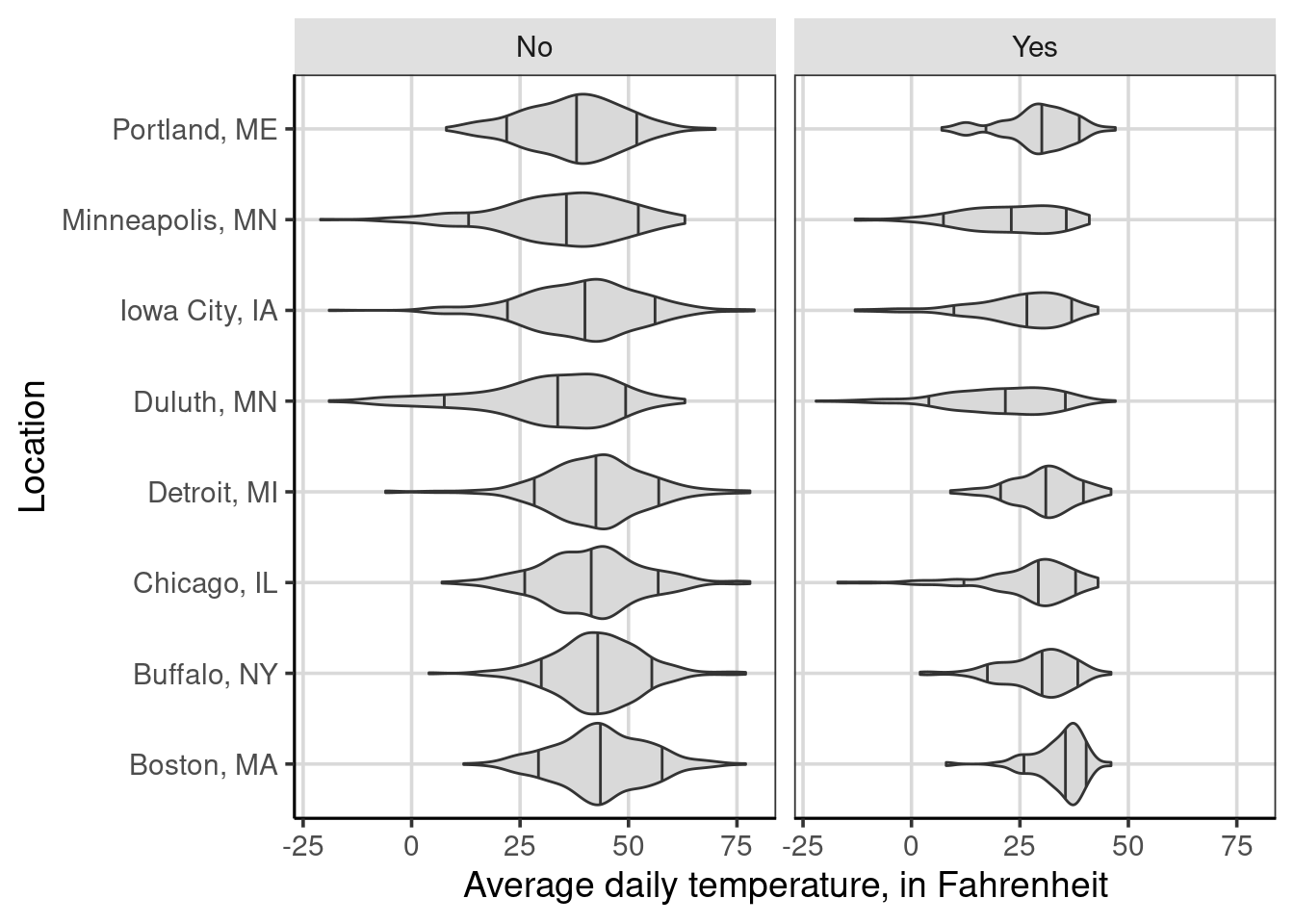
Figure 4.4: Average daily temperature by the location of weather measurement and whether it snowed on a given day.
From the figure, the primary difference between Figure 4.3 is the creation of two side-by-side plots, one representing observations when it did not snow (left-side plot) and the other representing observations when it did snow that day (right-side plot). If the two figures were combined, the same figure as in Figure 4.3 happens. The faceting is splitting the observations based on this new attribute. Therefore, each panel of the figure has less data than the overall that did not split the figure by whether it snowed.
A few differences are shown in the figure, primarily related to variation differences. For instance, the variation of average daily temperatures is much smaller for Detroit when it snows than when it does not. These variation differences are less pronounced for a city like Duluth or Minneapolis. Similar to previous discussions, there are not large differences in average daily temperature across the locations.
In contrast, one instance that may have a more impact than location would be the month of the year. Below is a faceted figure that adds the month of the year instead of the location.
gf_violin(drybulbtemp_avg ~ month, data = us_weather, fill = 'gray85',
          draw_quantiles = c(.1, .5, .9)) |>
  gf_labs(y = "Average daily temperature, in Fahrenheit",
          x = "Month") |>
  gf_refine(coord_flip()) |>
  gf_facet_wrap(~ snow)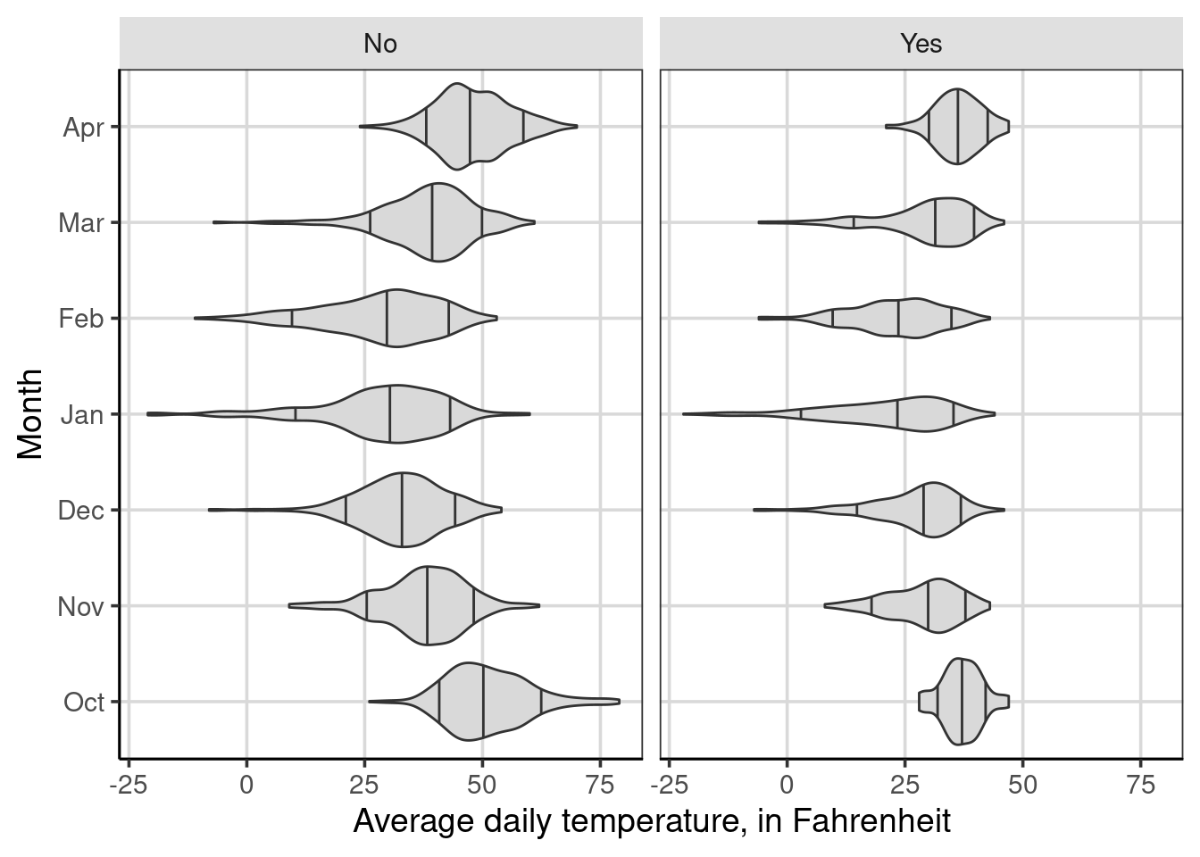
Figure 4.5: Average daily temperature by the month of weather measurement and whether it snowed on a given day.
4.3 Multivariate Descriptive Statistics
We have spent much time researching other attributes that may be important in explaining variation in our attribute of interest. We started this chapter by exploring visually other attributes that help to understand or explain variation in the primary outcome. For example, we visually explored attributes that may help us understand why average daily temperatures may differ. If it snows on a given day, the month has an impact, but the location does not seem to have as large of an effect.
In this section, we will revisit descriptive statistics or single-number summaries of key elements of a distribution. The idea of descriptive statistics will now be generalized to be multivariate. Practically, this means that we will no longer use a single numeric quantity, as was done in Chapter 3. Instead, we will consider multiple numeric quantities for a single distribution. More accurately, we are now calculating conditional descriptive statistics for conditional distributions. For example, look back at Figure 4.5, we conditioned the distribution on the month and whether it snowed. The conditioning means that the distribution of the average daily temperature was split into separate distributions for each unique combination of the month and snow attributes. In the case of descriptive statistics, we will now compute single-number summaries for those conditional or separate distributions. Let us jump in with a concrete example that computes the multivariate (conditional) descriptive statistics we explored in Figure 4.2.
Recall from Chapter 3, the df_stats() function is used to compute descriptive statistics. The primary arguments to this function are a formula indicating the attributes to consider and the statistics to be calculated. In Chapter 3, the formula used for the df_stats() function was one-sided as these were univariate descriptive statistics. When calculating multivariate (conditional) descriptive statistics, the formula will be two-sided of the following form primary-attribute ~ conditional-attributes. In this formula specification, the primary attribute would represent the attribute the descriptive statistics will be computed for or the attribute of interest. The conditional attribute(s) represents the attribute that the data will be conditioned or split on. Looking at the following code chunk, notice that the formula specification is drybulbtemp_avg ~ snow which means that the descriptive statistics will be computed for the average daily temperature or the primary attribute and this computation will be done for each unique value of the snow attribute. As we know, the snow attribute takes on two unique values: it snowed or did not snow. Therefore, the resulting output will contain two rows, one for days it did snow and one for when it did not snow.
##          response snow median
## 1 drybulbtemp_avg   No     41
## 2 drybulbtemp_avg  Yes     29
Presented above are the conditional medians for the average daily temperature for days it snowed (Yes) compared to days it did not snow (No). These are the middle lines shown in Figure 4.2, but now explicitly calculated. The data were split into subgroups, and the median was computed for each of those subgroups instead of pooling all observations.
One helpful thing to add when computing conditional statistics is how many data points are in each group. This is particularly useful when the groups are different sizes, which commonly occurs. To do this, we can add another function, length, to the df_stats() function.
##          response snow median length
## 1 drybulbtemp_avg   No     41   2392
## 2 drybulbtemp_avg  Yes     29   1008
This adds another column that represents the number of observations that went into the median calculation for each group and that there are many more days for these locations where it did not snow. The syntax above also shows that adding additional functions separated by a comma in the df_stats() function is possible and are not limited to a single function. We will take advantage of this feature later on.
4.3.1 Adding additional groups
What if we thought more than one attribute was important in explaining variation in the outcome? These can also be added to the df_stats() function for additional conditional statistics. The key is to add another attribute to the right-hand side of the formula argument. Each attribute on the right-hand side of the ~ is separated with a + symbol. The following example computes the median and number of observations for the average daily temperature based on the unique values of whether it snowed each month.
##           response snow month median length
## 1  drybulbtemp_avg   No   Oct   50.0    466
## 2  drybulbtemp_avg  Yes   Oct   37.0     30
## 3  drybulbtemp_avg   No   Nov   38.0    309
## 4  drybulbtemp_avg  Yes   Nov   30.0    171
## 5  drybulbtemp_avg   No   Dec   33.0    335
## 6  drybulbtemp_avg  Yes   Dec   29.0    161
## 7  drybulbtemp_avg   No   Jan   31.0    238
## 8  drybulbtemp_avg  Yes   Jan   24.0    258
## 9  drybulbtemp_avg   No   Feb   30.0    256
## 10 drybulbtemp_avg  Yes   Feb   23.5    200
## 11 drybulbtemp_avg   No   Mar   40.0    381
## 12 drybulbtemp_avg  Yes   Mar   32.0    115
## 13 drybulbtemp_avg   No   Apr   47.0    407
## 14 drybulbtemp_avg  Yes   Apr   36.0     73
From the output, there are 14 rows which coincide with the number of months times 2. The 2 here represents the number of categories for the snow attribute, whether it snowed or not. In this case, each month by snow combination has data, but if a combination of the attributes on the right-hand side of the equation does not have any data, those rows would not show up in the descriptive statistic summary table. These multivariate descriptive statistics coincide with Figure 4.5, specifically the middle line in these violin plots.
4.3.2 Adding more descriptive statistics
Chapter 3 discussed adding descriptive statistics to the df_stats() function. This section serves as a reminder of how to do that. In this chapter, we have only computed the median and number of observations. These are useful statistics, but it is often helpful to compute descriptive statistics of variation or other location-based statistics such as percentiles or means.
To do this, we can continue adding functions separated by commas directly at the end of the df_stats() function. For example, we can add the mean and standard deviation to the previous multivariate descriptive statistics tables by adding , mean, sd to the end of the previous df_stats() function.
##           response snow month median length     mean        sd
## 1  drybulbtemp_avg   No   Oct   50.0    466 51.25751  8.739614
## 2  drybulbtemp_avg  Yes   Oct   37.0     30 37.03333  4.278925
## 3  drybulbtemp_avg   No   Nov   38.0    309 37.52427  9.009927
## 4  drybulbtemp_avg  Yes   Nov   30.0    171 28.77778  7.512952
## 5  drybulbtemp_avg   No   Dec   33.0    335 32.60000  9.318451
## 6  drybulbtemp_avg  Yes   Dec   29.0    161 27.20497  8.892495
## 7  drybulbtemp_avg   No   Jan   31.0    238 28.51681 13.316250
## 8  drybulbtemp_avg  Yes   Jan   24.0    258 20.96899 12.657990
## 9  drybulbtemp_avg   No   Feb   30.0    256 28.01172 12.269676
## 10 drybulbtemp_avg  Yes   Feb   23.5    200 22.74500  9.545447
## 11 drybulbtemp_avg   No   Mar   40.0    381 38.30446 10.005878
## 12 drybulbtemp_avg  Yes   Mar   32.0    115 29.31304  9.812600
## 13 drybulbtemp_avg   No   Apr   47.0    407 47.91646  7.817367
## 14 drybulbtemp_avg  Yes   Apr   36.0     73 36.31507  4.918437
One thing to note when adding more statistics to the df_stats() function is the order in which these appear. The statistics computed show up in the order specified. Therefore, the statistics from the following command will be median, number of observations (length), mean, and then standard deviation.
For more information on why it snows instead of rains, this is an informative description from the National Snow & Ice Data Center↩︎
The interquartile range is the difference between the 25th and 75th percentiles↩︎