Chapter 3 Descriptive Statistics: Numerically Describing the Sample Data
Data visualization is often the first step on the statistical journey to explore a research question. However, this is usually different from where the journey stops. Instead, additional analyses are often performed to learn more about the trends and structure of the data. In this chapter, we will learn about methods that are useful for numerically summarizing a sample of data. These methods are commonly referred to as descriptive statistics.
We will again use the data provided in the file College-scorecard-clean.csv to examine admissions rates for 2,019 higher education institutions. As in the previous chapter, before we begin the analysis, we will load several packages that include functions we will use in the chapter. We also import the College Scorecard data using the read_csv() function.
# Load packages
library(tidyverse)
library(ggformula)
library(mosaic)
library(statthink)

# Set theme for plots
theme_set(theme_statthinking(base_size = 14))

# Import the data
colleges <- read_csv(
  file = "https://raw.githubusercontent.com/lebebr01/statthink/master/data-raw/College-scorecard-clean.csv",
  guess_max = 10000
  )

# View first six cases
DT::datatable(colleges)
3.1 Summarizing Attributes
Data are often stored in a tabular format where the rows of the data are the cases and the columns are attributes. For example, in the college scorecard data (displayed above), the rows each represent a specific institution of higher education (cases), and the columns represent various attributes measured on those higher education institutions. This type of tabular representation is a typical structure for storing and analyzing data.
In the previous chapter, we visualized different attributes by referencing those attributes in the function we used to create a plot of the distribution. For example, when we wanted to plot a histogram of the distribution of admission rates, we referenced the adm_rate attribute in the gf_histogram() function. Similarly, we will obtain numerical summaries of an attribute by referencing that attribute in the df_stats() function. Below, we obtain numerical summaries for the admissions rate attribute:
##   response median
## 1 adm_rate 0.7077
The df_stats() function takes a formula syntax like the one introduced in the previous chapter. In particular, the variable we wish to compute a statistic is specified after the ~. We also specify the data object with the data = argument. Finally, we include additional arguments indicating the name of the particular numerical summary (or summaries) that we want to compute.7 In the syntax above, we compute the median admission rate.
The median is also referred to as the 50th percentile and is the value at which half of the admission rates in the data are above, and half are below. In our data, the median admission rate is 70.8%. In our data, 1,009 institutions have an admission rate below 70.8%, and 1,009 have an admission rate above 70.8%. In the histogram shown in Figure 3.2, we add a vertical line at the median admission rate to help you visualize where this statistic would fall in the distribution of admission rates.
Another common numerical summary used to describe a distribution is the mean. We again use the df_stats() function to compute the mean admission rate but include mean as our additional argument. The mean additional argument replaces the median function from the previous code using the df_stats() function.
##   response      mean
## 1 adm_rate 0.6827355
The mean (or average) admission rate for the 2,019 higher education institutions is 68.3%.
3.2 Understanding the Median and Mean
Although we do not show the formula for the mean and median, we describe the general structure for each. For example:
- Mean: Add up all the values of the attribute and divide by the number of values;
- Median: Order all attribute values from smallest to largest and find the one in the middle. Find the mean of the middle two values if there is an even number of observations.
To better understand these summaries, we will visualize them on the distribution of admission rates.
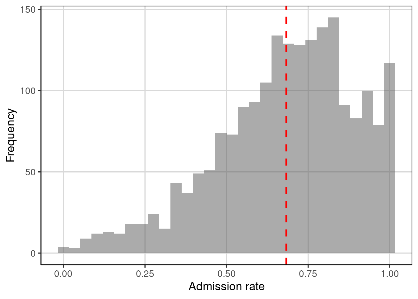
Figure 3.1: Distribution of admission rates for the 2,019 higher education institutions. The mean admission rate is displayed as a red, dashed line.
The mean (displayed as a red dashed line in Figure 3.1) represents the “balance point” of the distribution. If the distribution were a physical entity, it would be the location where the distribution would be balanced, not leaning in one direction or another. In a statistical sense, we balance the distribution by “balancing” the deviations. To explain this, let us examine a toy data set of five observations:
\[ Y = \begin{pmatrix}10\\ 10\\ 20\\ 30\\ 50\end{pmatrix} \]
The mean of these five values is 24. Each value has a deviation computed as the difference between the observed value and the mean value. For the toy data,
\[ Y = \begin{pmatrix}10 - 24\\ 10-24\\ 20-24\\ 30-24\\ 50-24\end{pmatrix} = \begin{pmatrix}-14\\ -14\\ -4\\ 6\\ 26\end{pmatrix} \]
Notice that some deviations are negative (the observation was below the mean), and some are positive (above the mean). The mean “balances” these deviations since the sum of the deviations is 0. What if we had instead looked at the deviations from the median, which is 20?
\[ Y = \begin{pmatrix}10 - 20\\ 10-20\\ 20-20\\ 30-20\\ 50-20\end{pmatrix} = \begin{pmatrix}-10\\ -10\\ 0\\ 10\\ 30\end{pmatrix} \]
The median does not balance the deviations; the sum is not zero (\(+20\)). The mean is the only value that “balances” the deviations. In this sense, the mean is optimal, and this is another reason the mean is used much more frequently than the median in many statistical applications.
What about the median?
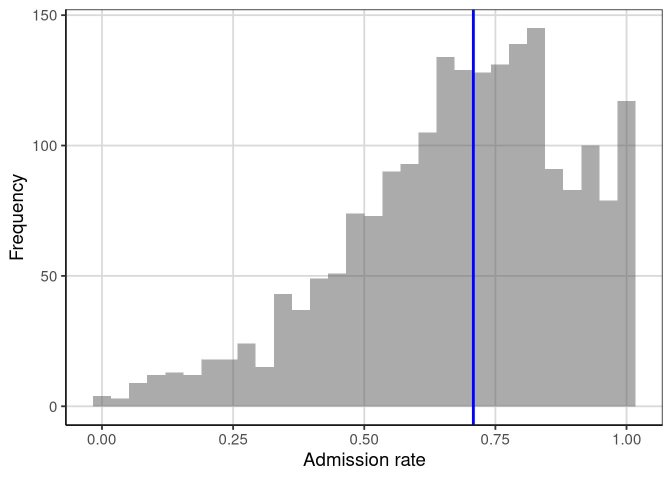
Figure 3.2: Histogram depicting the median of the distribution.
In Figure 3.2, half of the observations in the histogram have an admission rate below the blue line, and half have an admission rate above the blue line. The median splits the distribution into two equal areas; as such, the median is equivalent to the 50th percentile. Note that the median is not necessarily in the middle of the values represented on the \(x\)-axis; that would be 0.50 rather than 0.708. Instead, the area under the curve (embodied by the histogram or density) is halved. We will come back to this idea later when we explore a type of figure called the empirical cumulative density to show another way to summarize the distribution and discuss percentiles.
3.2.1 Summarize with the Mean or Median?
The goal of numerically summarizing the distribution is to provide a single value that typifies or represents the observed values of the attribute. In our example, we need a value summarizing the 2,019 admission rates. Since the mean balances the deviations, it is representative because the value is “closest” (at least on average) to all of the observations. (The value produces the smallest average deviation—since the sum of deviations is 0, the average deviation is also 0.) The median is representative because half of the distribution is smaller than that value, and the other half is larger. However, does one represent the distribution better than the other?
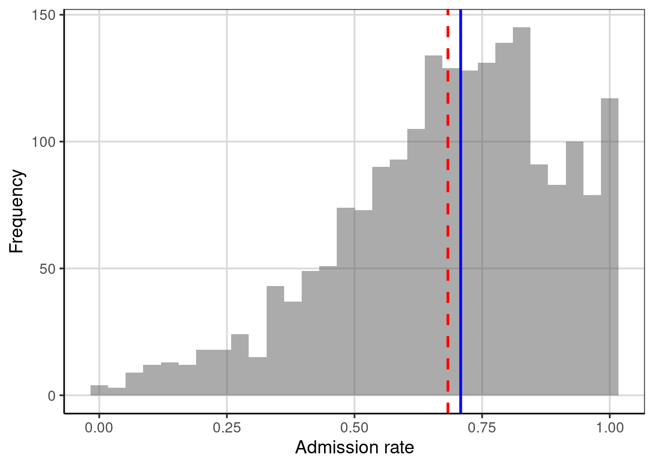
Figure 3.3: Distribution of the admission rates for 2,019 higher education institutions. The mean admission rate is displayed as a red, dashed line. The median admission rate is displayed as a blue, solid line.
Figure 3.3 shows the mean and median on the same plot. The red dashed line represents the mean, and the blue dashed line is the median. In this example, both values are similar, so either would send a similar message about the distribution of admission rates: a typical admission rate for these 2,019 higher education institutions is around 70%.
The plot shows that the mean admission rate is lower than the median admission rate. In a left-skewed distribution, this will often be the case. The mean is “pulled toward the tail” of the distribution. This is because extreme values influence the mean (which are in the tail) in a skewed distribution. Extreme values do not influence the median; we say it is robust to these values. This is because in calculating the median, only the middle score (or middle two scores) is used, so its value is not informed by the extreme values in the distribution.8
In practice, it is a good idea to compute both the mean and the median and explore whether one is more representative than the other (perhaps by plotting them on the distribution). The choice of one over the other should also be guided by substantive knowledge. For example, the median is often favored or commonly reported in highly skewed distributions such as personal income or house prices. The median is used due to its robust property discussed earlier. Imagine what a personal income distribution may look like if visualized with a histogram or density figure. In that case, the majority of individuals make low to moderate incomes, with a few individuals making much larger incomes.9 As such, the median is often more representative of typical household income than the mean. The strong positive/right-skewed (right-sided tail) income distribution would result in the mean being pulled much larger than the median due to the balance property discussed earlier.
3.3 Numerically Summarizing Variation
In the distribution of admission rates, both the mean and median offer a representative admission rate since both are close to the modal clump of the distribution. (Several colleges have an admission rate close to 70%.) However, an admission rate of 70% better represents all of the institutions’ admissions rates. This is true for any single statistic we pick to summarize the distribution.
To more fully summarize the distribution, we need to summarize the variability in the distribution in addition to a “typical” or representative value. There are several summaries that statisticians and data scientists use to describe the variation in a distribution. Furthermore, like the representative summary measures, each of the summaries of variation provides slightly different information by highlighting different aspects of the variability. We will explore some of these measures below.
3.3.1 Range
The range is one simple measure of variation. This numerical measure is the difference between the maximum and minimum values in the data. To compute this, we provide the df_stats() function with two additional arguments, min and max. Then, we can compute the difference between these values.
##   response min max
## 1 adm_rate 0 1## [1] 1The range of the admission rates is 1. When people colloquially describe the range, they typically provide the limits of the data rather than the range. For example, they may describe the range of the admission rates as: “the admission rates range from 0 to 1”. While this is technically not the range (which is a single number), it is more descriptive as it also gives a sense of the observations’ lower- and upper limits.
One problem with the range is that if there are extreme values, the range will not give an accurate picture of the variation encompassing most observations. For example, consider the following five test scores:
\[ Y = \begin{pmatrix}30\\ 35\\ 36\\ 37\\ 100\end{pmatrix} \]
The range of these data is 70, indicating that the variation between the lowest and highest scores is 70 points, suggesting a lot of variation in the scores. The range, however, is clearly influenced by the score of 100. Were it not for that score, we would have a much different take on the score variability; the other scores are between 30 and 37 (a range of 7), suggesting that there are not many differences in the test scores.10
While the range is not the best measure of variation, it is quite helpful as a validity check on the data to ensure that the attribute’s values are theoretically possible. In this case, the values are all between 0 and 1, theoretically plausible for the admission rate. If, for example, we had found a data value that was 1.1, this would represent a data error. We want to confirm that the case was entered correctly, or if no adjustment could be made, remove this case from further analysis as a proportion can not be larger than 1.
3.3.2 Percentile Range
One way to deal with extreme values in the sample is to exclude them when calculating the range. For example, instead of computing the difference between the maximum and minimum values in the data (which includes extreme values), truncate the bottom 10% and upper 10% of the data and calculate the range between the remaining maximum and minimum values. This is the range of the middle 80% of the data.
To compute the endpoint after truncating the lower- and upper 10%, we will use the quantile() function. This function finds the data value for an associated percentile provided to the function. If we want to truncate the lower- and upper 10% of a distribution, we want to find the values associated with the 10th and 90th percentiles. The syntax below shows two manners for obtaining these values for the admissions rate attribute.
# Provide both percentiles separately
colleges |>
  df_stats(~ adm_rate, quantile(0.10), quantile(.90))
## response 10% 90%
## 1 adm_rate 0.39284 0.94706# Provide both percentiles in a single quantile() call
colleges |>
df_stats(~ adm_rate, quantile(c(0.1, 0.9)))## response 10% 90%
## 1 adm_rate 0.39284 0.94706## [1] 0.55422The range of admissions rates for 80% of the 2,019 higher education institutions is 0.554. We can visualize this by adding the percentiles on the plot of the distribution of admission rates, shown in Figure 3.4. These values visually correspond to where most of the data are concentrated and may provide a better indication of the variability for most of the data or the typical cases.
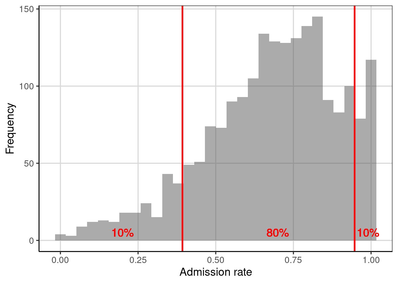
Figure 3.4: Distribution of the admission rates for 2,019 higher education institutions. The solid, red lines are placed at the 10th and 90th percentiles, respectively.
3.3.3 Interquartile Range (IQR)
One percentile range that statisticians and data scientists use extensively is the interquartile range (IQR). This range demarcates the middle 50% of the distribution; it truncates the lower and upper 25% of the values. In other words, it is based on finding the range between the 25th- and the 75th-percentiles.
# Obtain values for the 25th- and 75th percentiles
colleges |>
  df_stats(~ adm_rate, quantile(c(0.25, 0.75)))
## response 25% 75%
## 1 adm_rate 0.5524 0.83815## [1] 0.28575The range of admission rates for the middle 50% of the distribution is 28.5%. Since it is based on only 50% of the observations, the IQR no longer gives the range for “most” of the data, but, as shown in Figure 3.5, this range encompasses the modal clump of institutions’ admission rates and can help describe the variation.
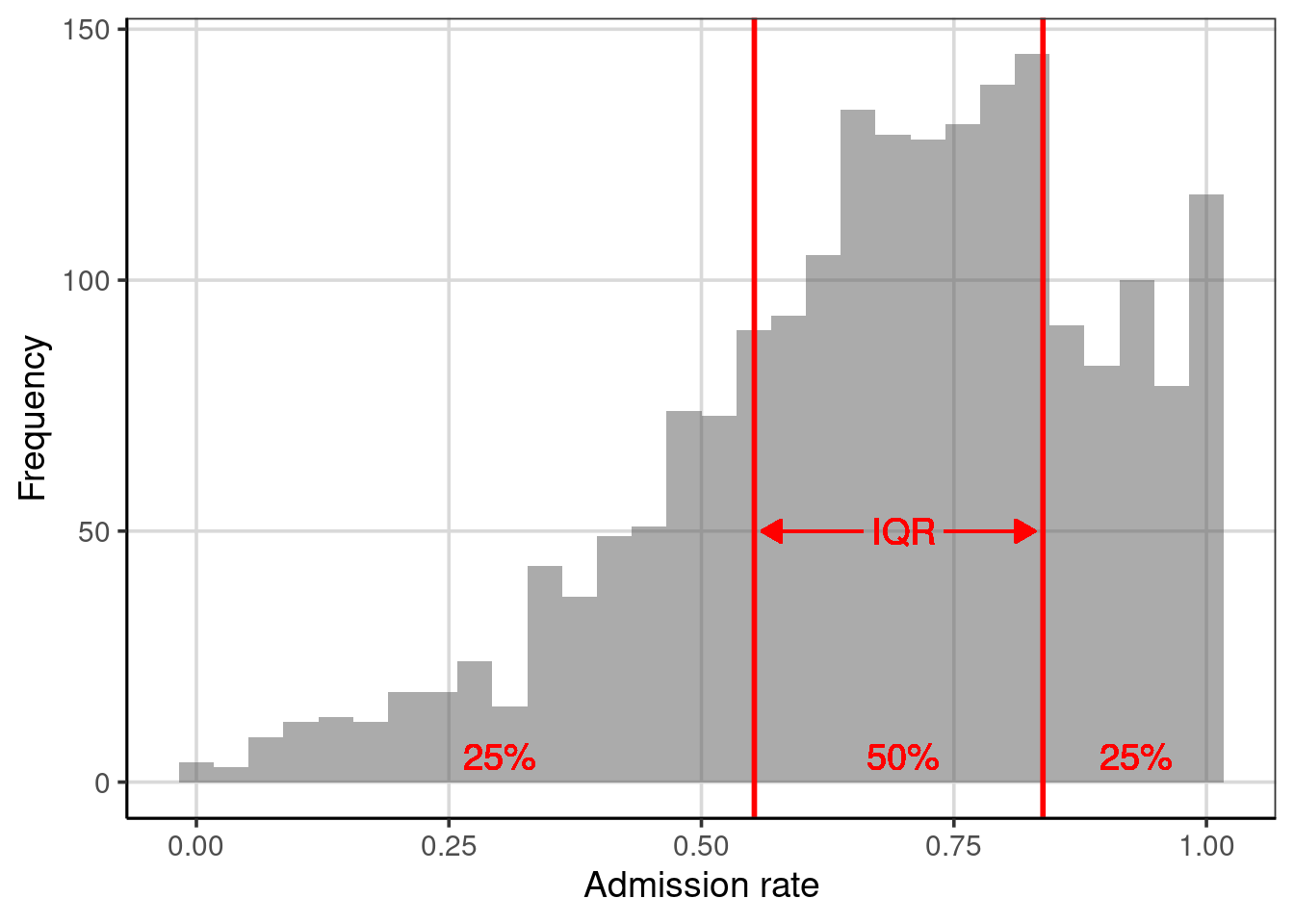
Figure 3.5: Distribution of the admission rates for 2,019 higher education institutions. The solid, red lines are placed at the 25th and 75th percentiles, respectively.
Since the IQR describes the range for half of the observations, it can also be helpful to compare this range with the entire range of the data. Below, we compute these values and visualize them on a histogram of the distribution; see Figure 3.6.
# Obtain values for the 25th- and 75th percentiles
colleges |>
  df_stats(~ adm_rate, min, quantile(c(0.25, 0.75)), max)
## response min 25% 75% max
## 1 adm_rate 0 0.5524 0.83815 1## [1] 0.28575## [1] 1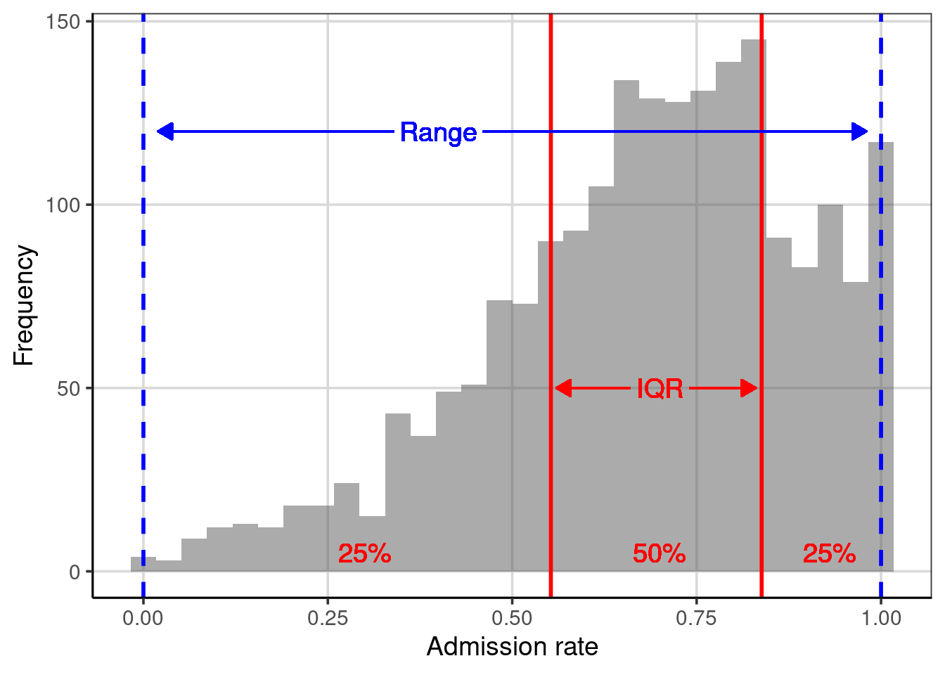
Figure 3.6: Distribution of the admission rates for 2,019 higher education institutions. The solid red lines are placed at the 25th and 75th percentiles. The dashed, blue lines are placed at the minimum and maximum values, respectively.
Although our sample of 2,019 higher education institutions has wildly varying admissions rates (from 0% to 100%), the middle half has admissions rates between 55% and 84%. We also note that the 25% of institutions with the lowest admissions rate range from 0% to 55%, while the 25% of institutions with the highest admissions rate range from only 84% to 100%. This means that there is more variation in the admissions rates in the institutions with the lowest than in the institutions with the highest.
Understanding how similar the range of variation is in these areas of the distribution can give us information about the shape of the distribution. For example, the larger range in the lowest 25% of the data suggests that the distribution has a tail on the left side. Seventy-five percent of the institutions have admissions rates higher than 50%. These two features suggest that the distribution is left-skewed (which we also see in the histogram). When we describe the shape of a distribution, we describe the variability in the data!
Examining the lowest 25%, highest 25% and middle 50% of the data is so common that a statistician named John Tukey invented a visualization technique called the box-and-whiskers plot to show these ranges. To create a box-and-whiskers plot we use the gf_boxplot() function. This function takes a slightly different formula than we have been using, namely 0 ~ attribute name. (Note that the 0 in the formula is where the box-and-whiskers plot is centered on the y-axis.)
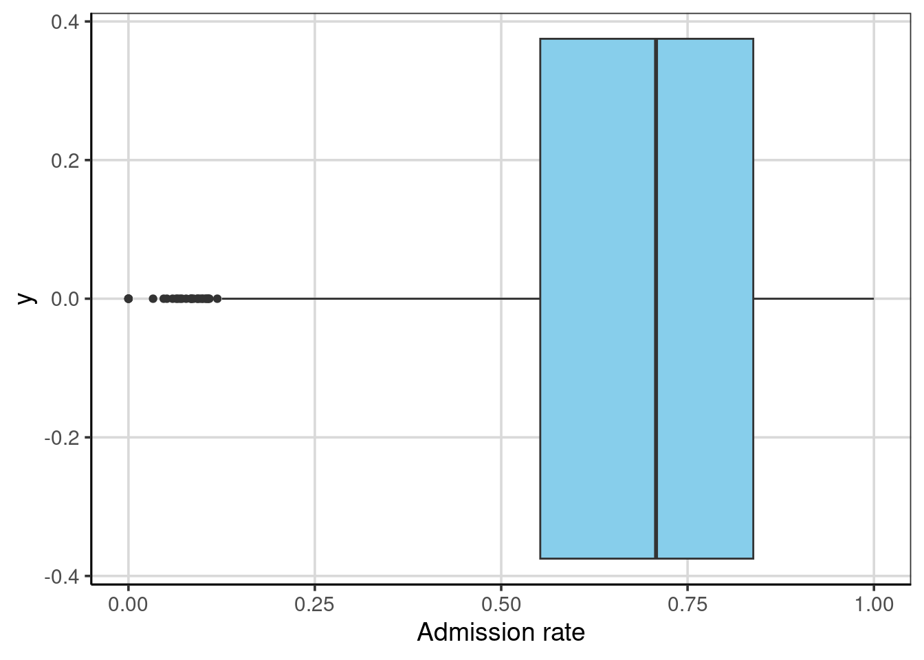
The “box”, extending from 0.55 to 0.84, depicts the interquartile range, the middle 50% of the distribution. The line near the middle of the box is the median value. The “whiskers” extend to either the end of the range or the next closest observation that is not an extreme value.11 Several extreme values on the left-hand side of the distribution represent institutions with extremely low admission rates. The whisker’s length denotes the range of the lowest 25% of the distribution and the highest 25% of the distribution.
We can also display both the histogram and the box-and-whiskers plot. In the syntax below, we center the box-and-whiskers plot at \(y=170\). We also made the box slightly wider to display better in the plot. The resulting figure is shown in Figure 3.7.
gf_histogram(~ adm_rate, data = colleges, bins = 30) |>
  gf_boxplot(170 ~ adm_rate, data = colleges, fill = "skyblue", width = 10) |>
  gf_labs(x = "Admission rate", y = "Frequency")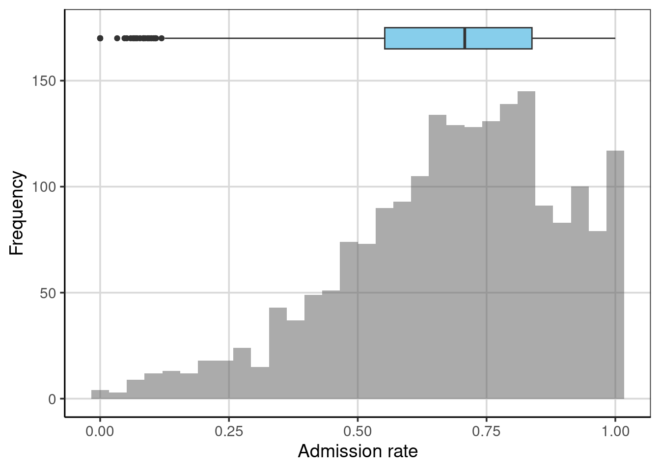
Figure 3.7: Histogram and boxplot shown together.
3.3.4 Empirical Cumulative Density
The percentile range plots and the boxplot indicated the values of the distribution that demarcated a particular proportion of the distribution. For example, the boxplot visually showed the admission rates at the 25th, 50th, and 75th percentiles. Another plot that can be useful for understanding how much of a distribution is at or below a particular value is a plot of the empirical cumulative density. To create this plot, we use the gf_ecdf() function from the ggformula package.
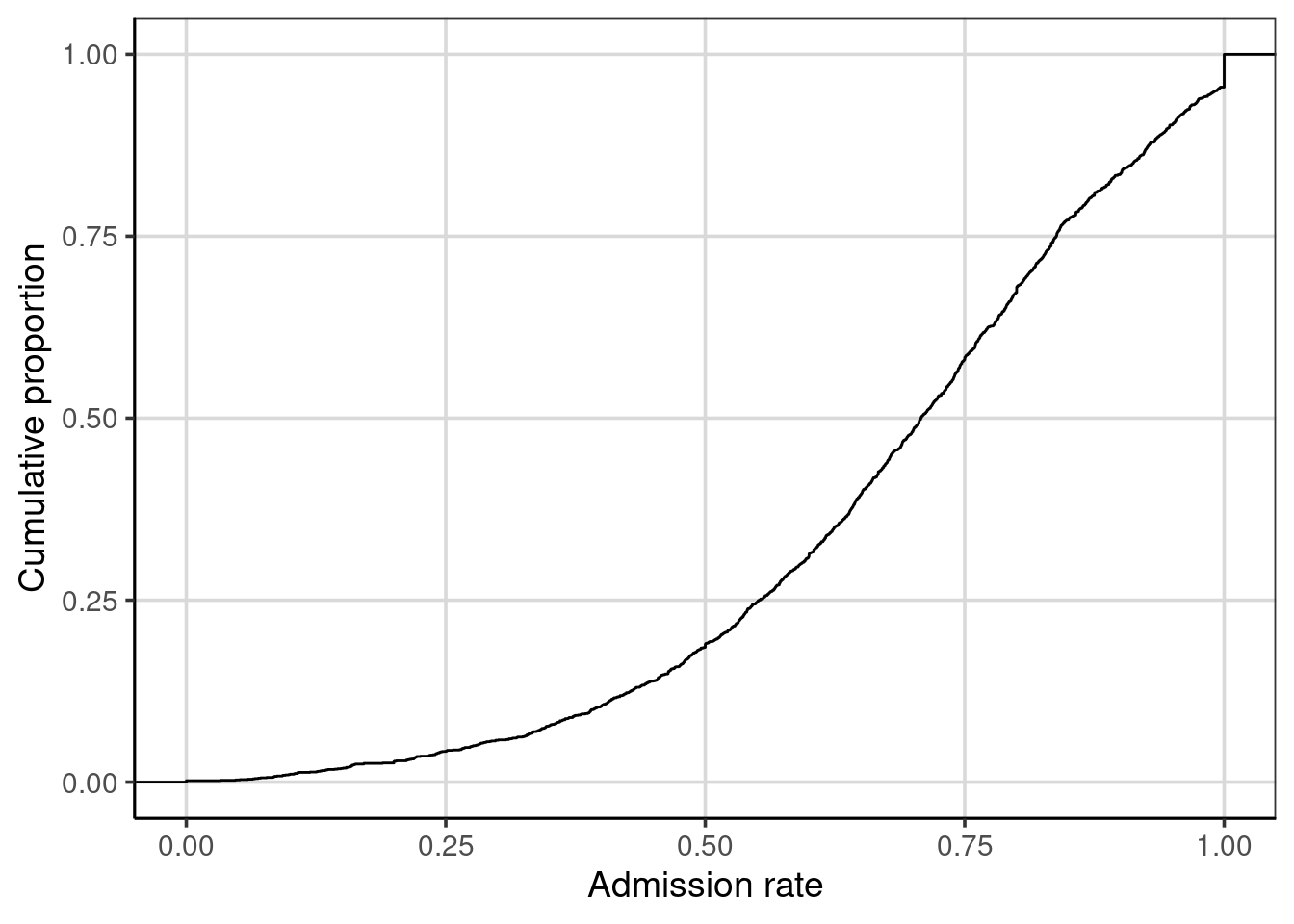
We can map admission rates to their associated cumulative proportion to read this plot. For example, one-quarter of the admission rates in the distribution are at or below 0.55; that is, the admission rate 0.55 has an associated cumulative proportion of 0.25. Similarly, an admission rate of 0.71 is associated with a cumulative proportion of 0.50; one-half of the admission rates in the distribution are at or below the value of 0.71.
The cumulative proportion depicted on the y-axis is the same as the percentiles for the distribution. For example, the admission rate of 0.55 has an associated cumulative proportion of 0.25, which is also the 25th percentile. The cumulative proportion represents the data that fall below the associated score on the x-axis.
3.3.5 Variance and Standard Deviation
Two variation measures commonly used by statisticians and data scientists are the variance and the standard deviation. These can be obtained by including var and sd in the df_stats() function.
##   response        var        sd
## 1 adm_rate 0.04467182 0.2113571
The variance and standard deviation are related in that if we square the standard deviation value, we obtain the variance.
## [1] 0.04467182In general, the standard deviation is more helpful in describing the variation in a sample because it is in the same metric as the data. In our example, the metric of the data is the proportion of students admitted, and the standard deviation is also in this metric. As the square of the standard deviation, the variance is in the squared metric in our example, the proportion of students admitted squared. While this is not a helpful metric, it does have some nice mathematical properties, so it is also a helpful measure of the variation.
3.3.5.1 Understanding the Standard Deviation
To understand the interpretation of the standard deviation, it is helpful to see how it is calculated. To do so, we will return to our toy data set:
\[ Y = \begin{pmatrix}10 \\ 10\\ 20\\ 30\\ 50\end{pmatrix} \]
Recall that earlier, we computed the deviation from the mean for each of these observations and that these deviations were a measure of how far above or below each observation’s mean.
\[ Y = \begin{pmatrix}10 - 24\\ 10-24\\ 20-24\\ 30-24\\ 50-24\end{pmatrix} = \begin{pmatrix}-14\\ -14\\ -4\\ 6\\ 26\end{pmatrix} \]
A valuable measure of the variation in the data would be the average of these deviations. This tells us how far from the mean the data are. Unfortunately, if we were to compute the mean, we would get zero because the sum of the deviations is zero. (That was a property of the mean discussed earlier in the chapter!) To alleviate this, we square the deviations before summing them.
\[ \begin{pmatrix}-14^2\\ -14^2\\ -4^2\\ 6^2\\ 26^2\end{pmatrix} = \begin{pmatrix}196\\ 196\\ 16\\ 36\\ 676\end{pmatrix} \]
The sum of these squared deviations is 1,120. Furthermore, the average squared deviation is \(1120/5 = 224\), representing the population variance for these values. If we take the square root of 224, which is 14.97, we now have the average deviation for the five observations. On average, the observations in the distribution are 14.97 units from the mean value of 24. The standard deviation is the average deviation from the mean.12
3.3.5.2 Using the Standard Deviation
In our example, the mean admission rate for the 2,019 higher education institutions was 68.2%, and the standard deviation was 21.1%. We can combine these two pieces of information to make a statement about the admission rates for most of the institutions in our sample. Generally, most observations in a distribution fall within one standard deviation of the mean. So, for our example, most institutions have an admission rate between 47.1% and 89.3%.13
## [1] 0.471## [1] 0.8933.4 Summarizing Categorical Attributes
Categorical attributes are attributes that have values that represent categories. For example, the attribute region indicates the region where the institution is located (e.g., Midwest) in the United States. The attribute bachelor_degree is a categorical value indicating whether or not the institution offers a Bachelor’s degree. Sometimes, statisticians and data scientists use dichotomous (two categories) and polytomous (more than two) to define categorical variables further. Using this nomenclature, region is a polytomous categorical variable, and bachelor_degree is a dichotomous categorical variable.
Sometimes, analysts use numeric values to encode the categories of a categorical attribute. For example, the attribute bachelor_degree is encoded using the values of 0 and 1. It is important to note that these values indicate whether the institution offers a Bachelor’s degree (1) or not (0). The values are not necessarily ordinal because a 1 means more of the attribute than a 0. Since the values refer to categories, an analyst might have reversed the coding and used 0 to encode institutions that offer a Bachelor’s degree and 1 to encode those institutions that do not. Similarly, the values of 0 and 1 are not sacrosanct; any two numbers could have been used to represent the categories.14
Most of the time, the numerical summaries we computed earlier in the chapter do not work for categorical attributes. For example, it would not make sense to compute the mean region for the institutions. It suffices to compute counts and proportions for the categories included in these attributes. We use the tally() function to compute the category counts. This function takes a formula indicating the name of the categorical attribute and the name of the data object. To find the category counts for the region attribute:
## region
##           Far West        Great Lakes           Mid East        New England
##                221                297                458                167
##     Outlying Areas             Plains    Rocky Mountains          Southeast
##                 35                200                 50                454
##          Southwest US Service Schools
##                133                  4
To find the proportion of institutions in each region, we can divide each count by 2,019.
## region
##           Far West        Great Lakes           Mid East        New England
##        0.109460129        0.147102526        0.226844973        0.082714215
##     Outlying Areas             Plains    Rocky Mountains          Southeast
##        0.017335315        0.099058940        0.024764735        0.224863794
##          Southwest US Service Schools
##        0.065874195        0.001981179
The proportions could be computed directly with the tally() function by specifying the argument format = "proportion".
## region
##           Far West        Great Lakes           Mid East        New England
##        0.109460129        0.147102526        0.226844973        0.082714215
##     Outlying Areas             Plains    Rocky Mountains          Southeast
##        0.017335315        0.099058940        0.024764735        0.224863794
##          Southwest US Service Schools
##        0.065874195        0.001981179
Descriptively exploring both the raw counts and the proportions can be informative when exploring the data. This can be true for more complicated tables when multiple attributes are explored simultaneously. This will be explored in more detail in subsequent chapters.
3.5 Advanced Extension: Computing Another Measure of Variation
If other non-standard measures of variation were desired to be computed, a new function can be constructed. For example, there is not a function for the mean absolute error (the mean of the absolute values of the deviations). We first need to define a new function to compute the mean absolute error.
mae <- function(x, na.rm = TRUE, ...) {
  avg <- mean(x, na.rm = na.rm, ...)
  abs_avg <- abs(x - avg)

  mean(abs_avg)
}
We can now use this new function as an argument in the df_stats() function.
##   response       mae
## 1 adm_rate 0.1692953
This statistic is interpreted as the average absolute deviation from the mean admission rate is about 16.9%.
Note that the names of the summaries we include in the
df_stats()function need to be the actual names of functions that R recognizes.↩︎The downside of using the median is that it is only informed by one or two observations in the data. All observations inform the mean. This property of the mean makes it more valuable than the median in some mathematical and theoretical applications.↩︎
To be more specific, in 2014, 50% of households made less than $53,700 and 90% of households made less than $157,500 according to the US census bureau↩︎
A second issue with range is that it is a biased statistic. If we use it to estimate the population range, it will almost inevitably be too small. The population range will almost always be larger since the sampling process will often not select extreme population values.↩︎
Extreme values are typically defined as ranged more than 1.5 times the IQR from either the lower or upper portion of the box. Recall that the lower and upper portion of the box reflects the 25th and 75th percentiles, respectively.↩︎
Technically, after summing the squared deviations, we divide this sum by \(n-1\) rather than \(n\). However, this difference is trivial when the sample size is somewhat large.↩︎
If we know the exact shape of the distribution, we can be more specific about the proportion of the distribution that falls within one standard deviation of the mean.↩︎
Using 0’s and 1’s for the encoding does have some advantages over other coding schemes, which we will explore later when fitting statistical models.↩︎