Chapter 7 Linear Regression
Linear regression is another statistical model used when the outcome is an integer or continuous, similar to the regression tree. There are similarities between linear regression and regression trees. However, there are also very notable differences.
Linear regression and regression trees are used when the outcome is continuous or continuous. These methods can both make predictions for the outcome and identify which attributes are most important in aiding in making those predictions. There are differences, though, in the two methods that are important to distinguish. Linear regression assumes the relationship between the outcome and attributes entered into the model. Linear regression, as in the name, assumes that the relationship between the outcome and an attribute is linearly related.17 Regression trees, however, do not directly make this linear assumption between the outcome and an attribute. This assumption can make linear regression more parsimonious, meaning that the model can be simpler, which is often a goal of science, to explain the phenomenon of interest with the simplest possible explanation.
7.1 Simple Regression continuous predictor
7.1.1 Description of the Data
These data contain information on weather from various weather stations in the northern part of the United States during cooler months of the year (October to April). There are 3,400 observations in the data, 425 observations from each station.
library(tidyverse)
library(ggformula)
library(mosaic)
library(rsample)
library(statthink)

# Set theme for plots
theme_set(theme_statthinking(base_size = 14))

us_weather <- mutate(us_weather, snow_factor = factor(snow),
                     snow_numeric = ifelse(snow == 'Yes', 1, 0))
The station locations are shown below using the function count(us_weather, location) and in Table 7.1. Weather observations from these station locations were collected, including temperature, dewpoint, humidity, wind speed, precipitation type and amount, and other information.
| location | n |
|---|---|
| Boston, MA | 425 |
| Buffalo, NY | 425 |
| Chicago, IL | 425 |
| Detroit, MI | 425 |
| Duluth, MN | 425 |
| Iowa City, IA | 425 |
| Minneapolis, MN | 425 |
| Portland, ME | 425 |
7.1.2 Scatterplots
As we have explored before, scatterplots help to explore the relationship between two continuous, quantitative data attributes. The gf_point() function creates scatterplots. Adding lines to the figure to guide the relationship between the two attributes can be done with the gf_smooth() function. Below, a scatterplot shows the relationship between the low temperature and the average daily dew point.18
gf_point(drybulbtemp_min ~ dewpoint_avg, data = us_weather, size = 3, alpha = .2) %>%
  gf_smooth(method = 'lm', size = 1) %>%
  gf_labs(x = "Average daily dew point",
          y = "Minimum daily temperature (in F)")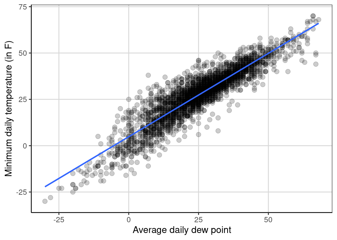
Figure 7.1: Scatterplot showing the minimum temperature by dewpoint.
Figure 7.1 shows the relationship between minimum temperature and average daily dew point, assuming a linear relationship (specified with gf_smooth(method = 'lm')) between the two attributes. In this example, the relationship between the two attributes goes from the lower left to the upper right, indicating a positive relationship. As the average daily dew point tends to increase, the minimum daily temperature also tends to increase. The relationship is not perfect, as shown by the points not falling perfectly on the blue line, but the data are clustered relatively closely to this blue line. This would suggest that the relationship is stronger rather than weaker and closer to +1 than 0.
The correlation estimates the relationship between the two attributes with a single numeric quantity. The correlation can be calculated with the cor() function, with the primary argument being a formula depicting the two variables to compute the correlation. The optional argument, use = 'complete. obs' is used as there is some missing data on these attributes, and these data are removed prior to the calculation.
## [1] 0.9102476The correlation represents the degree of linear relationship between the two variables. Values closer to 1 in absolute value (i.e., +1 or -1) show a stronger linear relationship, and values closer to 0 indicate no relationship or weaker relationship. The correlation between the two variables above was about 0.91 indicating that there is a strong positive linear relationship between the minimum temperature and the daily dew point. The correlation is positive due to the coefficient being positive, and the general trend from the scatterplot shows a direction of relationship moving from the lower left to the upper right of the figure. A negative correlation would have a negative sign associated with it and would trend from the upper left to the lower right of a scatterplot.
7.1.3 Fitting a linear regression model
The correlation showed evidence of a relationship between the minimum temperature and the average daily dew point. Fitting a linear regression model is often done to provide more evidence about the strength of this relationship and how much error is involved. Estimating the linear regression uses R’s lm() function. The two arguments that need to be specified are a formula and the data for the model fitting. The formula takes the following form: drybulbtemp_min ~ dewpoint_avg, where the minimum temperature is the outcome of interest (in language we have used previously, this is the attribute we want to predict) and the average daily dew point is the attribute we want to use to help to predict the minimum temperature. Another way to think about what these variables represent is to explain variation in the minimum temperature with the average daily dew point. In other words, the assumption is that the average daily dew point impacts or explains differences in the minimum temperature.
##  (Intercept) dewpoint_avg
##    4.8343103    0.8999469
The following coefficients represent the linear regression equation that more generally can be shown as:
\[\begin{equation} drybulbtemp\_min = 4.83 + 0.90 dewpoint\_avg + \epsilon \end{equation}\]
The equation can omit the error term, \(\epsilon\), as:
\[\begin{equation} \hat{drybulbtemp\_min} = 4.83 + 0.90 dewpoint\_avg \end{equation}\]
the minimum temperature outcome now has a hat (i.e., \(\hat{y}\)). The hat denotes mathematically that the equation predicts a value of minimum temperature given solely the average daily dew point. The first equation above says that the original observed minimum temperature is a function of the average daily dew point plus some error. Computing the predicted minimum temperature can be done by inserting a value for the average daily dew point. Let us pick a few values for the average daily dew point to try.
## [1] -8.67## [1] 4.83## [1] 27.33## [1] 28.23Notice that the predicted minimum temperature value increases by 0.90 degrees Fahrenheit for every one-degree increase in average daily dew point, often called the linear slope. The predicted values would fit on the line shown in Figure 7.1. This highlights the assumption made from the linear regression model in which the relationship between the minimum temperature and the average daily dew point is linear. It is possible to relax this assumption with a more complicated model. However, that is not explored here. The y-intercept, shown as 4.83 in the equations above, will be explored in the next section.
7.1.4 Explore the y-intercept
So far, the discussion has focused on the linear slope, often the most interesting term. However, the y-intercept can also be an important term. The y-intercept from the equations above when the minimum temperature was predicted or explained by the average daily dew point was 4.83. What does this term mean? Exploring the scatterplot can provide some insight into the interpretation of the intercept.
Figure 7.2 shows a scatterplot where the y-axis is the minimum temperature, and the x-axis is the average daily dew point. This figure shows a horizontal and vertical line that crosses the blue line shown in the figure. The vertical line is shown at an average daily dew point of 0, and the horizontal line is at a minimum temperature of 4.83. These cross or intersect on the blue line, representing the relationship between the average daily dew point and the minimum temperature. This depicts the y-intercept. The y-intercept represents the average minimum temperature for a daily dew point of zero. More generally, the y-intercept is the average value of the outcome when all of the attributes included in the linear regression are 0.
gf_point(drybulbtemp_min ~ dewpoint_avg, data = us_weather, size = 3, alpha = .2) %>%
  gf_smooth(method = 'lm', size = 1) %>%
  gf_vline(xintercept = 0) %>%
  gf_hline(yintercept = 4.83) %>%
  gf_labs(x = "Average daily dew point",
          y = "Minimum daily temperature (in F)")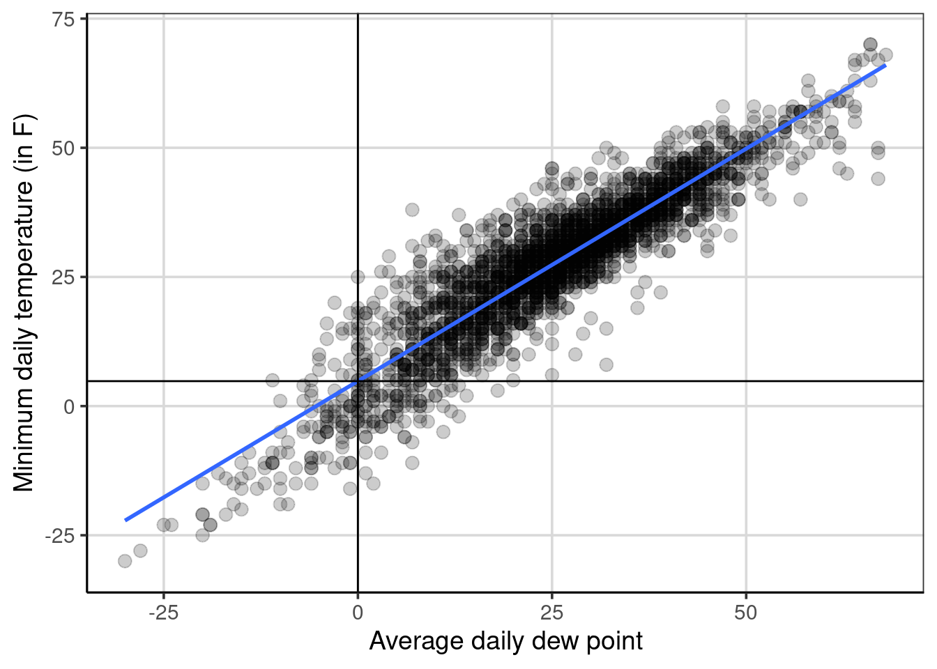
Figure 7.2: Scatterplot showing the minimum temperature by dewpoint highlighting the intercept.
In the example, a value of 0 for the average daily dew point occurs within the sample of data. That is, an average daily dew point of 0 occurs in the data and is directly interpretable. This would mean that when an average daily dew point of 0 happens in real life, the average predicted minimum temperature is 4.83 degrees Fahrenheit. In some situations, a value of 0 for an attribute is not plausible. An example could be predicting a baby’s birth weight based on the number of gestation days.19 In situations where the value of 0 is not plausible or meaningful, the data can be centered on a value that is more meaningful or plausible to help with the interpretation of the y-intercept.
Before this is done, below is a more concrete example that still tries to predict/explain minimum temperature, but now the attribute to explain differences in the minimum temperature is the average daily sea level pressure. Sea-level pressure is a way to measure atmospheric pressure and is measured in inches of mercury20. Figure 7.3 shows a scatterplot of this relationship. First, notice that the direction of the blue line is different than before. It starts in the upper left quadrant and decreases as the sea level pressure increases. This is indicative of a negative relationship between the two attributes. The correlation can be estimated to be -0.38, a moderate negative relationship. This relationship is weaker than the relationship between minimum temperature and average daily dew point. The variation around the blue line in 7.3 is much larger, which depicts a weaker relationship (i.e., more error) compared to the minimum temperature and dew point relationship (see Figure 7.1).
gf_point(drybulbtemp_min ~ sealevelpressure_avg, data = us_weather, size = 3, alpha = .2) %>%
  gf_smooth(method = 'lm', size = 1) %>%
  gf_labs(x = "Average daily sea level pressure",
          y = "Minimum daily temperature (in F)")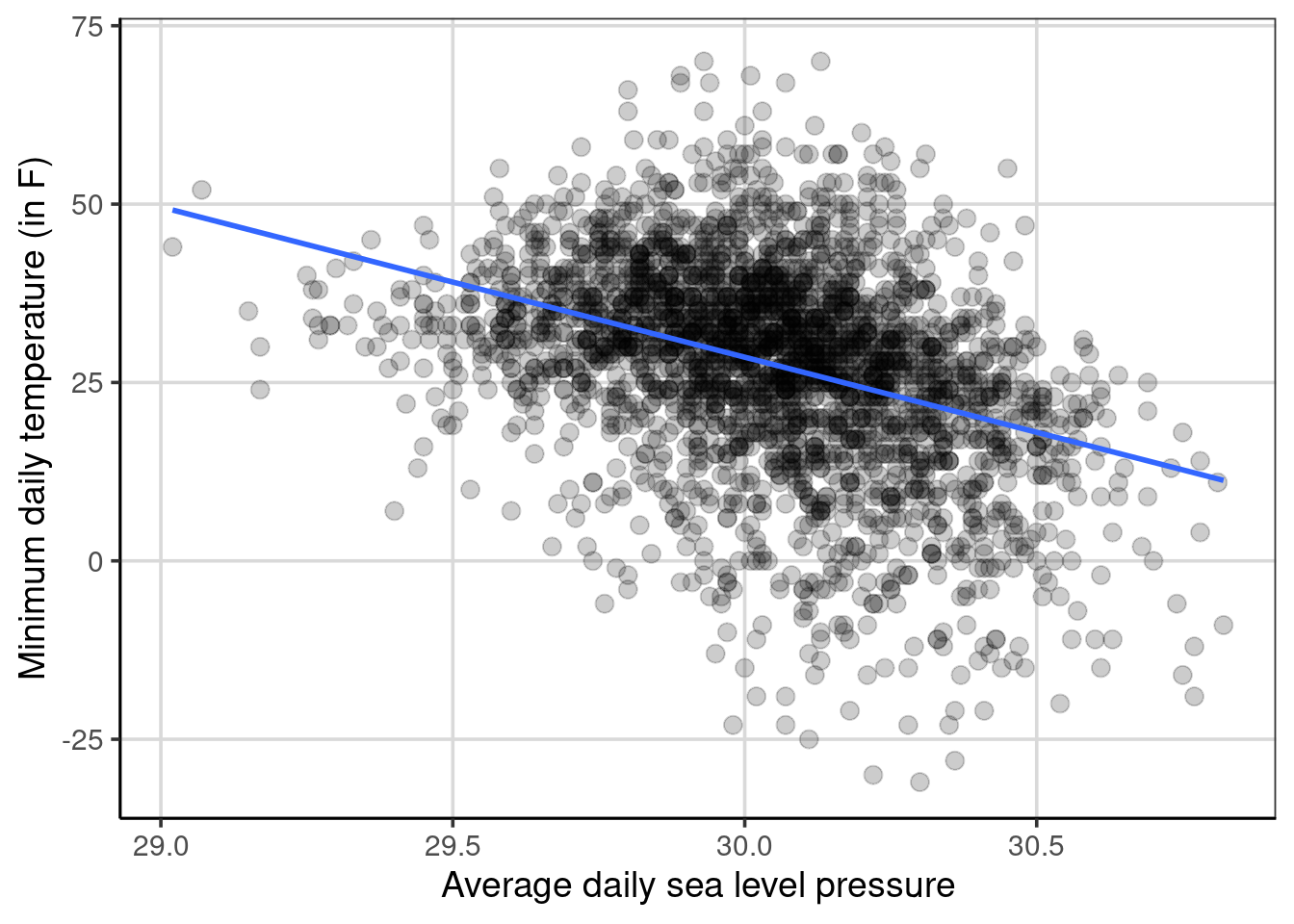
Figure 7.3: Scatterplot showing minimum temperature by sea level pressure.
The following coefficients can be estimated, resulting in the following regression equation.
##          (Intercept) sealevelpressure_avg
##            660.05123            -21.05011
\[\begin{equation} drybulbtemp\_min = 660.05 - 21.05 sealevelpressure\_avg + \epsilon \end{equation}\]
For these, the y-intercept is about 660 degrees Fahrenheit, and the linear slope is about -21 degrees Fahrenheit. How are these interpreted? Starting with the linear slope, the -21 means that for every one-unit increase in sea level pressure (i.e., moving from 29 to 30 inches of mercury), the average minimum temperature decreases by 21 degrees Fahrenheit.
Why is the y-intercept 660 degrees Fahrenheit, a temperature much above water’s boiling point and hotter than most ovens? Furthermore, this is not an atmospheric temperature observed in the data, so why is the y-intercept 660 degrees Fahrenheit? Ultimately, this comes down to the range of sea level pressure, where the minimum value in the data is 29.02, a value very far from 0. Therefore, the linear relationship depicted above is extrapolated outside the range of the data (i.e., decreased by 29.02 sea level units), which increases the temperature by 610.871 degrees Fahrenheit units. This value is not interpretable or meaningful as it would be impossible to get a sea level pressure of 0 in the metric of inches of mercury. It is possible to modify the data but keep the overall relationship between minimum temperature and sea level pressure to help increase the interpretation of the y-intercept. Three options are explored: mean value-centered, minimum value-centered, and maximum value-centered, although there are many other potential options.
7.1.4.1 Mean center sea level pressure
First, mean centering the x attribute can often be a way to make the y-intercept more interpretable. The code below shows a scatterplot by subtracting the mean from all the values of sea level pressure. More explicitly, the value of 30.04 was subtracted from each sea level pressure value in the data.
gf_point(drybulbtemp_min ~ I(sealevelpressure_avg - mean(sealevelpressure_avg, na.rm = TRUE)),
         data = us_weather, size = 3, alpha = .2) %>%
  gf_smooth(method = 'lm', size = 1) %>%
  gf_labs(x = "Average daily sea level pressure",
          y = "Minimum daily temperature (in F)")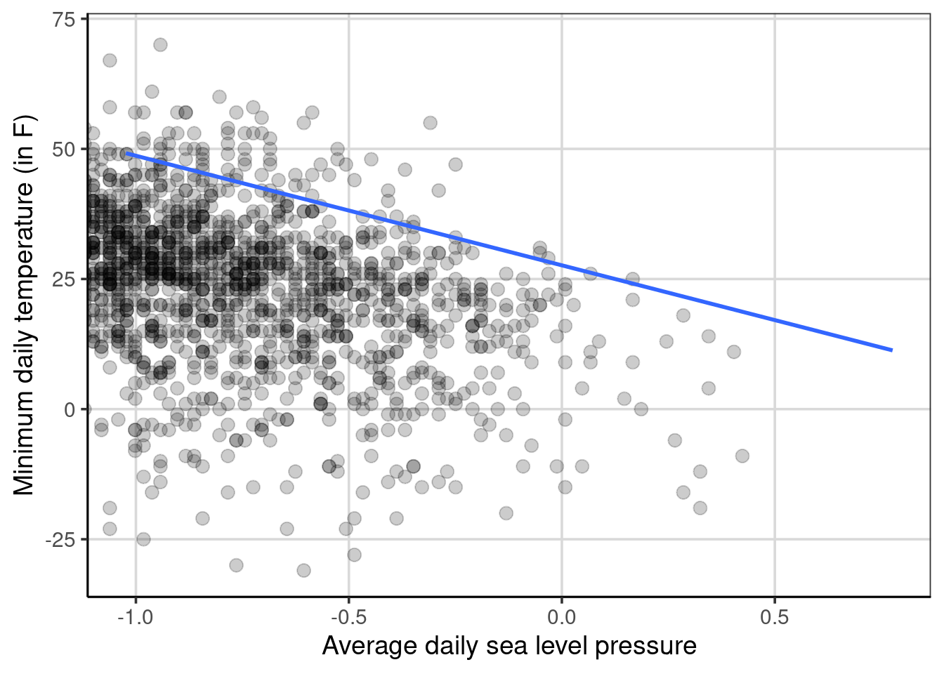
Figure 7.4: Scatterplot showing the relationship between minimum temperature by sea level pressure that is mean centered.
Notice that the relationship is the same as before, but now the scale of sea level pressure is different. From the coefficients shown below, notice that the linear slope is the same as before, -21.05, showing that the subtraction of the mean for each value did not impact the overall relationship between the two attributes. The difference is now the y-intercept is much smaller and would represent the mean minimum temperature when the mean-centered sea level pressure is 0 (i.e., a value of 30.04 in the original metric).
sealevel_reg_centered <- lm(drybulbtemp_min ~ I(sealevelpressure_avg - mean(sealevelpressure_avg, na.rm = TRUE)),
         data = us_weather)
coef(sealevel_reg_centered)
## (Intercept)
## 27.63117
## I(sealevelpressure_avg - mean(sealevelpressure_avg, na.rm = TRUE))
## -21.05011The new equation would look like:
begin{equation} = 27.63 - 21.05 (sealevelpressure_avg - mean(sealevelpressure_avg)) \end{equation}
## [1] 48.68## [1] 27.63## [1] 17.105This can provide a more interpretable intercept and be a direct interest model parameter. The value for the y-intercept also makes more intuitive sense, which can aid in model interpretation. This model would fit the data the same as before. That is, this model is not inherently better. Instead, the benefits of this model are simply in the interpretation and intuitiveness of the y-intercept. The regression line shown in the scatterplots in Figures 7.3 and 7.4 are the same.
7.1.4.2 Minimum or Maximum centered sea level pressure
Mean centering an attribute can be an attractive way to make the y-intercept more intuitive and interpretable, but there are other options. Other common options include subtracting the minimum or maximum values from the predictor attribute. The minimum-centered and then the maximum-centered regression are shown in order.
sealevel_reg_min <- lm(drybulbtemp_min ~ I(sealevelpressure_avg - min(sealevelpressure_avg, na.rm = TRUE)),
         data = us_weather)
coef(sealevel_reg_min)
## (Intercept)
## 49.17705
## I(sealevelpressure_avg - min(sealevelpressure_avg, na.rm = TRUE))
## -21.05011sealevel_reg_max <- lm(drybulbtemp_min ~ I(sealevelpressure_avg - max(sealevelpressure_avg, na.rm = TRUE)),
data = us_weather)
coef(sealevel_reg_max)## (Intercept)
## 11.28686
## I(sealevelpressure_avg - max(sealevelpressure_avg, na.rm = TRUE))
## -21.05011There are two main takeaways from these new models. First, the relationship between the minimum temperature and the sea level pressure does not change. The average change in the minimum temperature for a unit change of sea level pressure is still 21 degrees Fahrenheit, and the relationship is always negative. The element that changes is the y-intercept. For the minimum centered model, the y-intercept is 49.18 degrees Fahrenheit. The interpretation is that when the sea level pressure has a value of 0 (i.e., a value of 29.02 in the original metric), the average minimum temperature is 49.18 degrees Fahrenheit. Similarly, the maximum centered model has a y-intercept of 11.29. This represents the average minimum temperature when the sea level pressure is 0 (i.e., a value of 30.82 in the original metric).
If the three different centered y-intercepts are compared, min-centered = 49.18, mean-centered = 27.63, and max-centered = 11.29. The mean-centered y-intercept is in between the minimum and maximum centered values. Why is this occurring? This happens due to the linear relationship assumed between the minimum temperature and the sea level pressure with the linear regression model. If a different functional form were assumed (i.e., a curved relationship), there would likely be larger differences between the pairs of y-intercept values shown above.
Although there is an assumption that the outcome and attribute are linearly related in linear regression, it is possible to specify the model to explore non-linear trends.↩︎
Dew point is the temperature to which air must be cooled to become saturated with water vapor. Wikipedia↩︎
Gestational days is the number of days the baby is in the womb before birth. See gestation on Wikipedia↩︎