Chapter 9 Linear Regression with Categorical Predictors
In previous chapters, linear regression has only included a continuous attribute to help predict or explain variation in a continuous outcome. In previous models from chapter 7 and 8, linear regression models were considered that tried to explain variation in the minimum temperature with the sea level pressure and the average dew point. With both of these models, linear regression estimated how much the minimum temperature changed with a one unit increase for the predictor attribute (eg., either sea level pressure or the average dew point. What happens when a categorical predictor is used instead of a continuous predictor? For example, in the US weather data that has been used so far, one categorical attribute would be whether it snowed or rained on a particular day. In this case, these represents categories rather than continuous attributes that take on many different data points.
This chapter will explore using linear regression with a categorical attribute to predict/explain variation in the outcome. To mimic other chapters, the outcome attribute will be kept the same, the minimum temperature. First, a single categorical attribute with two categories will be explored. Then, a linear regression model with two terms will be explored, including one that is continuous and another that is categorical. Finally, the idea of a statistical interaction will be introduced and explored within a linear regression model.
library(tidyverse)
library(ggformula)
library(mosaic)
library(rsample)
library(statthink)
library(broom)

# Set theme for plots
theme_set(theme_statthinking(base_size = 14))

us_weather <- mutate(us_weather, snow_factor = factor(snow),
                     snow_numeric = ifelse(snow == 'Yes', 1, 0))
9.1 Categorical Predictor(s)
Precipitation can impact the temperature on a given day. For example, days that are sunny are often warmer than days that are cloudy or rainy. Similarly, days that snow often are colder for the precipitation to stay frozen as it falls from the clouds. Therefore, to show how categorical predictors can be entered into a linear regression model, differences in the minimum temperature will be explored based on whether it snows or not on a given day. Take a minute or so to hypothesize potential differences in the minimum temperature for days in which it snows.
Prior to fitting the linear regression model, it is first common to descriptively explore the distribution of the outcome by the different groups of the categorical attribute. This descriptive analysis can help to identify similarities or differences in center, variation, extreme cases, or other features across the two groups. For example, are there descriptive differences in the distribution of minimum temperature for days in which it snows vs does not snow?
There are numerous types of figures that can help explore this, but one way to explore this is through a violin plot. Below is the code to generate a violin plot depicting the distribution of minimum temperature for days in which it does snow vs does not snow.
gf_violin(drybulbtemp_min ~ snow, data = us_weather,
          draw_quantiles = c(0.1, 0.5, 0.9),
           fill = 'gray85') %>%
  gf_refine(coord_flip()) %>%
  gf_labs(y = 'Minimum Temperature (in F)',
x = 'Snowed?')gf_violin(drybulbtemp_min ~ snow, data = us_weather,
draw_quantiles = c(0.1, 0.5, 0.9),
fill = 'gray85') %>%
gf_refine(coord_flip()) %>%
gf_labs(y = 'Minimum Temperature (in F)',
x = 'Snowed?') %>%
plotly::ggplotly()Figure 9.1: Violin plots showing the distribution of minimum temperature by whether it has snowed on a day or not.
Figure 9.1 shows the two violin plots, the one on top is for days in which it does snow and the one on the bottom is for days in which it does not snow. What notable feature differences do you notice in this figure?
One element that stands out is the center differences in the median of the two groups, depicted by the middle vertical line in each violin plot. For days that it does snow, the median minimum temperature is just under 25 degrees whereas this is around 30 degrees for days in which it does not snow. Another notable difference is the shape of the two distributions. For days in which it snows (top violin plot), the distribution is left/negative skewed, whereas the distribution for days in which it does snow is much more symmetric. This makes some sense theoretically as days in which it does snow likely would have lower temperatures to ensure the precipitation does stay frozen as it falls.
Furthermore, there may be some slight evidence of differences in variation across the two distributions with the minimum temperatures being more condensed for days in which it does snow compared to days it does not snow. Finally, both seem to have some extreme values on the lower end of the distribution, around or below -25 degrees Fahrenheit. However, for days in which it does not snow, there are also some extreme values on the positive end where minimum temperatures are close to 70 degrees Fahrenheit. Although the range is not the best measure of variation, it can be helpful to descriptively explore differences in extreme values in the distributions.
In addition to the visualization, computing descriptive statistics can also be helpful. These can provide a more accurate values for the center, variation, and can also highlight sample size in each group. The df_stats() function can be used to compute statistics of interest. Below, these statistics were computed into three different groups. First, the mean and median were computed to represent the center of the distribution, then the standard deviation and IQR related to variation were computed, and finally information on the minimum and maximum values as well as the sample size of each group with the length() function.
us_weather %>%
  df_stats(drybulbtemp_min ~ snow, mean, median, sd, quantile(c(0.25, 0.75)), min, max, length)
## response snow mean median sd 25% 75% min max length
## 1 drybulbtemp_min No 30.98119 32 13.16565 24 39 -31 71 2392
## 2 drybulbtemp_min Yes 19.63095 23 12.32797 13 29 -30 38 1008The descriptive statistics show much of the same picture as the visualization, but provide specific values to confirm the initial thoughts based on Figure 9.1. In particular, the center for days in which it snows is lower for the mean and median by about 10 degrees Fahrenheit. Secondly, it was noted that there may be less variation for days in which it did snow, but the descriptive statistics (standard deviation and IQR) show that these values are similar across the two distributions. The upper end of the distribution for days in which it snows does appear to be more condensed from Figure 9.1 however. Finally, the minimum and maximum values mimic the sentiments from the violin plot and it should be noted that there are about half the number of days in which it snows compared to days in which it does not snow.
9.1.1 Linear Regression - Categorical Predictor
Performing a linear regression with a categorical attribute works programmatically just like a linear regression with a continuous attribute. More specifically, the same function is used, lm(), and the specification of the attributes in the model formula are the same. The code below fits the linear regression with the snow attribute as the sole categorical attribute that helps to explain variation in the minimum temperature. The coefficients associated with the linear regression are extracted and printed with the coef() function.
## (Intercept)     snowYes
##    30.98119   -11.35023
The output shows two parameters being estimated just like before. One is the y-intercept and is interpreted the same as with a continuous attribute. This term would represent the average minimum temperature when all of the attributes in the model are 0. What is not clear is what value is 0 from the model above. This will become more clear once the interpretation for the slope term is expanded upon next.
Before expanding on this, the linear slope term is interpreted the same as well. For example, the slope term shown above is still interpreted as the change in the outcome for a one unit increase in the predictor attribute. For the weather data example, this would mean that the linear slope coefficient of -11.35 indicates that the average minimum temperature decreases by about -11.35 degrees Fahrenheit for a one unit increase in the snow attribute. Similar to the intercept, it is not intuitive or clear as to what a one unit increase would represent here as the snow attribute represents categories rather than a continuous attribute.
9.1.1.1 Interpreting the Linear Slope for a Categorical Attribute
To explore what these coefficients mean in a bit more detail, let’s look at the data a bit more and how the linear regression uses the categorical attribute. In the model internals, the categorical attribute is converted from the category names (i.e., Yes vs No) to a numeric representation of those categories. By default, the numbers used to represent the categories used are 0 and 1. Table 9.1 shows this default numeric representation that R would use. R uses the category that is closer to the letter “A” for the number 0. The category that uses the value of 0 is referred to as the reference category in statistics.
knitr::kable(
  data.frame(snow = c('No', 'Yes'),
             snow_numeric = c(0, 1)),
  caption = "Conversion of categories to numeric representation."
)| snow | snow_numeric |
|---|---|
| No | 0 |
| Yes | 1 |
Within the data, there is an attribute called snow_numeric that follows the logic shown in Table 9.1. The count() function below shows these two attributes again and also show the number of observations or sample size for each group. As can be seen, the number of days in which it does not snow is over double those days in which it does snow.
## # A tibble: 2 × 3
##   snow  snow_numeric     n
##   <chr>        <dbl> <int>
## 1 No               0  2392
## 2 Yes              1  1008
To understand the interpretation of the linear regression coefficient for the snow attribute shown above (i.e., the estimated slope), a new linear regression model is fitted that uses the numeric representation directly rather than the categorical representation. Reference back to Table 9.1 to show what the numeric representation of the categorical element is. For days in which it snows, the numeric attribute would have a value of 1, whereas for days in which it does not snow, the numeric attribute would have a value of 0.
##  (Intercept) snow_numeric
##     30.98119    -11.35023
Notice that the coefficients for the linear regression are the same no matter which attribute is entered into the model. When a categorical attribute is entered into the regression in R, the attribute is automatically converted into something called an indicator or dummy variable. This means that one of the two values are represented with a 1, the other with a 0. The value that is represented with a 0 is the one that is closer to the letter “A”, meaning that the 0 is the first category in alphabetical order.
As mentioned earlier, the linear slope in this model indicates the change in the outcome for a one unit increase in the predictor attribute. In this example, this means that for a one unit change in the snow attribute (or snow numeric attribute) the average minimum temperature decreased by -11.35 degrees Fahrenheit. More specifically though, since there is only a single unit change for the snow numeric attribute, the one unit change can also be interpreted as a change in the categories. Therefore, the one unit change is the average change in the temperature moving from a 0 to a 1 or from a day in which it did not snow to a day in which it did snow.
The descriptive statistics and the coefficients from the regression are shown together below. Compare the difference in the mean statistics from the descriptive statistics below. How does this related to the slope from the linear regression with a categorical attribute.
us_weather %>%
  df_stats(drybulbtemp_min ~ snow, mean, median, sd, quantile(c(0.25, 0.75)), min, max, length)
## response snow mean median sd 25% 75% min max length
## 1 drybulbtemp_min No 30.98119 32 13.16565 24 39 -31 71 2392
## 2 drybulbtemp_min Yes 19.63095 23 12.32797 13 29 -30 38 1008## (Intercept) snowYes
## 30.98119 -11.35023More specifically, the linear slope here can be computed from the descriptive statistics as the mean minimum temperature for days in which it does snow minus the mean minimum temperature for days in which is does not snow. Mathematically, this can be represented with the following relationship and computation. In the equation below, \(\bar{Y}_{Yes}\) represents the mean minimum temperature for days in which it does snow and \(\bar{Y}_{No}\) represents the mean minimum temperature for days in which it does not snow.
\[ slope = \bar{Y}_{Yes} - \bar{Y}_{No} \\ slope = 19.63 - 30.98 = -11.35 \]
Finally, circling back to the interpretation of the y-intercept. This term is interpreted as the average value of the outcome when all the terms in the linear regression are equal to zero. In this case, there is a single categorical attribute included in the model, whether it snows or not. From Table 9.1, the numeric representation of the categories shows that days in which it does not snow is represented with a value of 0, this category would also be referred to as the reference group. Therefore, the y-intercept (or more generally the intercept), would equal the mean minimum temperature for days in which it does not snow. Notice how the intercept coefficient from the linear regression and the mean minimum temperature for days in which it does not snow are the same value.
Of final note, although this was fitted with a linear regression, this procedure is equivalent to a two sample independent t-test. We find the unified framework of conducting tests like this using the linear regression model provides an introduction that is easier to extend as the comfort level with statistics increases. Furthermore, the inferential procedures with the resampling/bootstrap techniques discussed next and in the previous chapter will remain the same no matter how complicated the linear regression model becomes.
9.1.2 Inference
Similar to the continuous predictor, resampling/bootstrapping takes a similar method compared to linear regression with a single categorical predictor. More specifically, the same general steps that were outlined in chapter 8 are done again here. These steps are outlined below for this specific example.
- Resample the observed data available, with replacement.
- Fit the same linear regression model as above.
- Save the slope coefficient representing the mean difference in minimum temperature between days that it snows or does not snow.
- Repeat steps 1 - 3 many times.
- Explore the distribution of slope estimates from the many resampled data sets.
The only difference in this example compared to the one outlined in chapter 8 is the linear regression model that is being fitted. In this example, the model is somewhat different to include a categorical predictor rather than a continuous predictor. Therefore, the interpretation of the linear slope term differs, however the framework is still the same. Resample data, fit the linear regression model, and then save the regression coefficients.
The first three steps outlined above are performed in the following code. The original data are resampled of the same size as the original data, with replacement. Then, the linear regression model is fitted with the snow attribute as the sole predictor helping to explain differences in the minimum temperature. Then, the tidy() function is used to extract the coefficients of interest. This process is saved to the function, resample_snow(); then this function is processed one time.
resample_snow <- function(...) {
  snow_resample <- us_weather %>%
    sample_n(nrow(us_weather), replace = TRUE)

  snow_resample %>%
    lm(drybulbtemp_min ~ snow, data = .) %>%
    tidy()
}

resample_snow()
## # A tibble: 2 × 5
## term estimate std.error statistic p.value
## <chr> <dbl> <dbl> <dbl> <dbl>
## 1 (Intercept) 30.8 0.265 116. 0
## 2 snowYes -10.9 0.486 -22.4 1.52e-103Notice from the single instance of running the resampling/bootstrapping function that the coefficients estimated are different from the linear regression using the original data. This shouldn’t be surprising given that the data were resampled. This means that the data being used to estimate the model coefficients are different than the original data. Therefore, the coefficient estimates are different.
However, the goal of the resampling/bootstrapping procedure is to estimate how much uncertainty would be expected if the sample was obtained again. Getting another sample in the real world would be costly, can take significant time, and is usually not done. The resampling/bootstrapping procedure however, aims to replicate this process using computation.
To do this, steps 1 - 3 of the resampling/bootstrapping process is repeated many times. This process of repetition allows the uncertainty found in the coefficients to be estimated. The resampling function written above is replicated 10,000 times below. The resulting estimates are visualized with a density plot shown in Figure 9.2. There will be one density figure representing the 10,000 estimates for the intercept and another density figure for the 10,000 estimates for the linear slope (i.e., mean difference in minimum temperatures for days in which it snows compared to when it does not snow).
snow_coef <- map_dfr(1:10000, resample_snow)

gf_density(~ estimate, data = snow_coef) %>%
  gf_facet_wrap(~ term, scales = 'free_x') %>%
  gf_labs(x = "")
snow_coef <- map_dfr(1:10000, resample_snow)
gf_density(~ estimate, data = snow_coef) %>%
gf_facet_wrap(~ term, scales = 'free_x') %>%
gf_labs(x = "") %>%
plotly::ggplotly()Figure 9.2: Density figures of the resampled/bootstrapped linear regression estimates.
Interpreting Figure 9.2 is similar to other density figures first explored in Chapter 2, however the primary difference here is that the density does not represent observed data. Instead, these density figures are representing 10,000 different estimates for the intercept and linear slope from the regression model. These estimates differ as part of the resampling process due to different data being used to estimate the intercept and slope coefficients.
Notice from the left-hand side of Figure 9.2 that the center of the distribution of intercepts is around 31. There is some variation in these estimates. This can be explored explicitly by looking at how wide the middle 90% of the distribution is. This will be computed more explicitly below, but this can be estimated from the figure where it appears most of the intercept values fall between about 30.5 and 31.5. Recall what the intercept represents here, the intercept is the mean minimum temperature when all the predictor terms are 0. For this model with a single categorical attribute included, the intercept is the mean minimum temperature for days in which it does not snow. Therefore, the average minimum temperature for these locations for days in which it does not snow is likely between 30.5 and 31.5 degrees Fahrenheit.
Moving to the right-hand side of Figure 9.2, the center of the distribution of linear slopes is around -11. There is also some evidence of variation in the linear slopes. Most of the slope estimates seem to fall between -12 and -10.5 degrees Fahrenheit. Recall that for a categorical attribute, the linear slope represents the mean change between the two categories. Since the intercept is the average minimum temperature for days in which it does not snow, the linear slope represents the change in average minimum temperatures moving from days it does not snow to days in which it does snow. More explicitly, the linear slope here says that the average minimum temperature is about 12 to 10.5 degrees Fahrenheit cooler than days in which it does not snow.
Computing specific descriptive statistics can also be helpful to supplement the distributions shown in Figure 9.2. The df_stats() function can do this and these statistics are computed separately for the intercept and linear slope. The 5th, 50th (median), and 95% percentiles are computed for each term. The output shows similar statements that were estimated from the density figures. These statistics will be used in the next section to provide evidence for or against the hypotheses of interest.
##   response        term        5%       50%       95%
## 1 estimate (Intercept)  30.53880  30.98624  31.42545
## 2 estimate snowYes -12.12392 -11.35144 -10.590369.2 More than two categorical groups
Categorical attributes are not limited to the simply two groups. For example, earlier in the book when the college scorecard data was used, the distributions of admission rate was explored by the primary degree status. This attribute had three groups representing schools that primarily granted associate, bachelor, or certificate degrees. This section is going to explore how a linear regression can be generalized to an attribute that has more than two groups.
Before exploring the linear regression with more than two categories or groups, first the college scorecard data are read in. Recall, that these data are for higher education institutions, so each row in the data below is for a single higher education institution. The subsequent columns are specific attributes about those higher education institutions, for example, their average admission rate, the median ACT score, the undergraduate enrollment, primary degree status, and a few other attributes.
library(tidyverse)
library(ggformula)
library(mosaic)

college_score <- read_csv("https://raw.githubusercontent.com/lebebr01/statthink/master/data-raw/College-scorecard-clean.csv", guess_max = 10000)
## Rows: 2019 Columns: 17
## ── Column specification ────────────────────────────────────────────────────────
## Delimiter: ","
## chr (6): instnm, city, stabbr, preddeg, region, locale
## dbl (11): adm_rate, actcmmid, ugds, costt4_a, costt4_p, tuitionfee_in, tuiti...
##
## ℹ Use `spec()` to retrieve the full column specification for this data.
## ℹ Specify the column types or set `show_col_types = FALSE` to quiet this message.## # A tibble: 6 × 17
## instnm city stabbr preddeg region locale adm_rate actcmmid ugds costt4_a
## <chr> <chr> <chr> <chr> <chr> <chr> <dbl> <dbl> <dbl> <dbl>
## 1 Alabama A… Norm… AL Bachel… South… City:… 0.903 18 4824 22886
## 2 Universit… Birm… AL Bachel… South… City:… 0.918 25 12866 24129
## 3 Universit… Hunt… AL Bachel… South… City:… 0.812 28 6917 22108
## 4 Alabama S… Mont… AL Bachel… South… City:… 0.979 18 4189 19413
## 5 The Unive… Tusc… AL Bachel… South… City:… 0.533 28 32387 28836
## 6 Auburn Un… Mont… AL Bachel… South… City:… 0.825 22 4211 19892
## # ℹ 7 more variables: costt4_p <dbl>, tuitionfee_in <dbl>,
## # tuitionfee_out <dbl>, debt_mdn <dbl>, grad_debt_mdn <dbl>, female <dbl>,
## # bachelor_degree <dbl>9.2.1 Explore distribution 3 groups
The first step in any analysis commonly starts with exploring the attributes of interest visually. This is particularly true if this is new data that is being explored for the first time. The code below creates violin plots of the college admission rate by the primary degree status. The 10th, 50th, and 90th percentiles are shown by the vertical lines within each violin plot. These can help guide the exploration by showing the center (50th percentile; median) and variation (difference in the 10th and 90th percentiles).
gf_violin(adm_rate ~ preddeg, data = college_score, fill = 'gray85',
          draw_quantiles = c(0.1, 0.5, 0.9)) %>%
  gf_labs(x = 'Primary Degree Status',
          y = 'Admission Rate') %>%
  gf_refine(coord_flip())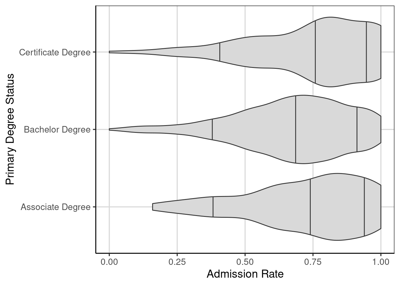
Figure 9.3: Violin plots of the college admission rates by the primary degree status.
Exploring Figure 9.3 shows that there are some small differences in the center (median) of the admission rates across the three primary degree statuses. In particular, schools that are primarily bachelor degree granting schools have evidence of slightly lower admission rates compared to primarily associate and certificate degree granting schools. The variation (shown by the gap between the 10th and 90th percentiles) and shapes of the distributions are relatively similar, being left or negatively skewed.
9.2.2 Linear Regression with three categories/groups
As there was small observed differences noted in the center of the admission rates across the three degree statuses, this can be explored more explicitly by fitting a linear regression model. This will make use of the lm() function in R and the formula is very similar to what was done before when the attribute only had two categories or groups. This also mimics the formula from the violin plot above.
##               (Intercept)    preddegBachelor Degree preddegCertificate Degree
##                0.72296993               -0.05170254                0.02193828
Notice that now there are three coefficients from the linear regression now instead of the two before. There is still the y-intercept, but now there are two linear slope terms. What do these terms represent? The names of the terms may give some hint into what these terms may represent.
To explore this issue, it is helpful to explore how these linear slope terms are created from the primary degree status attribute. Recall when there are two categories with an attribute, a dummy or indicator attribute is created by default where the categories are represented numerically. By default, one category is represented by a value of 0 and the second is represented by a value of 1 (see Table 9.1 for a reminder to how this was created for the snow attribute).
When there are more than two categories or groups, it now takes more than one attribute to represent the categories in a similar fashion. Table 9.2 shows this default behavior in creating the dummy or indicator attributes that the linear regression uses internally. Notice that there need to be two attributes to fully represent all three categories from the original attribute. By default, the lm() function represents the category that is closer to the letter “A” to be the reference group. This category is represented solely by 0’s in the new attributes that are created and similar to the analysis with two categories or groups, the referent group is tied to the y-intercept.
knitr::kable(
  data.frame(primary_degree = c('Associate', 'Bachelor', 'Certificate'),
             bachelor = c(0, 1, 0),
             certificate = c(0, 0, 1)),
  caption = "Default dummy/indicator attributes for an attribute with three categories/groups for a linear regression."
)| primary_degree | bachelor | certificate |
|---|---|---|
| Associate | 0 | 0 |
| Bachelor | 1 | 0 |
| Certificate | 0 | 1 |
The two additional terms, labeled “bachelor” and “certificate” in Table 9.2, are the terms associated with the two linear slopes from the coefficients. The linear slope terms are interpreted as the change in the outcome for a one unit change in the attribute. For the two attributes in Table 9.2, there is only a one unit change possible and the one unit change indicates a movement from one category (the associate degree group) to either the bachelor or certificate degree groups. Therefore, as with the two category analysis, each linear slope is interpreted as the mean difference between the reference category (associate degree group here) and the category represented by a value of 1.
Going back to the coefficients (the means for the categories are also shown for reference) from the linear regression, the y-intercept would represent the mean value for the associate degree group. This can be confirmed by looking at the results below, but theoretically, this occurs because the y-intercept represents the mean of the outcome when all terms in the regression are 0, this occurs for this model for those associate degree schools as shown in Table 9.2. The remaining two terms represent the change in admission rates for a one unit change in those attributes. The one with the bachelor degree in the name represents the change in admission rate comparing an associate degree school with a bachelor degree school. Similarly, the term with certificate degree in the name represents the change in admission rates comparing an associate degree school with a certificate degree school. If the differences in the mean values are computed, the values from the linear regression coefficients can be recreated.
##               (Intercept)    preddegBachelor Degree preddegCertificate Degree
## 0.72296993 -0.05170254 0.02193828## response preddeg mean
## 1 adm_rate Associate Degree 0.7229699
## 2 adm_rate Bachelor Degree 0.6712674
## 3 adm_rate Certificate Degree 0.7449082By default, the linear regression model will not compare the mean difference between all pairwise groups. More specifically, the difference between the bachelor degree and certificate degree is not done. There are ways to do this, often referred to as contrasts, but these are not discussed here. If the difference between bachelor degree and certificate degree schools is of interest, the contrasts could be explored or the reference group could be modified. If the reference group is modified, then another comparison would be missing. The following shows what changing the reference group could have on the model.
Table 9.3 shows what the changing of the reference group can be. In this example, the certificate degree group will serve as the reference group, that is, will be the group that is represented as all zeros. What impact will this have on the resulting linear regression model? Also, what mean difference will be missing from the results?
knitr::kable(
  data.frame(primary_degree = c('Associate', 'Bachelor', 'Certificate'),
             associate = c(1, 0, 0),
             bachelor = c(0, 1, 0)),
  caption = "Modifying dummy/indicator attributes for an attribute with three categories/groups for a linear regression."
)| primary_degree | associate | bachelor |
|---|---|---|
| Associate | 1 | 0 |
| Bachelor | 0 | 1 |
| Certificate | 0 | 0 |
The following code manually creates these two new attributes shown in Table 9.3. Then, the linear regression model is fitted with these two newly created attributes.
college_score <- college_score %>%
  mutate(associate = ifelse(preddeg == 'Associate Degree', 1, 0),
         bachelor = ifelse(preddeg == 'Bachelor Degree', 1, 0))

adm_model_cert <- lm(adm_rate ~ associate + bachelor, data = college_score)
coef(adm_model_cert)
## (Intercept) associate bachelor
## 0.74490821 -0.02193828 -0.07364082Notice that the y-intercept differs from before and represents the mean of the certificate degree group. The two linear slope terms represent the mean difference between the associate and bachelor degree group compared to the associate degree group. The missing mean difference comparison is that between the associate degree and bachelor degree groups.