Chapter 5 Classification
Classification is a task that tries to predict group membership using available data attributes. For example, one could predict if an individual is left or right-handed based on their preferences for music or hobbies. In this situation, the classification technique would look for patterns in the music or hobby preferences to help differentiate between left- or right-handed. The data may show that left-handed individuals are more likely to be artistic; therefore, those who rated more highly artistic tasks would be more likely to be classified as left-handed.
To perform the classification tasks in this chapter, we will consider a group of statistical models called decision trees, or more specifically, in this case, classification trees. Statistical models are used to help us as humans understand patterns in the data and estimate uncertainty. Uncertainty comes from the variation in the data. For example, those who are left-handed are likely not all interested in or like artistic hobbies or tasks, but on average, they may be more likely to enjoy these tasks than right-handed individuals. Statistical models help us to understand if the differences shown in our sample of data are due to signal (true differences) or noise (uncertainty).
In the remaining sections of this chapter, we will build off of this idea of statistical models to understand how these work with classification trees to classify. Furthermore, we will develop heuristics to understand if our statistical model is practically useful. For example, does our model help us do our classification task above randomly guessing? We will use a few additional packages to perform the classification tasks, including rpart, rpart.plot, and rsample. The following code chunk loads all the packages used in the current chapter.
library(tidyverse)
library(ggformula)
library(statthink)
library(rpart)
library(rpart.plot)
library(rsample)

# Add plot theme
theme_set(theme_statthinking(base_size = 14))

us_weather <- mutate(us_weather, snow_factor = factor(snow),
                     snow_numeric = ifelse(snow == 'Yes', 1, 0))
The book will also use a package on GitHub that helps visualize the decision trees in more detail. This can be installed with the following code, assuming the remotes package is already installed.
The package can then be loaded with the following single line of code.
5.1 Decision Trees
We will continue to use the United States weather data introduced in Chapter 4. Given that this data was for the winter months in the United States, the classification task we will attempt to perform is to correctly predict if it will snow on a particular day that precipitation occurs. To understand how often it rains vs. snows in these data, we can use the count() function. For the count() function, the first argument is the name of the data, followed by the attributes we wish to count the number of observations in the unique values of those attributes.
## # A tibble: 4 × 3
##   rain  snow      n
##   <chr> <chr> <int>
## 1 No    No     1571
## 2 No    Yes     728
## 3 Yes   No      821
## 4 Yes   Yes     280
The following table counts the times it rains or snows in the data. There are days when it does not rain or snow, as shown by the row with No for the rain and snow columns. There are also days when it rains and snows, as shown in the row with Yes in the rain and snow columns. Not surprisingly, it does not rain or snow most days, occurring about 46% of the time (\(1571 / (1571 + 728 + 821 + 280) = 46.2%\)). Using similar logic, about 8% of the data days have snow and rain.
5.1.1 Fitting a Classification Tree
Let’s class_tree our first classification tree to predict whether it snowed on a particular day. For this, we will use the rpart() function from the rpart package. The first argument to the rpart() function is a formula where the outcome of interest is specified to the left of the ~, and the attributes that are predictive of the outcome are specified to the right of the ~ separated with + signs. The second argument specifies the method for which we want to run the analysis. In this case, we want to classify days based on the values in the data. Therefore, we specify method = 'class'. The final argument is the data element, us_weather.
Before we fit the model, what attributes predict whether it will rain or snow on a particular day during winter? Take a few minutes to brainstorm some ideas.
Some attributes may be interesting to explore in this example, including the day’s average, minimum, and maximum temperature. These are all continuous attributes, meaning that these attributes can take many data values. The model is not limited to those types of data attributes, but that is where we will start the classification journey.
Notice that the fitted model is saved to the object, class_tree. This will allow for easier interaction with the model results later. Then, after fitting the model, the model is visualized using the rpart.plot() function. The primary argument to the rpart.plot() function is the fitted model object from the rpart() function. Here, that would be class_tree. The additional arguments are passed below to adjust the appearance of the visualization.
class_tree <- rpart(snow_factor ~ drybulbtemp_min + drybulbtemp_max,
   method = 'class', data = us_weather)

rpart.plot(class_tree, roundint = FALSE, type = 3, branch = .3)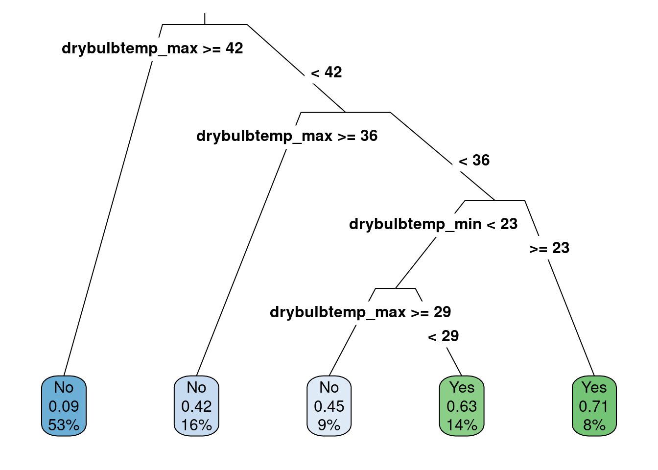
Figure 5.1: Classification tree predicting whether it will snow or rain
The visualization shown in Figure 5.1 produces the decision rules for the classification tree. The decision rules start from the top of the tree and proceed down the branches to the leaf nodes at the bottom that highlight the predictions. By default, the rpart() algorithm assumes that each split should go in two directions. For example, the first split occurs when the maximum temperature is less than 42 degrees Fahrenheit or greater than or equal to 42 degrees Fahrenheit. If the maximum temperature for the day is greater than or equal to 42 degrees Fahrenheit, the first split in the decision tree follows the left-most branch and proceeds to the left-most leaf node. This results in predicting those days when it does not snow (i.e., a category prediction of “No”). The numbers below the “No” label indicate the probability of snowing on a day when the maximum temperature is greater than or equal to 42 degrees Fahrenheit is 0.09 or about 9%. Furthermore, this category represents about 53% of the total data cases inputted.
We come to another split following the right-hand split of the first decision, which occurs for days when the maximum temperature is less than 42 degrees. This split is again for the maximum temperature, but now the split comes at 36 degrees Fahrenheit. In this case, if the temperature is greater than or equal to 36 degrees Fahrenheit, the decision leads to the next leaf node and a prediction that it will not snow that day. For this leaf node, there is more uncertainty in the prediction, where, on average, the probability of snow would be 0.42 or about 42%. This value is less than 50%. Therefore, the “No” category is chosen. This occurs for about 16% of the data.
For days when the maximum temperature is less than 36 degrees Fahrenheit, the decision tree moves further to the right and comes to another split. The third split in the decision tree is for the minimum daily temperature and occurs at 23 degrees Fahrenheit. The right-most leaf node is predicted for days where the minimum temperature is greater than 23 degrees Fahrenheit (but also has a maximum temperature of less than 36 degrees Fahrenheit). For these data cases, about 8% of the total data, the prediction is that it will snow (i.e., “Yes” category), and the probability of snowing in those conditions is about 71%.
Finally, suppose the minimum temperature is less than 23 degrees Fahrenheit (but also had a maximum temperature of less than 36 degrees Fahrenheit). In that case, one last split occurs at the maximum temperature of 29 degrees Fahrenheit. This leads to the last two leaf nodes in the middle of Figure 5.1. One prediction states it will snow for maximum temperatures less than 29 degrees, and one predicts it will not snow for those greater than or equal to 29 degrees. Both leaf nodes have more uncertainty in the predictions, being close to 50% probability.
Note that the average daily temperature was included in the model fitting procedure but not in the results shown in Figure 5.1. Why did this happen? The model results show the attributes that helped predict whether it snowed. For this task, the model found that the maximum and minimum temperature attributes were more helpful than others, and adding the average daily temperature did not improve the predictions. For this reason, it did not show up in the decision tree. Furthermore, the most informative attributes in making the prediction are at the top of the decision tree. In the results shown in Figure 5.1, the maximum daily temperature was the most helpful attribute in making the snow or not prediction.
The decision tree rules can also be requested in text form using the rpart.rules() function and are shown below. The rows in the output are the leaf nodes from 5.1, and the columns represent the probability of snow, the applicable decision rules, and the percentage of data found in each row. For example, for the first row, it is predicted to snow about 9% of the time when the maximum temperature for the day is greater than 42, which occurred in 53% of the original data. Since the probability is less than 50%, the prediction would be that it would not snow on days with those characteristics. In rows with & symbols, these separate different data attributes helpful in the classification model.
##  snow_factor                                                            cover
##         0.09 when drybulbtemp_max >=       42                             53%
##         0.42 when drybulbtemp_max is 36 to 42                             16%
##         0.45 when drybulbtemp_max is 29 to 36 & drybulbtemp_min <  23      9%
##         0.63 when drybulbtemp_max <  29       & drybulbtemp_min <  23     14%
##         0.71 when drybulbtemp_max <  36       & drybulbtemp_min >= 23      8%
5.1.1.1 Visualizing Results
We will visualize the study results to get another view of what the classification model is doing in this scenario. First, the gf_point() function creates a scatterplot where the maximum temperature is shown on the x-axis and the minimum temperature is shown on the y-axis, shown in Figure 5.2. There is a positive relationship between maximum and minimum temperatures, and it tends to snow on days with lower maximum temperatures. However, there is not perfect separation, meaning there are days with similar minimum and maximum temperatures where it does snow and others where it does not snow.
temperature_scatter <- gf_point(drybulbtemp_min ~ drybulbtemp_max,
                                color = ~ snow_factor,
                                alpha = .75,
                                data = us_weather) %>%
  gf_labs(x = "Maximum Temperature (in F)",
          y = "Minimum Temperature (in F)",
          color = "Snow?")

temperature_scatter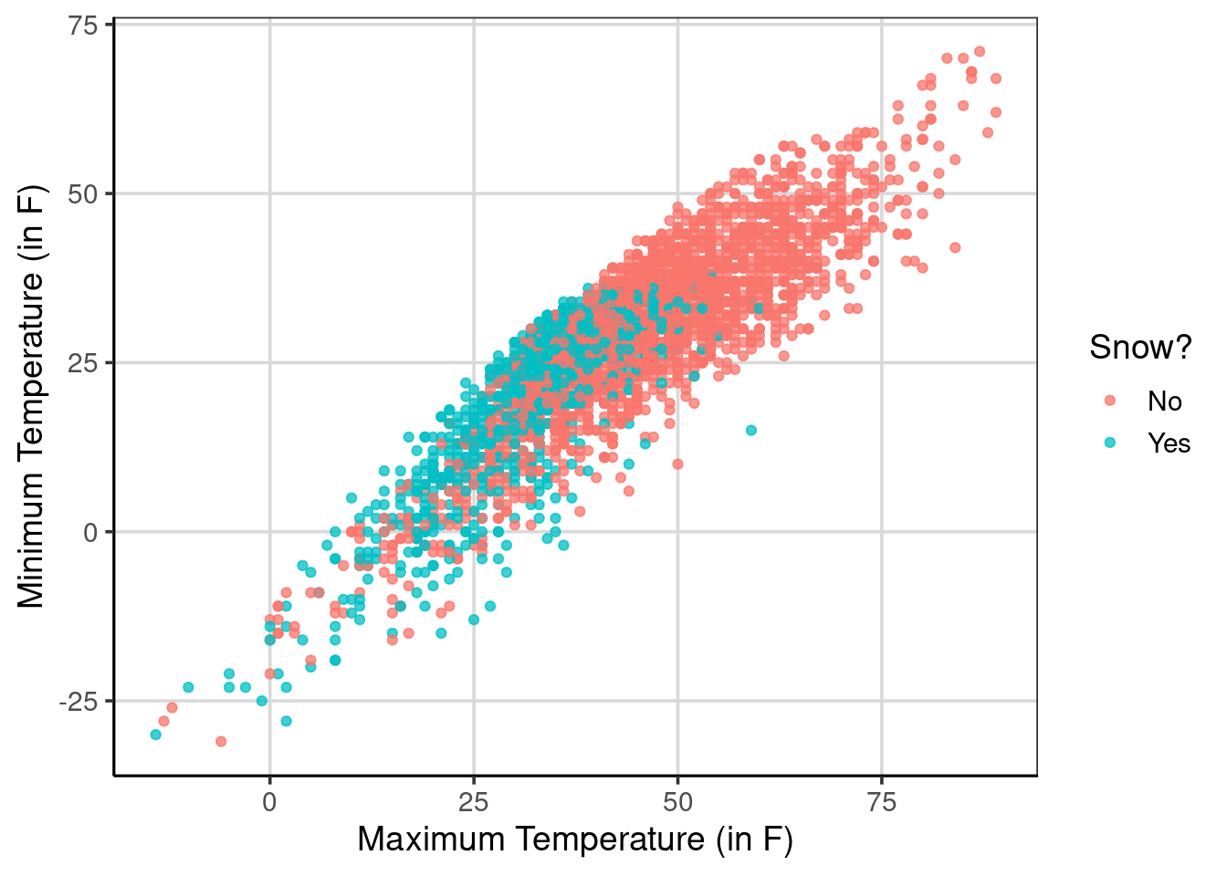
Figure 5.2: Scatterplot of the minimum and maximum daily temperatures and if it snows or not
The following figure will use the parttree R package to visualize what the classification model is doing. The geom_parttree() function is used where the primary argument is the saved classification model object that was saved earlier, named class_tree. The other two arguments to add are the fill aesthetic, which is the outcome of the classification tree, and the alpha aesthetic, which controls how transparent the background colors are. This example uses alpha = .25 where the transparency is set at 75% (i.e., 1 - 0.25 = 0.75). Setting a higher alpha value would reduce the transparency, whereas a smaller one would increase the transparency.
Figure 5.3 gives a sense of what the classification model does to the data. The classification model breaks the data into quadrants and makes a single uniform prediction for those quadrants. For example, the areas of the figure that are shaded as red are days in which the model predicts it will not snow, whereas the blue/green color are days in which the model predicts it will snow. The data points are the real data cases. Therefore, there are instances inside each quadrant in which the model did not correctly predict or classify the case. Each quadrant in the figure represents different leaf nodes shown in 5.1, and each represents a different likelihood of snowing.
temperature_scatter +
  geom_parttree(data = class_tree, aes(fill = snow_factor), alpha = .25) +
  scale_fill_discrete("Snow?")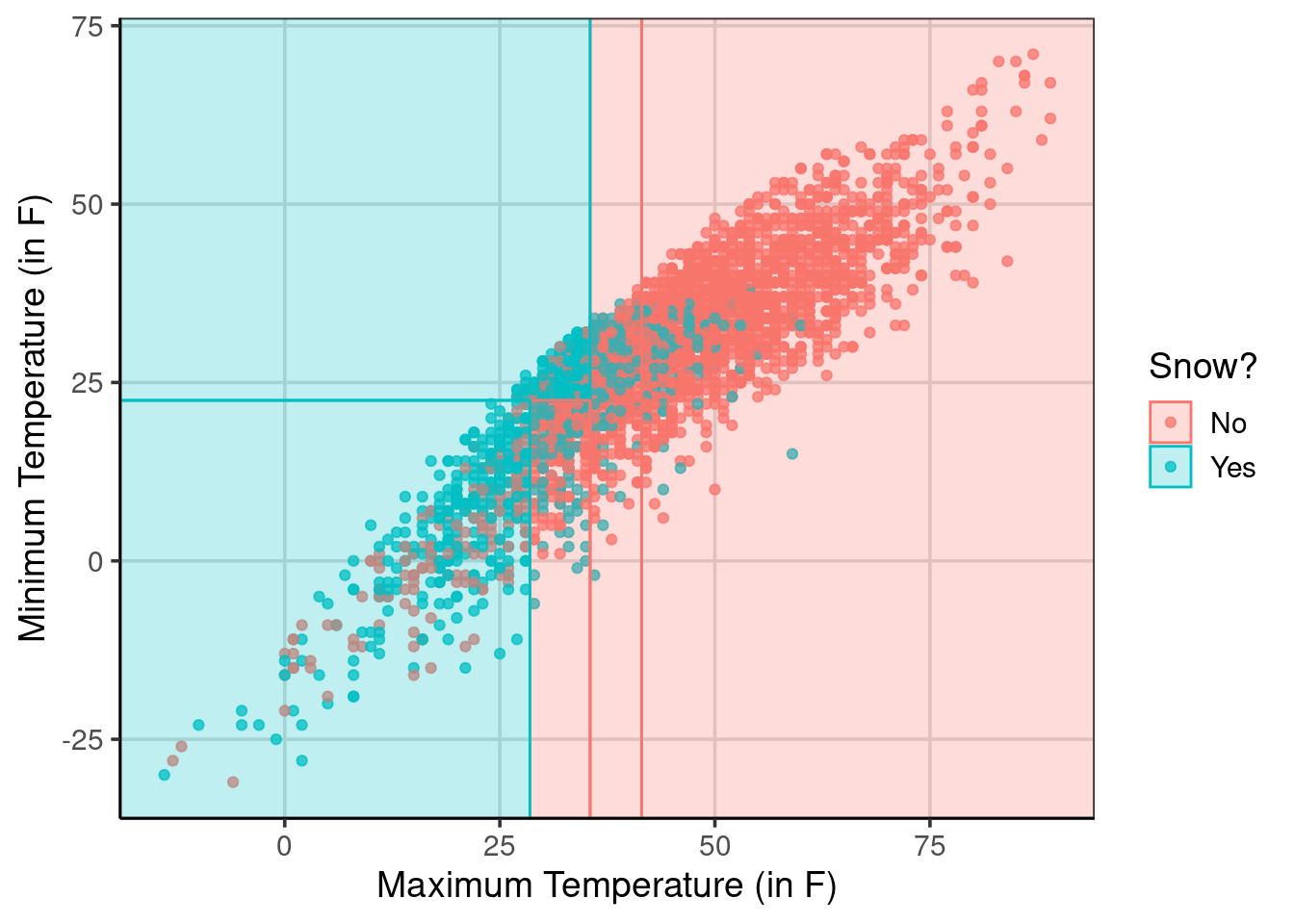
Figure 5.3: Showing the predictions based on the classification tree with the raw data
5.1.2 Accuracy
Evaluating the model’s accuracy helps to understand how well the model performed the classification. The classification model predicts whether it will snow on a given day based on the observed data where it was recorded if it snowed that day or not. Therefore, the data has for each day if it snowed or not. With this information, how could we evaluate how well the model performed in classifying whether it snows on a given day?
To do this, the observation of whether it snowed or not can be compared to the model prediction of whether it snowed or not. Better classification accuracy would occur when the observed snow or no snow attribute is the same as the model prediction of snow or not. That is, when the same category is predicted as what is observed, this will result in better classification accuracy, which is good. If there are cases where different categories between the observed and predicted categories or classes, this would be an example of poor classification accuracy.
In the data so far, there is the observed data value on whether it snowed. This attribute was used to fit the classification model, named snow_factor. To add the predicted classes based on the classification model shown in Figure 5.1, the predict() function can be used. To use the predict() function, a primary argument is a model object, the classification model object named class_tree. To get the predicted classes, that is, the leaf nodes at the bottom of Figure 5.1, a second argument is needed, type = 'class', which tells the predict function to report the top line of the leaf nodes in Figure 5.1. These predicted classes are saved into a new attribute named snow_predict. Another added element represents the probability of a particular day not snowing or snowing. These are reported in the columns No and Yes in the resulting output.
us_weather_predict <- us_weather %>%
  mutate(snow_predict = predict(class_tree, type = 'class')) %>%
  cbind(predict(class_tree, type = 'prob'))
head(us_weather_predict, n = 20)
## station date dewpoint_avg drybulbtemp_avg
## 1 72528014733 2018-10-01 23:59:00 51 52
## 2 72528014733 2018-10-02 23:59:00 59 60
## 3 72528014733 2018-10-03 23:59:00 55 62
## 4 72528014733 2018-10-04 23:59:00 56 60
## 5 72528014733 2018-10-05 23:59:00 43 51
## 6 72528014733 2018-10-06 23:59:00 62 63
## 7 72528014733 2018-10-07 23:59:00 58 60
## 8 72528014733 2018-10-08 23:59:00 61 68
## 9 72528014733 2018-10-09 23:59:00 66 77
## 10 72528014733 2018-10-10 23:59:00 64 74
## 11 72528014733 2018-10-11 23:59:00 56 62
## 12 72528014733 2018-10-12 23:59:00 36 47
## 13 72528014733 2018-10-13 23:59:00 36 46
## 14 72528014733 2018-10-14 23:59:00 39 51
## 15 72528014733 2018-10-15 23:59:00 43 49
## 16 72528014733 2018-10-16 23:59:00 32 45
## 17 72528014733 2018-10-17 23:59:00 34 45
## 18 72528014733 2018-10-18 23:59:00 30 40
## 19 72528014733 2018-10-19 23:59:00 38 50
## 20 72528014733 2018-10-20 23:59:00 42 48
## relativehumidity_avg sealevelpressure_avg stationpressure_avg
## 1 95 30.26 29.50
## 2 96 30.01 29.26
## 3 86 30.05 29.31
## 4 77 29.97 29.18
## 5 75 30.17 29.41
## 6 90 30.03 29.28
## 7 97 30.24 29.44
## 8 84 30.23 29.49
## 9 72 30.13 29.39
## 10 70 29.89 29.18
## 11 77 29.66 28.91
## 12 66 29.82 29.05
## 13 74 29.95 29.15
## 14 69 30.12 29.34
## 15 79 29.94 29.16
## 16 61 30.06 29.31
## 17 66 30.02 29.21
## 18 68 30.37 29.59
## 19 63 30.00 29.28
## 20 86 29.68 28.90
## wetbulbtemp_avg windspeed_avg cooling_degree_days
## 1 51 10.9 0
## 2 60 8.5 0
## 3 57 5.5 0
## 4 59 12.5 0
## 5 47 9.6 0
## 6 63 8.1 0
## 7 58 9.4 0
## 8 63 7.9 3
## 9 69 11.4 12
## 10 68 10.6 9
## 11 59 15.7 0
## 12 42 12.5 0
## 13 41 8.4 0
## 14 45 6.5 0
## 15 47 12.8 0
## 16 39 15.8 0
## 17 40 15.3 0
## 18 36 11.2 0
## 19 45 18.0 0
## 20 45 12.3 0
## departure_from_normal_temperature heating_degree_days drybulbtemp_max
## 1 -4.6 13 54
## 2 3.8 5 69
## 3 6.2 3 70
## 4 4.6 5 74
## 5 -4.0 14 58
## 6 8.4 2 74
## 7 5.7 5 67
## 8 14.1 0 82
## 9 23.5 0 83
## 10 20.9 0 81
## 11 9.2 3 74
## 12 -5.4 18 51
## 13 -6.1 19 51
## 14 -0.7 14 60
## 15 -2.4 16 58
## 16 -6.0 20 52
## 17 -5.7 20 53
## 18 -10.4 25 47
## 19 0.0 15 57
## 20 -1.7 17 55
## drybulbtemp_min peak_wind_direction peak_wind_speed precipitation snow_depth
## 1 50 50 24 0.090 0
## 2 51 320 24 1.000 0
## 3 53 210 25 0.005 0
## 4 46 220 39 0.450 0
## 5 44 100 21 0.000 0
## 6 51 250 26 0.730 0
## 7 53 50 21 0.020 0
## 8 53 70 20 0.010 0
## 9 70 210 30 0.000 0
## 10 67 190 25 0.005 0
## 11 50 220 39 0.010 0
## 12 42 280 27 0.010 0
## 13 40 250 24 0.140 0
## 14 41 250 17 0.000 0
## 15 40 220 37 0.090 0
## 16 38 210 40 0.005 0
## 17 36 290 36 0.050 0
## 18 33 250 28 0.030 0
## 19 43 210 48 0.005 0
## 20 40 220 49 0.470 0
## snowfall wind_direction wind_speed weather_occurances sunrise sunset month
## 1 0.000 60 20 RA DZ BR 612 1757 Oct
## 2 0.000 320 21 RA DZ BR 613 1755 Oct
## 3 0.000 200 20 DZ BR 614 1753 Oct
## 4 0.000 220 32 TS RA BR 615 1751 Oct
## 5 0.000 70 16 <NA> 616 1750 Oct
## 6 0.000 200 20 TS RA BR 618 1748 Oct
## 7 0.000 60 16 RA DZ BR 619 1746 Oct
## 8 0.000 70 16 RA 620 1744 Oct
## 9 0.000 210 23 <NA> 621 1743 Oct
## 10 0.000 190 21 <NA> 622 1741 Oct
## 11 0.000 240 29 RA 623 1739 Oct
## 12 0.000 260 21 RA 625 1738 Oct
## 13 0.000 240 18 RA BR 626 1736 Oct
## 14 0.000 250 14 <NA> 627 1734 Oct
## 15 0.000 290 28 RA BR 628 1733 Oct
## 16 0.000 220 30 RA 629 1731 Oct
## 17 0.005 290 28 GR RA SN 631 1729 Oct
## 18 0.005 240 21 RA SN HZ 632 1728 Oct
## 19 0.000 240 35 RA 633 1726 Oct
## 20 0.100 240 36 TS GR RA BR PL 634 1725 Oct
## month_numeric year day winter_group location fog mist drizzle rain snow
## 1 10 2018 1 18_19 Buffalo, NY No Yes Yes Yes No
## 2 10 2018 2 18_19 Buffalo, NY No Yes Yes Yes No
## 3 10 2018 3 18_19 Buffalo, NY No Yes Yes No No
## 4 10 2018 4 18_19 Buffalo, NY No Yes No Yes No
## 5 10 2018 5 18_19 Buffalo, NY No No No No No
## 6 10 2018 6 18_19 Buffalo, NY No Yes No Yes No
## 7 10 2018 7 18_19 Buffalo, NY No Yes Yes Yes No
## 8 10 2018 8 18_19 Buffalo, NY No No No Yes No
## 9 10 2018 9 18_19 Buffalo, NY No No No No No
## 10 10 2018 10 18_19 Buffalo, NY No No No No No
## 11 10 2018 11 18_19 Buffalo, NY No No No Yes No
## 12 10 2018 12 18_19 Buffalo, NY No No No Yes No
## 13 10 2018 13 18_19 Buffalo, NY No Yes No Yes No
## 14 10 2018 14 18_19 Buffalo, NY No No No No No
## 15 10 2018 15 18_19 Buffalo, NY No Yes No Yes No
## 16 10 2018 16 18_19 Buffalo, NY No No No Yes No
## 17 10 2018 17 18_19 Buffalo, NY No No No Yes Yes
## 18 10 2018 18 18_19 Buffalo, NY No No No Yes Yes
## 19 10 2018 19 18_19 Buffalo, NY No No No Yes No
## 20 10 2018 20 18_19 Buffalo, NY No Yes No Yes No
## snow_factor snow_numeric snow_predict No Yes
## 1 No 0 No 0.9130676 0.08693245
## 2 No 0 No 0.9130676 0.08693245
## 3 No 0 No 0.9130676 0.08693245
## 4 No 0 No 0.9130676 0.08693245
## 5 No 0 No 0.9130676 0.08693245
## 6 No 0 No 0.9130676 0.08693245
## 7 No 0 No 0.9130676 0.08693245
## 8 No 0 No 0.9130676 0.08693245
## 9 No 0 No 0.9130676 0.08693245
## 10 No 0 No 0.9130676 0.08693245
## 11 No 0 No 0.9130676 0.08693245
## 12 No 0 No 0.9130676 0.08693245
## 13 No 0 No 0.9130676 0.08693245
## 14 No 0 No 0.9130676 0.08693245
## 15 No 0 No 0.9130676 0.08693245
## 16 No 0 No 0.9130676 0.08693245
## 17 Yes 1 No 0.9130676 0.08693245
## 18 Yes 1 No 0.9130676 0.08693245
## 19 No 0 No 0.9130676 0.08693245
## 20 No 0 No 0.9130676 0.08693245The first 20 rows of the resulting data are shown. Notice that for all of these 20 rows, the predicted class, shown in the attribute, snow_predict, is represented as “No” indicating that these days it was not predicted to snow. Notice toward the bottom, however, that there were two days in which it did, in fact, snow, shown in the column named snow_factor. These would represent two misclassification cases as the observed data differs from the model predicted class. Finally, the probabilities shown in the last two attribute columns are all the same here. These are all the same as the maximum dry bulb temperature was greater than 42 degrees Fahrenheit in all of these days. Therefore, all 20 cases shown in the data here represent the left-most leaf node shown in Figure 5.1.
Now that the observed data and the model predicted classes are in the data, it is possible to produce a table that shows how many observations were correctly predicted (indicating better model accuracy). The count() function can be used where the observed and predicted class attributes are passed as arguments.
##   snow_factor snow_predict    n
## 1          No           No 2147
## 2          No          Yes  245
## 3         Yes           No  529
## 4         Yes          Yes  479
The resulting table shows the observed data values in the left-most column (snow_factor) followed by the predicted class (snow_predict) in the middle column. The final column represents the number of rows or observations in each combination of the first two columns. For example, the first row shows that 2,147 observations were counted that had the combination where it was observed and predicted to have not snowed that day. These 2,147 observations would be instances of correct classification. The second row shows that 245 observations did not snow, but the model predicted it would snow that day. All of the 245 observations were misclassified based on the classification model.
From this table, the overall model accuracy can be calculated by summing up the matched cases and dividing by the total number of observations. This computation would look like:
\[
accuracy = \frac{\textrm{matching predictions}}{\textrm{total observations}} = \frac{(2147 + 479)}{(2147 + 245 + 529 + 479)} = .772 = 77.2%
\]
This means that the overall classification accuracy for this example was just over 77%, meaning that on about 77% of days, the model was able to classify whether it snowed or not correctly. This computation can also be done programmatically. To do this, a new attribute named same_class, can be added to the data that is given a value of 1 if the observed data matches the predicted class and a 0 otherwise. Descriptive statistics, such as the mean and sum, can be computed on this new vector to represent the accuracy as a proportion and the number of matching predictions (the numerator shown in the equation above).
us_weather_predict %>%
  mutate(same_class = ifelse(snow_factor == snow_predict, 1, 0)) %>%
  df_stats(~ same_class, mean, sum)
## response mean sum
## 1 same_class 0.7723529 2626Notice that the same model accuracy was found, about 77.2%, and the number of observations (i.e., days) that the correct classification was found was 2,626 days. Is correctly predicting 77.2% of the days good? That is, is this model doing an excellent job at accurately predicting if it will snow or not on that day?
5.1.2.1 Conditional Accuracy
One potential misleading element of simply computing the overall model accuracy, as done above, is that the accuracy will likely differ based on which class. This could occur for a few reasons. One, it could be more difficult to predict one of the classes due to similarities in data across the two classes. The two classes are also often unbalanced. Therefore, exploring the overall model accuracy will give more weight to the group/class with more data. In addition, this group has more data, so it could make it easier for the model to predict. These issues could be exacerbated in small sample conditions.
Therefore, similar to the earlier discussion in the book about multivariate distributions, it is often important to consider conditional or multivariate accuracy instead of the overall model accuracy. Let us explore this differently than simply computing a percentage. Instead, we could use a bar graph to explore the model’s accuracy. Figure 5.4 shows the number of correct classifications for the two observed data classes (i.e., snow or did not snow) on the x-axis by the predicted classes shown with the fill color in the bars. The fill color is red for days the model predicts it will not show and green/blue for days in which it will not snow. Therefore, accuracy would be represented in the left-bar by the red portion of the bar and the right-bar by the green/blue portion.
gf_bar(~ snow_factor, fill = ~snow_predict, data = us_weather_predict) %>%
  gf_labs(x = "Observed Snow Status",
          fill = "Predicted Snow Status")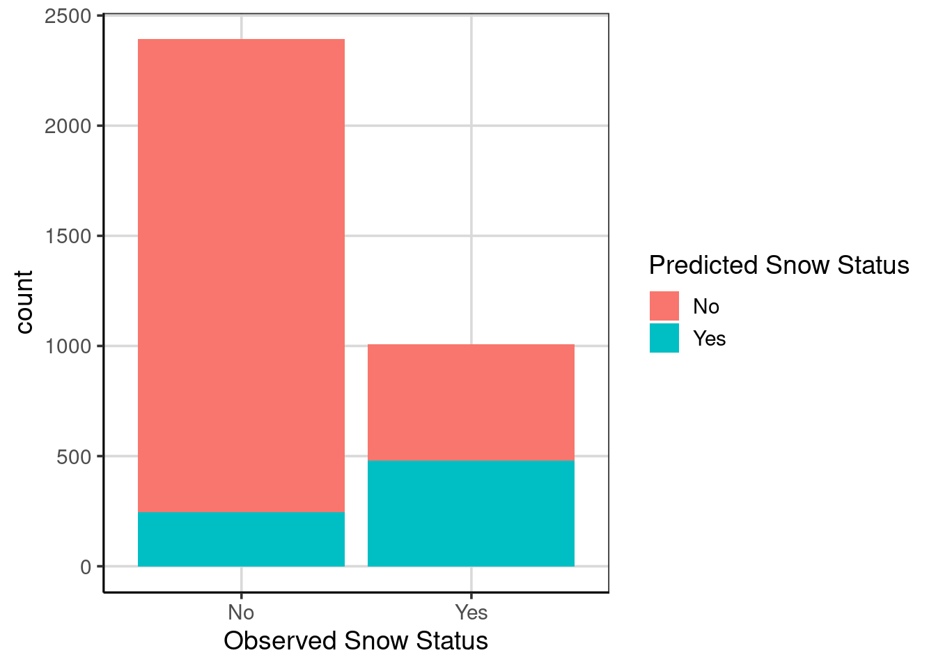
Figure 5.4: A bar graph showing the conditional prediction accuracy represented as counts.
Figure 5.4 could be a better picture to depict accuracy as the two groups have different observations, so comparisons between the bars are difficult. Secondly, the count metric makes estimating how many are in each group difficult. For example, it is difficult from the figure alone to know how many were incorrectly classified in the left-most bar represented by the blue/green color. These issues can be fixed by adding the argument, position = 'fill' which will scale each bar as a proportion, ranging from 0 to 1. The bar graph is scaling each bar based on the sample size to normalize differences.
gf_bar(~ snow_factor, fill = ~snow_predict,
       data = us_weather_predict, position = "fill") %>%
  gf_labs(x = "Observed Snow Status",
          fill = "Predicted Snow Status",
          y = 'Proportion') %>%
  gf_refine(scale_y_continuous(breaks = seq(0, 1, .1)))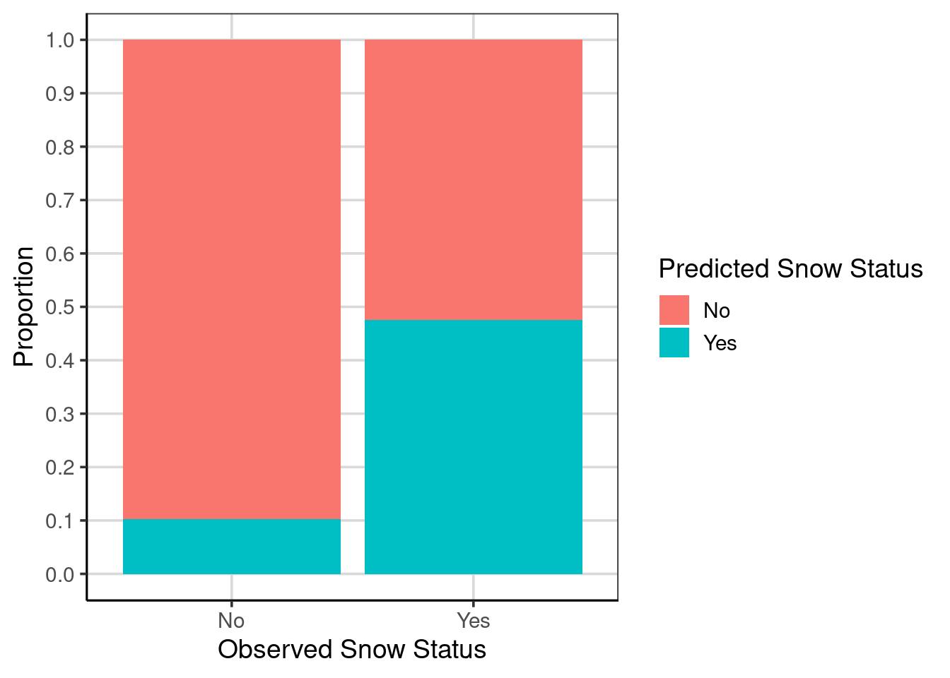
Figure 5.5: A bar graph showing the conditional prediction accuracy represented as a proportion.
From this new figure (Figure 5.5), it is much easier to estimate the prediction accuracy from the figure. For example, the green/blue portion of the left-most bar is at about 0.10, meaning that about 10% of the cases are misclassified and 90% would be correctly classified. Therefore, the classification accuracy for days in which it did not snow would be about 90%. Compare this to days when it did not snow (the right bar), where the prediction accuracy represented by the green/blue color is about 48%, meaning that the misclassification rate is about 52%.
Let us recalibrate how we think the model is doing. How well was the model performing when considering only the overall classification rate of about 77%? Now that we know, the model accurately predicts it will not snow about 90% of the time but can only identify that it will snow about 48%. How well is the model performing now? Would you feel comfortable using this model in the real world?
One last note: We can also compute the conditional model accuracy more directly using the df_stats() function as was done for the overall model accuracy. The primary difference in the code is to specify the same_class attribute to the left of the ~. This represents the attribute to compute the statistics of interest. Another attribute is added to the right of the ~ to represent the attribute to condition on, in this case, the observed data point of whether it snowed.
us_weather_predict %>%
  mutate(same_class = ifelse(snow_factor == snow_predict, 1, 0)) %>%
  df_stats(same_class ~ snow_factor, mean, sum, length)
## response snow_factor mean sum length
## 1 same_class No 0.8975753 2147 2392
## 2 same_class Yes 0.4751984 479 1008The output returns the conditional model accuracy as a proportion, the number of correct classifications for each class/group, and the total number of observations (both correct and incorrect classifications) for each class/group. The estimated values from the figure were very close to the actual calculated values, but we find the figure more engaging than just the statistics.
5.2 Adding Categorical Attributes
Up to now, the classification models have only used continuous attributes, that is, those that take on many different data values rather than a few specific values that represent categories or groups. Classification models do not need to be limited to only continuous attributes to predict the binary outcome. The model may also add some additional predictive power and accuracy with the inclusion of more attributes.
For example, one attribute that may be helpful in this context to predict whether it will snow on a given day could be the month of the year. The data used here are from the fall, winter, and spring seasons. Therefore, it would likely snow in the winter months rather than fall or spring. Prior to being included in the model, this can be visualized. Figure 5.6 shows a bar chart representing the proportion of days it tends to snow the most. Notice that it snows on some days every month; however, the frequency is much higher in January and February. As the proportion of days that it snows during different months of the year, this attribute could help predict days in which it snows.
gf_bar(~ month, fill = ~ snow, data = us_weather, position = 'fill') %>%
  gf_labs(x = "",
          y = "Proportion of days with snow",
          fill = "Snow?")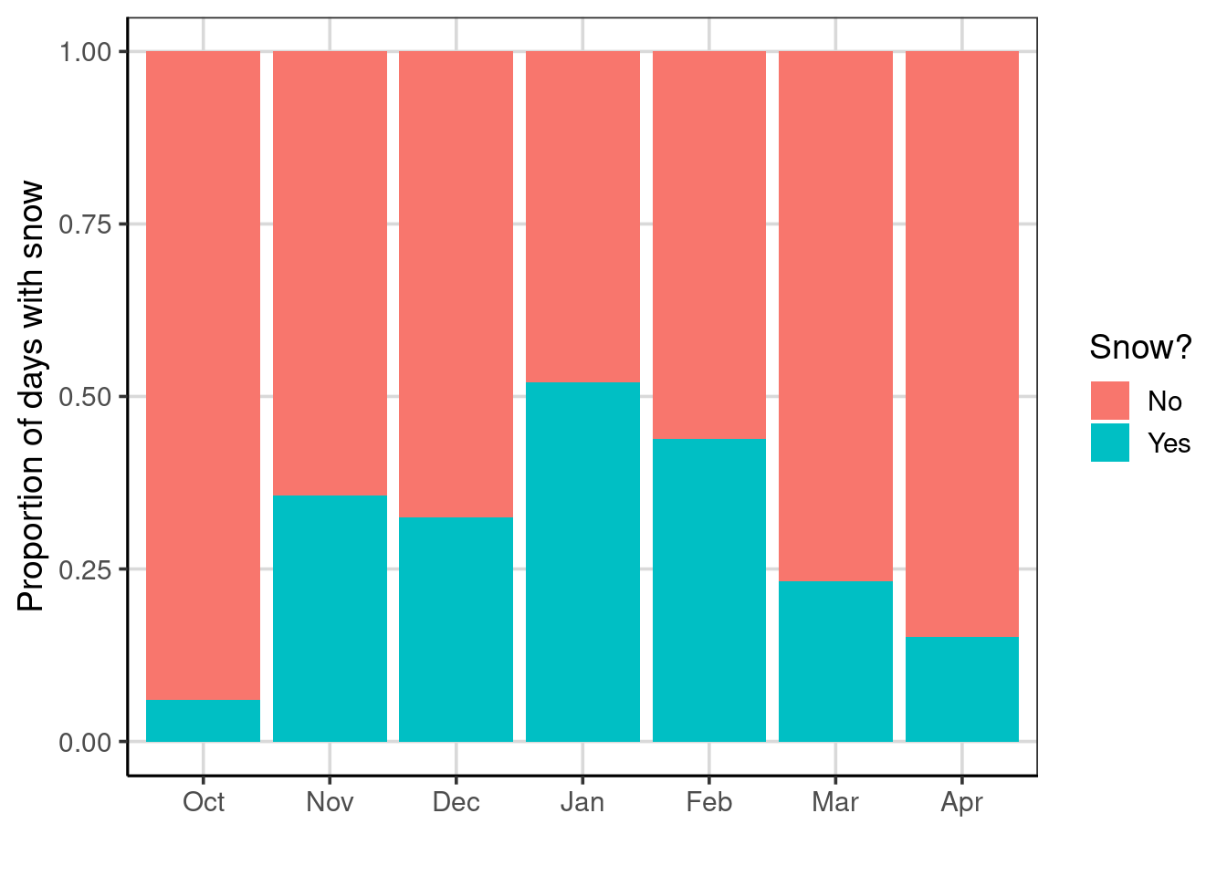
Figure 5.6: Bar chart showing the proportion of days that is snows across months
To add this attribute to the classification model, the model formula is extended to the right of the ~ to add + month. Note that this model is saved to the object, class_tree_month; the remaining code is the same as the previous model fitted with the two continuous attributes.
class_tree_month <- rpart(snow_factor ~ drybulbtemp_min + drybulbtemp_max + month,
   method = 'class', data = us_weather)

rpart.plot(class_tree_month, roundint = FALSE, type = 3, branch = .3)
Figure 5.7: The classification model with the month attribute added as a categorical attribute.
The fitted model classification results are shown in Figure 5.7. Notice that month does not show up in the figure of the classification tree, and Figure 5.7 is identical to Figure 5.1. Why is this happening, and what does this mean?
To understand what is happening, we need to think about temperature and how that may be related to the month of the year. In the United States, particularly in northern locations such as those with the data used here, the temperature varies quite substantially by the month of the year. Figure 5.8 shows the maximum daily temperature by the months of the year. Notice there is overlap in adjacent months, but the median for many of the months of the year is quite different from other months. This suggests that temperature can be a proxy for months and contains overlapping information. Not shown here, but a similar trend would likely be shown for the minimum daily temperature.
gf_violin(drybulbtemp_max ~ month, data = us_weather,
          fill = 'gray85', draw_quantiles = c(0.1, 0.5, 0.9)) %>%
  gf_labs(x = "",
          y = "Maximum daily temperature (in Fahrenheit)") %>%
  gf_refine(coord_flip())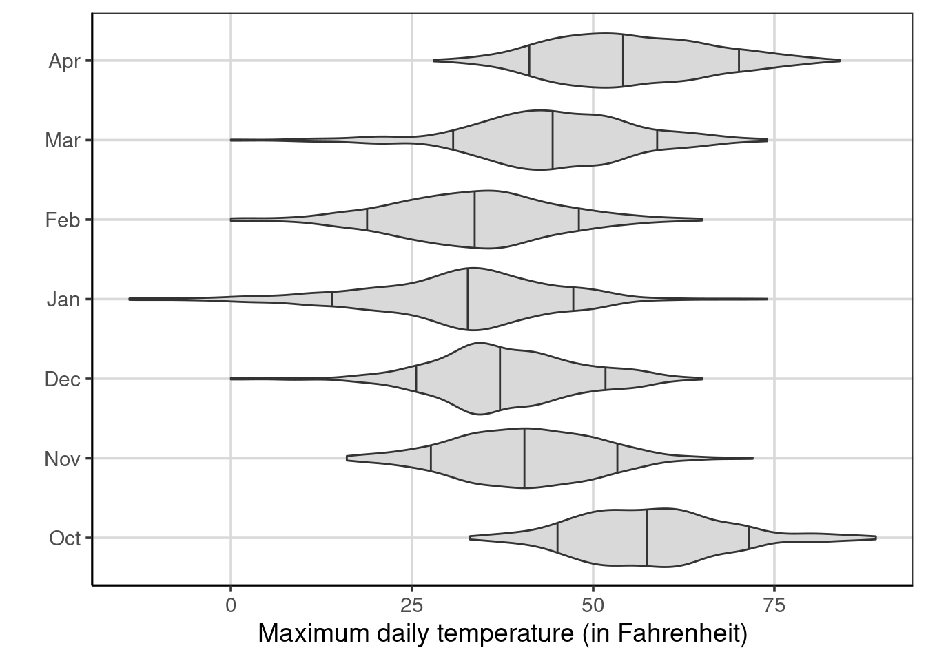
Figure 5.8: Violin plots of the maximum temperature by month of the year
For this reason, the month does not show up in the model because the classification model determined that the maximum and minimum daily temperatures were more useful at predicting whether it would snow on a particular day. This highlights an important point with these classification models: only the attributes most helpful in predicting the outcome will appear in the final classification model. An attribute must be helpful to appear in the classification results. As such, the model that included the month had the same classification tree and would result in identical predictions as the model fitted without the month. With identical predictions, the same model accuracy will also be obtained.
5.2.1 Exploring Location
Another categorical attribute in the data is the location of the weather observation. These locations are across various geographic locations within the northern part of the United States, including areas close to the Canadian border. Others are in the northeast portion of the United States as well. Thus, location could be important and include additional information over and above temperature. Figure 5.9 shows a bar chart that explores if some locations are more likely to have snow. The figure shows that Buffalo, Duluth, and Minneapolis all tend to have more days where it snows.
gf_bar(~ location, fill = ~ snow, data = us_weather, position = 'fill') %>%
  gf_labs(x = "",
          y = "Proportion of days with snow",
          fill = "Snow?")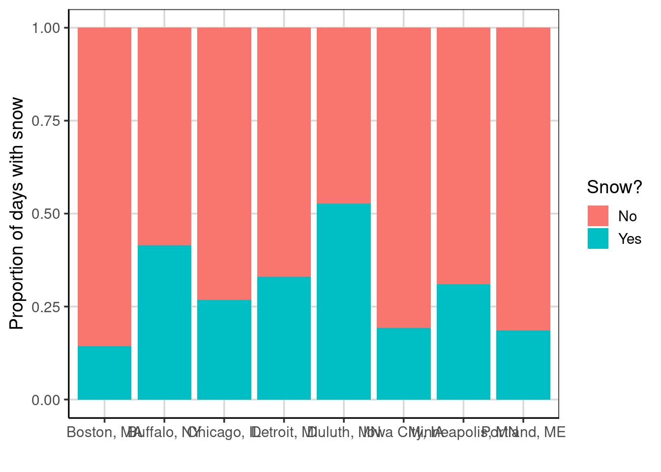
Figure 5.9: Bar chart showing the proportion of days that is snows across locations
We can also explore if the temperature is located to the location to determine if there is overlapping information in these. Recall that Buffalo, Duluth, and Minneapolis had evidence of higher days when it snowed. However, notice from Figure 5.10, that Duluth has a lower temperature than the rest, but Minneapolis and Buffalo have similar maximum daily temperatures to the other locations. The location may contain additional information that would be informative to the classification model.
gf_violin(drybulbtemp_max ~ location, data = us_weather,
          fill = 'gray85', draw_quantiles = c(0.1, 0.5, 0.9)) %>%
  gf_labs(x = "",
          y = "Maximum daily temperature (in Fahrenheit)") %>%
  gf_refine(coord_flip())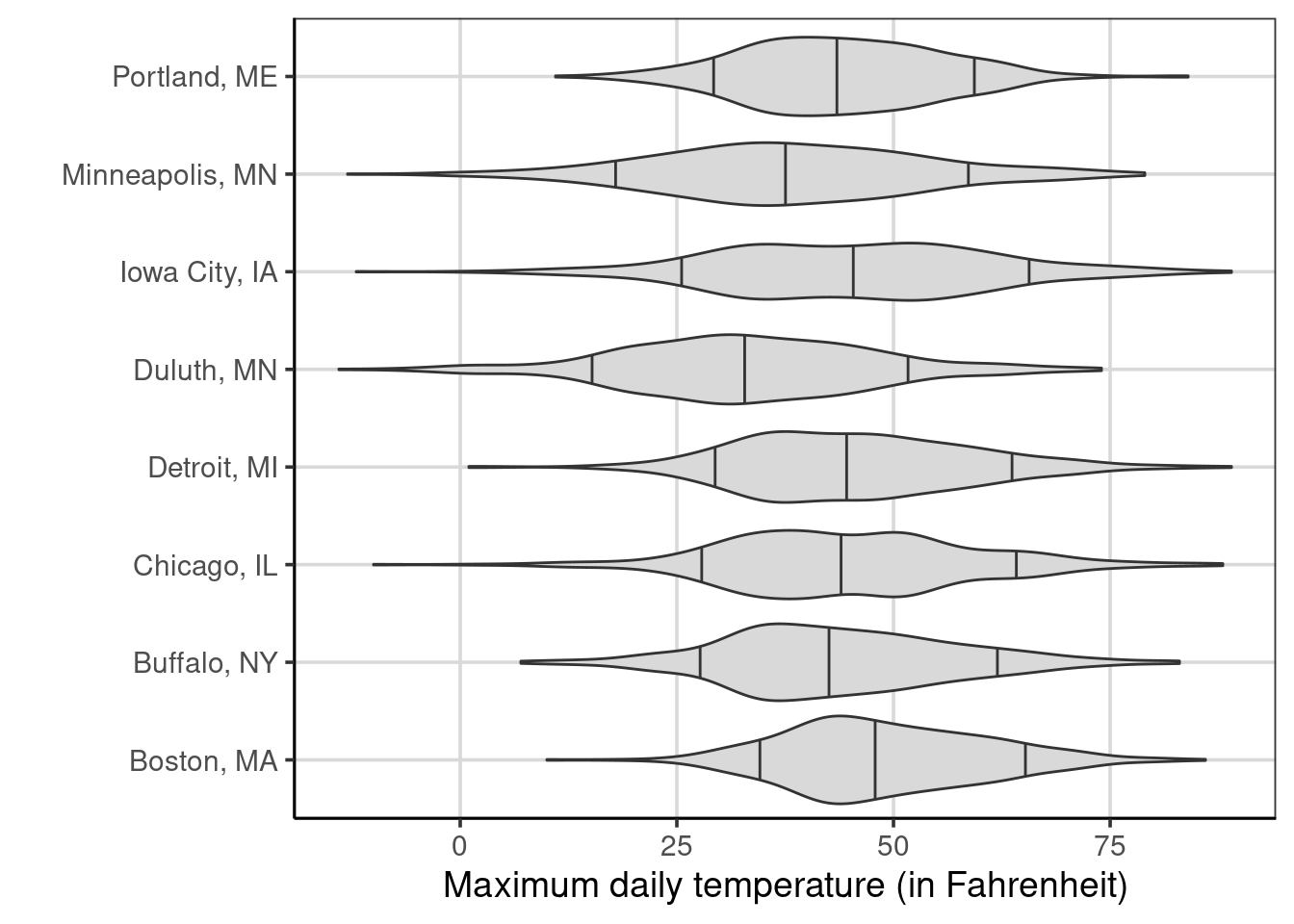
Figure 5.10: Violin plots of the maximum temperature by location
The location attribute is added similarly to the model as the month was. Note that the month attribute was removed as it was not deemed helpful to understand if it snows on a given day. The model results are shown in Figure 5.11. Notice that the maximum daily temperature is still included at two separate locations, but the location is now more helpful than the minimum daily temperature. As such, the minimum daily temperature is no longer in the classification tree.
class_tree_location <- rpart(snow_factor ~ drybulbtemp_min + drybulbtemp_max + location,
   method = 'class', data = us_weather)

rpart.plot(class_tree_location, roundint = FALSE, type = 3, branch = .3)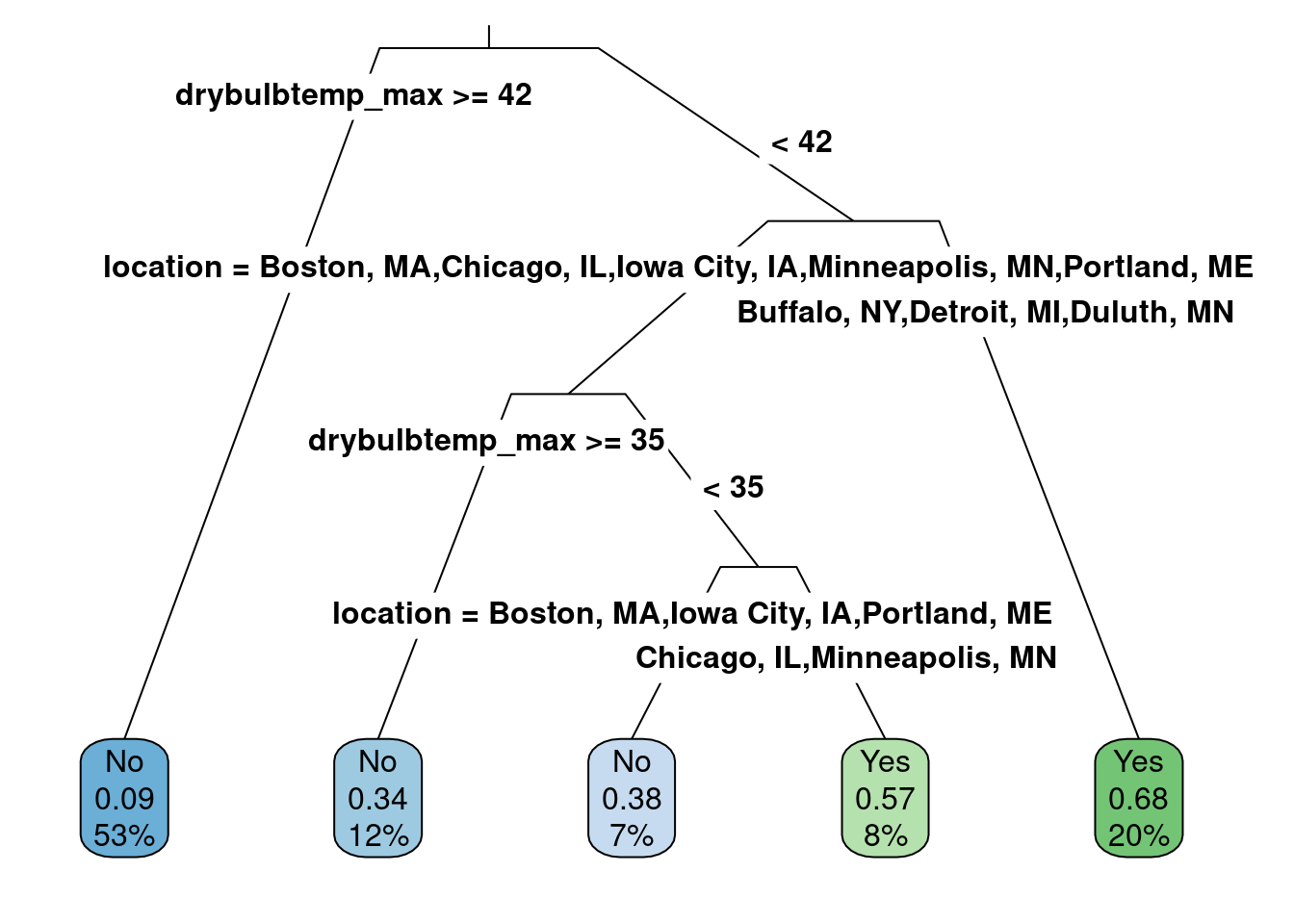
Figure 5.11: The classification model with the location attribute added as a categorical attribute.
When there is a split for a categorical attribute, the category split does not occur at a value like with continuous attributes. Instead, the split occurs for one or more categories. For example, for the second split in the latest results, if the location is Buffalo, Detroit, or Duluth, the path progresses to the right to the “Yes” category, representing a prediction that it will snow. The other locations continue to the left of that split, then the maximum daily temperature is helpful again, and finally, the final split is the location again. Now, the location attribute does not contain Buffalo, Detroit, or Duluth but contains the other groups. In this case, those locations of Chicago and Minneapolis result in predictions that it will snow and other locations will not.
5.2.1.1 Accuracy
The accuracy could be different as the attributes used in the model differ. Therefore, it is important to explore model accuracy again. Figure 5.12 shows the classification results. These results can be compared to Figure 5.5. There are two major differences: one, the prediction accuracy for days in which it did not snow decreased slightly (left bar), but the prediction accuracy for days where it did snow the accuracy increased (right bar).
us_weather_predict <- us_weather_predict %>%
  mutate(snow_predict_location = predict(class_tree_location, type = 'class'))

gf_bar(~ snow_factor, fill = ~snow_predict_location,
       data = us_weather_predict, position = 'fill') %>%
  gf_labs(x = "Observed Snow Status",
          fill = "Predicted Snow Status") %>%
  gf_refine(scale_y_continuous(breaks = seq(0, 1, .1)))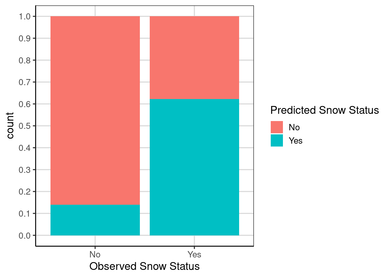
Figure 5.12: Bar chart showing model accuracy with location attribute included.
The prediction accuracy can also be computed analytically with the df_stats() function.
us_weather_predict %>%
  mutate(same_class = ifelse(snow_factor == snow_predict, 1, 0),
    same_class_location = ifelse(snow_factor == snow_predict_location, 1, 0)) %>%
  df_stats(same_class_location ~ snow_factor, mean, sum, length)
## response snow_factor mean sum length
## 1 same_class_location No 0.8599498 2057 2392
## 2 same_class_location Yes 0.6220238 627 10085.3 Comparison to Baseline
As shown above, overall or conditional model accuracy can be an important first step in evaluating the performance of the classification model. However, it is helpful to compare the model accuracy to a baseline. This is important to consider as it is often not the case that the event the model predicts is equally likely. More specifically, it has a probability of occurring equal to 50%. For example, in the US weather data, the observed number of days in which it snows was 0.3, meaning that on average for the days and locations in the data, it snowed on 3 out of 10 days. This would mean that a naive model that only predicted it did not snow would be correct 70% of the time. Therefore, the overall accuracy of the classification models can use this information to see if the model outperforms a simple analysis that predicts the predominant category (in this case, that it does not snow).
The first model fitted to the US weather data used the drybulb maximum and minimum temperature and had an overall model accuracy of around 77%. Therefore, using the two temperature attributes increased the overall model accuracy by about 7%, \(77% - 70% = 7%\), compared to the naive/baseline prediction of not snowing every day. Is this 7% improved accuracy useful in this situation? In general, likely yes, but this answer is more complicated after looking at the conditional accuracy presented for the model using the two temperature attributes (see Figure 5.5). For example, the model accurately predicts days it will not snow (about 90% accurate) but not days it does snow (less than 50% accurate).
When thinking about this situation compared to the baseline model that would predict that all observations would not snow, this model would correctly predict all of the days in which it would not snow (left-bar in Figure 5.5), but would not predict any days correctly in which it did snow (right-bar in Figure 5.5). Arguably, accurately predicting the days it snows is the more interesting/valuable characteristic. Therefore, this model going from a 0% prediction accuracy for the baseline model to almost 50% is a sizable increase in prediction accuracy.
This same idea could be taken with the updated model that includes the location and the two temperature attributes (see Figure 5.12). The prediction accuracy is worse for days when it does not snow but about a 12% increase in accuracy compared to the model with just temperature. Compared to the baseline model, there would be a 62% accuracy increase for days it snows. This shows that the idea of the baseline comparison can come from the naive model, which predicts a single category for all attributes. However, the baseline comparison can be a previous model to compare how the model improves by including even more attributes.
5.3.0.1 Further conditional accuracy
It was not explored earlier, but the model uses location in the prediction. Therefore, it would also be possible to condition the accuracy based on the location to understand if the model is performing better for specific locations than others. Figure 5.13 shows a bar chart on model accuracy for each location separately. This could be compared directly with Figure 5.12 to see if there are differences in the prediction accuracy by different locations.
gf_bar(~ snow_factor, fill = ~snow_predict_location,
       data = us_weather_predict, position = 'fill') %>%
  gf_labs(x = "Observed Snow Status",
          fill = "Predicted Snow Status") %>%
  gf_refine(scale_y_continuous(breaks = seq(0, 1, .2))) %>%
  gf_facet_wrap(~ location)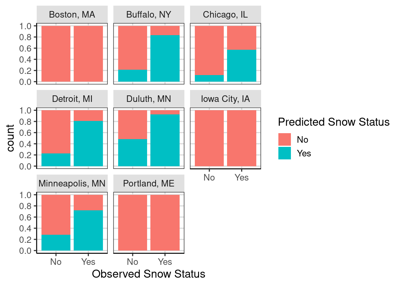
Figure 5.13: Bar chart showing model accuracy with location attribute included and facetted by the different locations.
The prediction accuracy varies substantially across the locations. For example, Boston, Iowa City, and Portland consistently predict that it will not snow (i.e., a 0% prediction accuracy for days it does snow). In contrast, for Buffalo, Detroit, and Duluth, the prediction accuracy for days it snows is above 80%. Furthermore, Duluth has the worst prediction accuracy for days when it does not snow, slightly larger than 50%. If Boston, Iowa City, and Portland were removed from the data to make the predictions, the prediction accuracy for days in which it snows would increase. However, the prediction accuracy for days in which it does not snow would likely decrease.
5.4 Training/Test Data
So far, we have used the entire data to make our classification. This is not best practice, and we will explore this in more detail. First, take a minute to hypothesize why using the entire data to make our classification prediction may not be the best.
It is common to split the data before fitting a classification/prediction model into a training data set. The model makes a series of data predictions, learning which data attributes are the most important. Then, upon successfully identifying a helpful model with the training data, test these model predictions on data that the model has not seen before. This is particularly important as the algorithms to make the predictions are very good at understanding and exploiting minor differences in the data used to fit the model. Therefore, exploring the extent to which the model does an excellent job on data the model has yet to see is a better test of the utility of the model. We will explore in more detail the impact of not using the training/test data split later, but first, let us refit the classification tree to the weather data by splitting the data into 80% training and 20% test data.
A 70/30 split is typical in practice, so why choose an 80/20 training/test data split? This choice can be broken down into two primary arguments to consider when making this decision. The main idea behind making the test data smaller is that the model initially has more data to train on to understand the attributes from the data. However, as discussed above, evaluating the model on data the model has yet to see before is helpful. This ensures the process is similar to that of what may happen in the real world, where the model could be used to help predict/classify cases that happen in the future. Secondly, the test data can be smaller, but we would like it to be representative of the population of interest. The splitting may not make big differences in larger samples, but in small samples, choosing the appropriate split percentages is a helpful step. Here, the data are not small, but also not extremely large, about 3400 weather instances. When using an 80/20 training/test data split, there would be 2720 in the training data and 680 in the testing data.
5.4.1 Splitting the data into training/test
This is done with the rsample package utilizing three functions, initial_split(), training(), and test(). The initial_split() function helps to take the initial random sample, and the proportion of data to use for the training data is initially identified. The random sample is done without replacement, meaning that the data are randomly selected but can not show up in the data more than once. Then, after using the initial_split() function, the training() and test() functions are used to obtain the training and test data respectively. It is good practice to use the set.seed() function to save the seed that was used, as this is a random process. Without using the set.seed() function, the same split of data would likely not be able to be recreated if the code was run again.
Let’s do the data splitting.
set.seed(2021)
us_weather_split <- initial_split(us_weather, prop = .8)
us_weather_train <- training(us_weather_split)
us_weather_test <- testing(us_weather_split)
class_tree <- rpart(snow_factor ~ drybulbtemp_min + drybulbtemp_max + location,
method = 'class', data = us_weather_train)
rpart.plot(class_tree, roundint = FALSE, type = 3, branch = .3)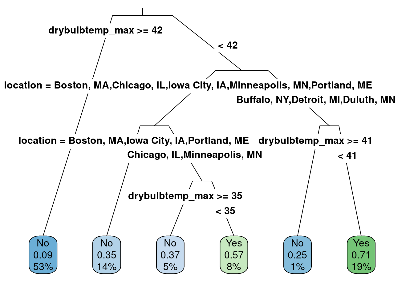
This is a reasonable model. Let us check the model’s accuracy.
us_weather_predict <- us_weather_train %>%
  mutate(snow_predict = predict(class_tree, type = 'class'))
us_weather_predict %>%
  mutate(same_class = ifelse(snow_factor == snow_predict, 1, 0)) %>%
  df_stats(~ same_class, mean, sum)
## response mean sum
## 1 same_class 0.79375 2159The model accuracy on the training data, the same data that was used to fit the model, was about 80%. We will now use the testing data to compare to the 80% accuracy obtained from the training data. Predict what you think is the prediction accuracy for the testing data. Will it be higher, the same, or lower compared to the accuracy of the training data?
5.4.2 Evaluating the accuracy of the testing data
To evaluate the accuracy of the test data, the primary difference in the code is to pass a data object to the argument, newdata. The new data object is the testing data that was not used to fit the data and was withheld for the sole purpose of testing the performance of the classification model. In this example, the code to input the new data is, newdata = us_weather_test.
us_weather_predict_test <- us_weather_test %>%
  mutate(snow_predict = predict(class_tree, newdata = us_weather_test, type = 'class'))
us_weather_predict_test %>%
  mutate(same_class = ifelse(snow_factor == snow_predict, 1, 0)) %>%
  df_stats(~ same_class, mean, sum)
## response mean sum
## 1 same_class 0.7911765 538The test data’s prediction accuracy was significantly lower, about 76.5%. The accuracy tends to be lower when evaluating accuracy on the testing data because the model has yet to see these data. Therefore, there could be new patterns in these data that the model has not seen before. Although the accuracy is lower than when using the training data, it would be more realistic to how these models would be used in practice. Commonly, the model is fitted to data on hand and is used to predict future cases. The training/test data setup is more realistic to this scenario in practice, where the testing data mimic those future cases that the model would ultimately be used to predict.
5.5 Introduction to Resampling/Bootstrap
To explore these ideas in more detail, a statistical technique called resampling or bootstrap will be helpful. Going forward, these ideas will be used to explore inference and understand sampling variation. In straightforward terminology, resampling or the bootstrap can help understand uncertainty in model estimates and allow more flexibility in the statistics that can be used. The main drawback of resampling and bootstrap methods is that they can be computationally heavy. Therefore, depending on the situation, more time is needed to reach the desired conclusion.
Resampling and bootstrap methods use the sample data that are already collected and perform the sampling procedure again. This assumes that the sample data are representative of the population, an assumption that is also made for classical statistical inference. Generating the new samples is done with replacement (more on this later) and is done many times (e.g., 5,000, 10,000), with more generally being better. For example, with the US weather data, assume this is the population of interest and resample from this population 10,000 times (with replacement). For each resampled data, calculate the proportion of days that it snows. Before this computation is run, think about the following questions.
- Would you expect the proportion of days that it snowed to be the same in each new sample? Why or why not?
- Sampling with replacement keeps coming up. What do you think this means?
- Hypothesize why sampling with replacement would be a good idea.
Let us try the resampling by calculating the proportion of days that snowed. These 10,000 calculations will be saved and visualized. To summarize what the resampling procedure does here,
- Resample the data with replacement (assuming the population is representative)
- Compute and save a statistic of interest (e.g., mean)
- Repeat steps 1 and 2 many times (i.e., 5000, 10,000, or more)
- Explore the distribution of the statistic of interest
resample_weather <- function(...) {
    us_weather %>%
        sample_n(nrow(us_weather), replace = TRUE) %>%
        df_stats(~ snow_numeric, mean)
}

snow_prop <- map_dfr(1:10000, resample_weather)

gf_density(~ mean, data = snow_prop) %>%
  gf_labs(x = 'Proportion of snow days')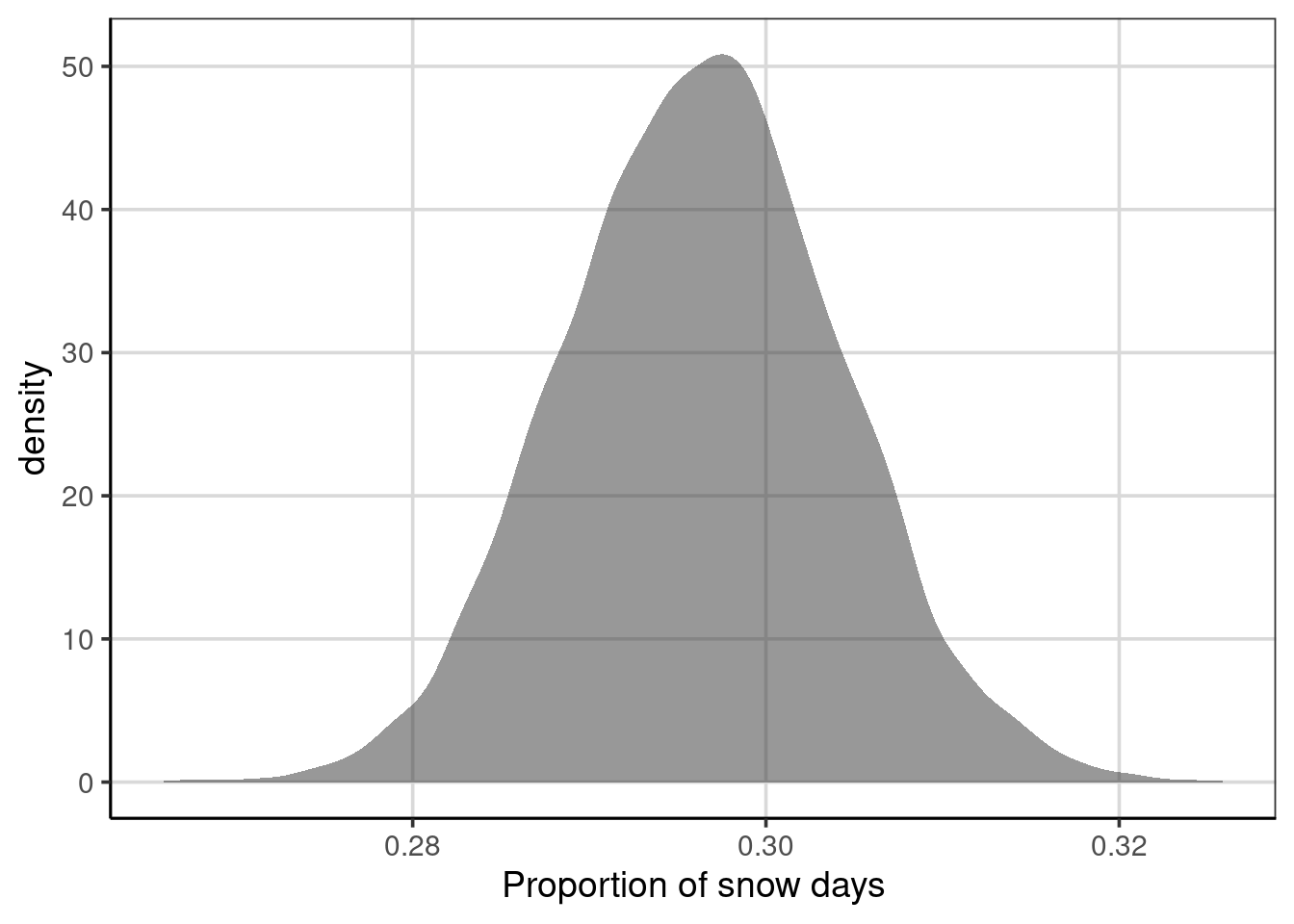
Figure 5.14: Density figure of the distribution of the proportion of days in which is snows from the resampled data.
One can see from the figure that there is variation in the proportion of days that have snowfall. It is centered just below 0.3, shown by the peak of the density curve. This means that, on average, there are just under 30% of days in which snow fell across all of the resampled data. The variation in the proportion of days in which it snowed ranged from just under 0.28 to just over 0.32, meaning that in the resampled data, there were some data cases where it snowed 28% of the time and others it snowed 32% of the time. Proportions of snow days in these extremes are more unlikely to occur as the density curve is much lower for these ranges, compared to the peak of around 29% to 30%.
5.5.1 Bootstrap variation in prediction accuracy
The same methods can be used to evaluate the prediction accuracy based on the classification model above. When using the bootstrap, we can get an estimate of how much variation there is in the classification accuracy based on our sample. In addition, we can explore how different the prediction accuracy would be for many samples when using all the data and by splitting the data into training and test sets.
The steps to do this resampling/bootstrap are similar to before, but one important step is added. Before the relevant statistic of interest is saved, the statistical model must be fitted on the resampled data.
- Resample the data with replacement (assuming the population is representative)
- Fit statistical model to resampled data
- Compute and save a statistic of interest (e.g., mean accuracy)
- Repeat steps 1 through 3 many times (i.e., 5000, 10,000, or more)
- Explore the distribution of the statistic of interest
When fitting a classification model, it can often be of interest to split the resampled data into the training and testing data as part of this process. This mimics how the model would be used in practice and will help ensure that the prediction accuracy obtained is not overstated. Therefore, a step 1a could be added such that the steps look like:
- Resample the data with replacement (assuming the population is representative)
- Split resampled data into training/test data.
- Fit statistical model to resampled data
- If data are split into training/test, fit to training data
- Compute and save a statistic of interest (e.g., mean accuracy)
- If data are split into training/test, evaluate performance on testing data
- Repeat steps 1 through 3 many times (i.e., 5000, 10,000, or more)
- Explore the distribution of the statistic of interest
This process is shown below with the function calc_predict_acc(). Here, the sample_n() function is used to sample with replacement, fit the classification model to each sample, and calculate the prediction accuracy. First, I will write a function to do all of these steps once.
calc_predict_acc <- function(data) {
  rsamp <- us_weather %>%
    sample_n(nrow(us_weather), replace = TRUE)

  rsamp_split <- initial_split(rsamp, prop = .8)
  rsamp_train <- training(rsamp_split)
  rsamp_test <- testing(rsamp_split)

  class_model <- rpart(snow_factor ~ drybulbtemp_min + drybulbtemp_max + location,
        method = 'class', data = rsamp_train, cp = .02)

  rsamp_predict <- rsamp_test %>%
    mutate(tree_predict = predict(class_model, newdata = rsamp_test, type = 'class'))
  rsamp_predict %>%
    mutate(same_class = ifelse(snow_factor == tree_predict, 1, 0)) %>%
    df_stats(~ same_class, mean, sum)
}

calc_predict_acc()
## response mean sum
## 1 same_class 0.7985294 543The function will then be replicated 10,000 times to generate the prediction accuracy. The following code replicates the function written above 10,000 times, then creates a density figure of the mean column representing the average prediction accuracy for each resampled dataset. Would there be variation in the average prediction accuracy across the 10,000 resampled datasets? If you answered yes, then you would be correct. Why is there variation? The variation occurs due to the resampling with replacement. This process mimics what would occur if we had obtained 10,000 different random samples from the population of interest, in this case, 10,000 random samples of weather data from the locations of interest.
predict_accuracy_fulldata <- map_dfr(1:10000, calc_predict_acc)

gf_density(~ mean, data = predict_accuracy_fulldata) %>%
  gf_labs(x = "Classification Accuracy")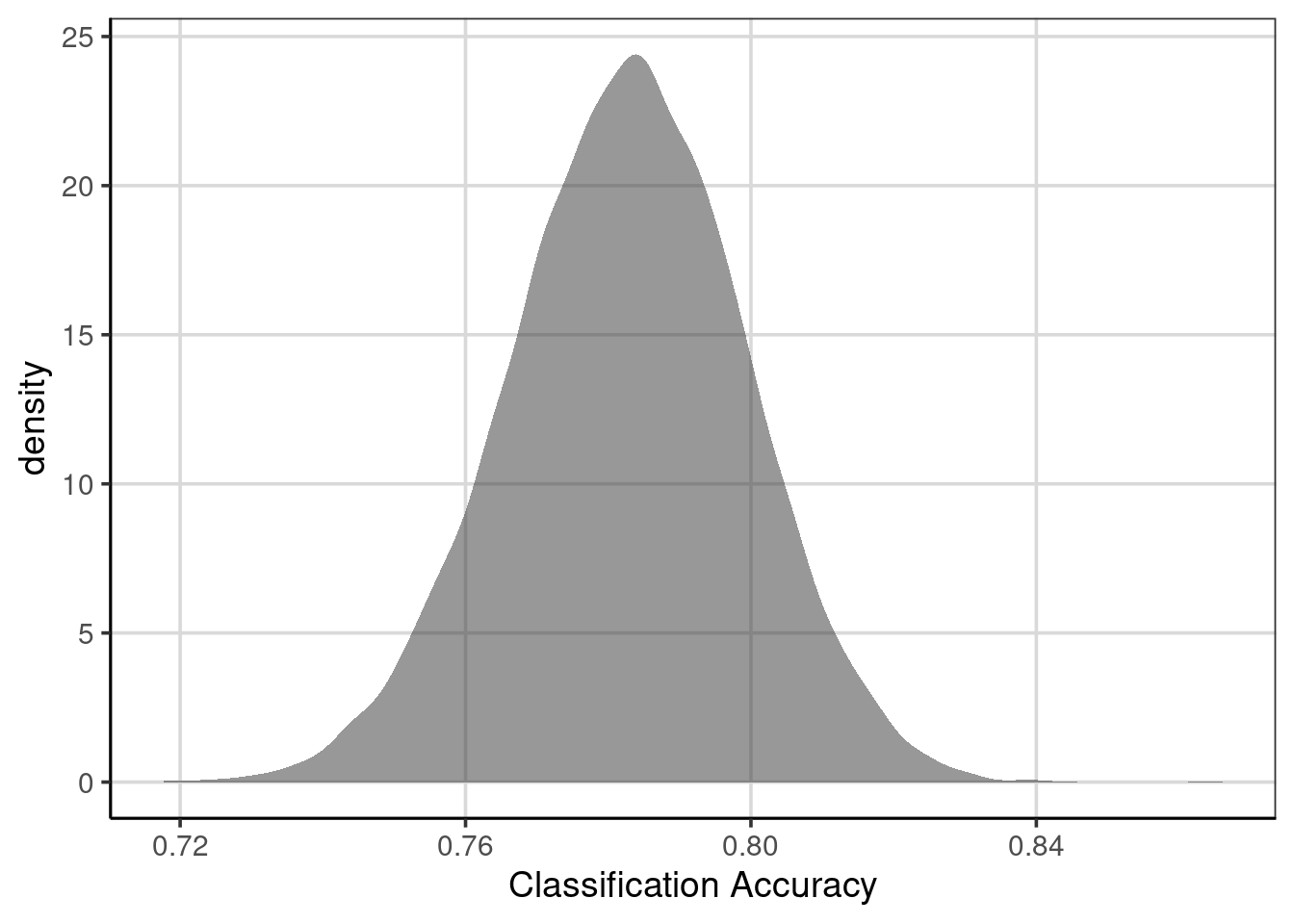
Figure 5.15: Prediction accuracy of classification model on resampled data with training/testing split.
The distribution shown in Figure 5.15 depicts the overall prediction accuracy for each of the 10,000 resampled cases. This figure can be interpreted similarly to the density curves first introduced in Chapter 3. However, the context is the average prediction accuracy rather than for a specific attribute in the data. First, the center or peak for this distribution is about 0.78, meaning that, on average, the classification model has an overall accuracy of about 78%. As discussed earlier, there is variation, however. The prediction accuracy falls between 75% (0.75) and 81% (0.81). We could be more accurate for these values and compute percentiles instead of estimating the figures’ values.
##   response        5%       95%
## 1     mean 0.7544118 0.8088235
The preceding code chunk computed the 5th and 95th percentiles for the average prediction accuracy across the 10,000 resampled estimates. These values show that most of the prediction accuracy values fall between 0.75 and 0.81. We made the deliberate assumption to use the 5th and 95th percentiles, but other percentiles could be used as well, for example, the 2.5th and 97.5th percentiles would depict the values that encompass the middle 95% rather than the middle 90%.